Category: User Interface

How to redesign a numeric keypad?

In an interesting blog post on Smashing Magazine, C.Y. Gopinath explained the design choices he made to build a new calculator for smartphones (iPhones more specifically). He started with an interesting summary of the reasons and origins of the numerical keypads of phones and calculators (keyboards, ATM, etc.). This is what drove me to read his post. Indeed I posted a photo on Flickr that showed the difference, a few years ago.

3267740436_ae26c899cf_z

While reading the post, I was happy the author of the app did some research on the traditions behind this keyboard layout as well as the reasons and studies that lead to these layout. The article also contains links to further details, if necessary, and interesting comments from Harry Blanchard and Michael Long.

However I think the author mixed several things before re-designing his numerical keypad …

Circular design with numbers already exists in the real world: the analog watch (also mentioned in a comment). I guess most if not all humans above 10 years old are used to this design and the way it starts with “0” (well, “12”) at the top and “6” at the bottom. So when I saw Gopinath’s app screen, I was wondering if there is a reason or if there are research showing the tilt is beneficial and will not confuse for the user.

160111-comp-with-clock
Comparison of C.Y. Gopinath’s calculator app (left) and a regular clock on a smartphone (“HTC Sense – Home” from Cha già José on Flickr, CC-by-sa, right)

Citing research from Bell Laboratories is great: very few apps did this amount of research and still show “revolutionary” user interfaces based only on the gut feeling of a designer on steroids (when there was a designer) (to be fair, some new designs achieve their goals). However the period during which they were conducted (early/mid-last century) has most probably a large role to play in the choices and habits of respondents. One thing in particular is that people most probably would use these numerical keyboards sitting on the table (like phones on table) and use their finger (or fingers but I expect the index being the single most used finger) of one hand.

What could be the response now? Only research would tell. My feeling is to start from habits of smartphone users. My own use would consider the following facts:

  1. so far smartphones are still square / rectangle objects
  2. most smartphones are still small enough to be held with only one hand and one finger on the same hand would be used (the thumb)
  3. if smartphones are too big to be used with only one hand, either you hold it with 2 hands and use your 2 thumbs (text messaging) or you hold it with 1 hand and use one finger from the other hand.

I did not (yet) witness cases where the user types on a smartphone with many fingers, like a typist would use all his/her fingers on a keyboard.

160111-holding-smartphone
Two ways to hold and interact with a smartphone: with one hand on top (from Iriss on Flickr, CC-by-nc) and with two hands below (from Freestocks.org, public domain)

Therefore I would rather see another “radical” design like this one (case phone held with 2 hands, using 2 thumbs to type):

160111-example-calculator-smartphone
My example of mock-up smartphone with digits on the side, reachable by thumbs if placed on the sides (I guess it needs some more research, of course)

I was also wondering why the author added so many gesture and swiping left, right, center. In his assessment of other calculators, it was mentioned that they offered little or no feedback. How these gestures can be intuitive or discovered by the user? I must admit I didn’t install the app but I guess there should be a tutorial for all these gestures. In my opinion, these tutorials are however the admission that these features were not intuitive, that the discoverability principle was forgotten, most probably on the altar of minimalism …

Although I appreciated the author’s research and share most of the author’s comments on current numerical keyboards, I don’t think the current implementation solves the issues of user-friendliness, discoverability and the greater goal of making kids love maths. Ironically, the “Edit History” page of the app shows the standard, old-fashioned numerical keyboard …

Any free solution for the demise of Google Reader?

Last week Google announced it will shut down its Reader service. It is a web-based RSS reader. It therefore allows to be kept updated of news from around the net in a central location. I liked the service for 3 reasons (on top of the fact it’s free, 0$, to use):

  1. It’s web-based, accessible from anywhere/everywhere with a simple browser;
  2. It’s text-based, you can quickly scan headlines and use the powerful search function from Google;
  3. It’s backed by an API so you can use it via different apps on different platforms and they all stay synchronised (the web/mobile version of Reader is not as efficient as the web/desktop version; hence the proliferation of apps using Reader as a backbone).

Of course it frustrated a lot of people, from scientists to consultants … to name a few only. People are looking for alternative (you can do a search on Google while the Search service is still working). Feedly is cited very often as the next best alternative. However its nice, graphical interface conflicts with my second reason to like Google Reader: it’s text-based. The Old Reader looks also interesting, it is text-based but no apps on different platforms yet. But both are also proprietary and can be turned off (or changed to a pay-for-use model) at any moment 😦

An interesting solution could be an Evernote RSS reader. Evernote has already a portfolio of application ranging from a note-taking software, screenshots, drawing, food, … They have a synchronisation process in place. Why not a RSS reader then?

Back to the main track … Fortunately – in a way – Google Takeout allows you to retrieve all your data from Reader, along with an OPML file containing all your subscriptions. You can feed this file in another reader and you can go forward. Starred items are also retrieved (but which reader can use them?). And if you are interested The Guardian has an interesting article about the average duration of Google free services (1459 days, see below) and other nice facts. I guess they will keep Search alive 😉

130325-Google_Keep_Guardian

But what can be done for free (as in free speech)? One of the solution is Owncloud (AGPL) and they recently released a RSS reader add-on. Another solution could be pyAggr3g470r, a news aggregator written in Python. And I was wondering why there isn’t just a simple API that would allow any kind of application to connect, update and display RSS feed. Something like the NewsCredNews API but free, simpler to use than Owncloud and with apps/website interface for mobile devices. And a poney with that, please.

Do you have any other solution?

Visualizing categorical data in mosaic with R

A few posts ago I wrote about my discomfort about stacked bar graphs and the fact I prefer to use simple table with gradients as background. My only regret then was that the table was built in a spreadsheet. I would have liked to keep the data as it is but also have a nice representation of these categorical data.

This evening I spent some time analysing results from a survey and took the opportunity to buid these representations in R.

The exact topic of the survey doesn’t matter here. Let just say it was a survey about opinion and recommendations on some people. The two questions were:

  1. How do you think these persons were, last year? Possible answers were: very bad, bad, average, good or very good.
  2. Would you recommend these persons for next year? Possible answers were just yes or no.

For the first question, the data was collected in a text file according to these three fields: Person, Opinion, Count. Data was similar to this:

Person,Opinion,Count
Person 1,Very bad,0
Person 1,Bad,0
Person 1,Average,4
Person 1,Good,9
Person 1,Very good,3
Person 2,Very bad,3
Person 2,Bad,4
Person 2,Average,4
Person 2,Good,5
Person 2,Very good,0

The trick to represent this is to use  geom_tiles (from ggplot2) to display each count. There is an additional work to be done in order to have the Opinion categories in the right order. The code is the following:

library(ggplot2)
data1 <- read.table("resultsQ1.txt", header=T, sep=",")
scale_count <- c("Very bad", "Bad", "Average", "Good", "Very good")
scale_rep <- c("1", "2", "3", "4", "5")
names(scale_count) <- scale_rep
ggplot(data1, aes(x=Opinion, y=Person)) +
geom_tile(aes(fill=Count)) +
xlim(scale_count) +
scale_fill_gradient(low="white", high="blue")+theme_bw() +
opts(title = "Opinion on persons")

And the graph looks like this:

For the second question, the data was collected in a text file according to these three fields too: Person, Reco, Count. Data was similar to this:

Person,Reco,Count
Person 1,Recommend,16
Person 1,Do not recommend,0
Person 2,Recommend,5
Person 2,Do not recommend,11

And we use approximately the same code:

library(ggplot2)
data2 <- read.table("resultsQ2.txt", header=T, sep=",")
ggplot(data2, aes(x=Reco, y=Person)) +
geom_tile(aes(fill=Count)) +
scale_fill_gradient(low="white", high="darkblue")+theme_bw() +
opts(title = "Recommendations")

And the graph for the second question looks like this:

Easy isn’t it? Do you have other types of visualization for this kind of data?

No more Read More!

Just a little post to write how I hate those “Read More” sentences in blog post!

Grrr, again a disguised "Read More"!
Grrr, again a disguised "Read More"! This post has a very low information content as presented.

“Read More” is a way to cut your blog post in two: one part that will be shown in your blog RSS flux, on your front page and another part that will only be read by those who click on the “Read More”. A variant of this is the […] (as shown above).

Most of the time, I read blogs I subscribed to via a RSS reader (or news aggregator). I read blog posts when I have time. A central place like the RSS reader is like a personalized newspaper. I usually read blog posts grouped by the interest I have at the moment I read them. An organized place like the RSS reader is like a personalized newspaper, just on a certain topic, just when you need it.

Now, if there are “Read More” after 2 or 3 lines of text, I usually don’t know anything about the quality of the remaining article. Either I click, I launch my web browser (wait, wait, wait …) and finally read the remaining part of the article. It’s very rare I do that. Usually, I just go to the next article. Most of the time, the next article is by someone else, on another blog (items being classed by interest topic and time in my reader). After a few disappointments of finding a “Read More”, I just cancel my subscription to the RSS feed. Unless information given there is very, very interesting.

I know that “Read More” directs more traffic to your website. I know getting more traffic makes you earn money (if you serve ads), can potentially make you earn money (if you sell something) or simply gives you more details about your audience. I know that  “Read More” allows to “shorten” long blog post so your front page is not 10-pages long.

But in the end, the goal is to be read. If you write well, have a good product and/or don’t annoy people with unnecessary “clicks”, people will anyway come to your website and potentially buy your stuff. Imho, simplifying readers’ lives by giving them all the information they want in the format they want regardless of the channel (RSS, e-mail alert and website) is more important than any other reason. Don’t force page views, it’s annoying!

Wearable electronics/communication

I became recently interested in wearable electronics and wearable communication. I think we usually don’t need a computer at home. But I also think that electronics, sensory / storage / communication / helper devices will invade our world (privacy) at one point.

A few months ago, I liked Phillip Torrone’s retrospective collection of wearable electronic devices (for Make:). It will be quite fun to wear some of the stuff he showed. However most of the current applications shown are mostly designed to collect information from the body they are attached to or to communicate with this body. This is very much self-centered.

Recently (tonight), I watched Kate Hartman’s TED talk: The art of wearable communication. As the title implies, Kate Hartman goes one step further and designs wearable communication devices. I must admit I’m not sure I would want to wear the devices she designed. But I admire how simple these devices can be and yet some of them create an effective embryo of communication with others.

Kate Hartman and her wearable communication devices

The full video is just below:

Google+ API started

Logo Google PlusGoogle+ (G+) is a social networking and identity service operated by Google. It started a few months ago like a closed service from where you can’t get out any data and where the only possible interaction (read/write/play) is only possible via the official interfaces (i.e. the web and android clients). Google promised to release a public API and it partly did so tonight, here.

As they stated, “this initial API release is focused on public data only — it lets you read information that people have shared publicly on Google+” (emphasis is mine). So you can already take most of your data out of G+ (note that it was already possible to download your G+ stream with Takeout from the Google Data Liberation Front). As usual, it’s a RESTful API with OAuth authorization. It comes with its own rules and terms (it could be interesting to add to GooDiff). The next step would be to be able to directly write something on Google+.

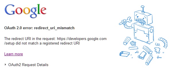
I only tried to try the examples so far. But unfortunately I got an authorization error. I won’t go further for tonight but their error screen is interesting 🙂

Error 400 screen - Bad request - Google+ API

We don’t need a computer at home

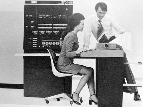
Historically, computers were invented to solve issues in the factory or the office (university office or company office) but recently invaded home and are becoming ubiquitous.

IBM System/370 Model 145

At the beginning of this invasion, computers for home were (and are still) very similar to the ones for the industry/office: a CPU, a keyboard to enter data or commands and a screen to see what was happening. Artifacts to be attached to the computer were first invented for the corporate world and then progressively entered into homes. I still remember the first mouse we had at home: it was like a mini-revolution. After years there were still some software that could not take advantage of it or its usage was implemented but in a rudimentary way. Idem for the first webcam we acquired: only the provided software was able to use it. Now it comes embedded in most computer screen and can be used for various purposes (video chat, take pictures, read bar codes, art, …).

More and more, computers are now declined its various avatars like calculators, mobile phones, game consoles, car dashboards, ATMs, cashiers, … All of them affect our daily lives in a way or another. But in my opinion the computer shouldn’t have left the corporate world. Its home avatars should have directly been via adapted technologies. Because Mr. and Mrs. Everyone don’t need any computer at home.

Although some bosses want their employees to behave differently, the factory/office is were we work and home is were we don’t work. At home, we read, eat, sleep, play, interact with other family members and neighbors, perform personal care, watch the television, etc. None of these activities requires a computer as we know it (CPU, keyboard, mouse and screen). However some of them can be enhanced or at least affected by it.

Whatever how it is materialized, a “computer” can enhance your reading experience. It can monitor your sleep while you snore or, more broadly, it can monitor your health while performing your daily activities. Computers can enhance your movie experience (by linking to related content, e.g.). They can help you improve your cooking skills and watch your savings.

Without pretending to know the future, I think miniaturization is and will put thing back “in order”: you will no longer have a computer on your desk but a bunch of small devices, each of them responsible for a small part of your daily life activities. You probably already have a mobile phone or a smartphone, i.e. a mini portable computer allowing us to phone. You probably already used a calculator, i.e. a mini portable computer specialized for calculus. Computer-like devices are becoming more and more small and powerful. They are also doing more than one simple thing at a time.

Another interesting trend is that computer-like devices are becoming more and more transparent, i.e. becoming more and more hidden or at least embedded in our daily lives. This is obviously allowed by miniaturization. The soda distributor contains a small computer-like device. Your electronic watch contains more electronics than ever. Your television screen is flat and is more capable but takes less space than your grandma’s television (relatively to the size of the screen of course).

To go beyond that, people started to experiment with wearable devices and electronics. These devices are part of your daily clothes. Currently these artifacts are merely gadgets and most of them are monitoring devices, just collecting and sometimes displaying information to the outside world. But other applications can be found like being able to carry your electronic documents (without the need for a USB key or CDs) or actually being your receiver/transmitter (“phone” without the actual plastic object we always lose somewhere when we need it). Without becoming cyborgs these guys below won’t soon need cellphones anymore:

Suits & Cells

Now is this an praise of closed platforms like the iPad, the iPod, etc.? No. I don’t say that no computer should be allowed at home: some people are working from home and they obviously need a computer. On top of that, in order to become part of our everyday habits, these devices would need to be transparent, open: people should be aware of what these devices are doing, what are their benefits and potentially what are the drawbacks of using / wearing them. One of the main concerns about these closed platforms and future platforms is privacy: how much of you do you agree to reveal “in exchange” of being empowered by these devices? I think people should be able to refuse to reveal anything and still be able to use these devices.

Photo credits: IBM System/370 Model 145 by John Keogh (CC-by-nc) and Suits & Cells by Alexa Clark (CC-by-nc), both on Flickr.

Two annoying issues with Firefox 4 (and their solutions)

The Mozilla Foundation updated Firefox to its version 4 last month and it has lots of interesting features. So I upgraded and although I initially criticized the new interface (when looking at screenshot from beta releases), I now quite like it: it gives more space to the actual content (web pages) to keep the “container” (the Firefox GUI in itself) to a minimum.

But … (because there always is a “but”). But I found 2 annoying issues with the new version …

  1. the “open in new Tab” option is now second in the pop-up menu when you right-click on a link;
  2. Firefox will not save all your open tabs when you close it.

In version 3, when you right-click on a link, the pop-up menu shows you options to open in new window or in new tab in this order:

  1. Open Link in New Window
  2. Open Link in New Tab

Now in version 4, when you right-click on a link, the pop-up menu shows you these options in the following (inverted) order:

  1. Open Link in New Tab
  2. Open Link in New Window

So if you are used to click on the second option to open the link in a new tab (in version 3), you automatically do this in the new version. But you open a new window. That’s annoying! And that’s a known bug/feature.

There are three solutions to this issue:

  1. use Ctrl + (left) click to open a link in a new tab.
  2. use the Menu Editor add-on to re-organise the pop-up menu order as you wish.
  3. use this tweak proposed in a Mozilla forum.
  4. (I know, a fourth solution) just get used to it because I’ll also find it annoying if Firefox developers suddenly change the order of the menu items back in version 5.

My other issue with this new version of Firefox is that it doesn’t warn you that you will close it but not save the tabs you are currently browsing. In Firefox 3, there was a warning dialog box telling you something like: “you are about to close Firefox but there are still tabs open. Would you like to save them, quit anyway (and lose them) or stay in Firefox”. In Firefox 4, no warning, it closes and doesn’t save your tabs.

Initially you think you made a mistake, there was no tab when you closed Firefox. Or maybe you didn’t pay attention to the dialog box and closed Firefox, telling it not to save. At the third occurrence, you are sure there is an issue! And there is one indeed! The Firefox development team apparently decided not to show this box anymore. It sounds ok if you think that this roadblock-dialog-box isn’t in the user’s way when he/she decides to quit. But then save the tabs to users used to this features don’t lose their tabs. This evening, I lost at least 20 tabs containing things not so important (so not in bookmarks) but I wanted to read tonight. Grrr …

Fortunately, as usual, there is a solution:

In the address/url bar enter: about:config
In the filter box enter: quit
set browser.showQuitWarning to ‘true’

Again, this is a feature or an explicit decision: see bugs 592822 and 593421 for instance.

From my point of view, the gold standard is: don’t change the UI and user experience ; or do it but tell the user you did it the first few times the old behaviour isn’t occurring.

Google and the bottom search box

When Google rolled out “Instant“, they also removed the bottom search box. Bad idea.

Google Instant is a nice, web 2.0 improvement to Google “classic” where results appear as soon as you type them in the ad hoc text box. Google claims that Instant can save 2 to 5 seconds per search. Maybe.

But, at the same time, they removed the bottom search box. I extensively used this search box: when you enter your search criteria and look at the results, you may want to refine your search, add some terms, remove or exclude others, etc. With a second search box at the bottom, you can directly do it after having browsed the first bunch of results. Without this box at the bottom, you can’t: you have to think to scroll all the way to the top of the page and actually do the change in the only, upper text box. You lose 2 seconds to scroll back to the top of the page and you may lose some idea on the way (especially if you have 1001 ideas at the same time). When you sometimes perform a lot of searches per day, the time you gain with Instant per search is largely lost by the time spent browsing back to the top. I’m not the only one to think it’s was a bad idea.

But if you want to keep Google as (one of your) your search engine(s) and want to get back the second search/text box at the bottom (and optionally get Instant too), just use “Encrypted Google SSL Beta” (URL in clear: https://encrypted.google.com/).

Browser hardware acceleration issue?

Browser hardware acceleration is meant to render websites faster by allowing the graphics card (its GPU) to directly display “things” (videos, animation, canvas, compositing, etc.) on the screen. By bypassing software rendering systems, lots of websites seem to render faster. All major browsers jumped on this: Firefox, Chrome, Internet Explorer and Opera (post of 2008!).

I understand that enhancing the user’s experience while surfing the web is something that can be interesting. Hardware acceleration opens the door to unseen compositions, to new types of animations, to new kind of applications. Directly in your favourite browser.

Comment if I’m wrong but hardware acceleration will not lead to fragmentation of the web landscape. HTML5 seems to be the standard behind which browsers developers are adding their acceleration engines.

However, an issue (from the user’s point-of-view) will probably be that hardware acceleration will still help the emergence of a consumer-only web. A lot of your applications will be in your browser, with your data in someone else’s data center. You want your data safe? You need to trust your provider’s security measures. You simply want your data on your hard drive? I think you’ll have a problem here. But I agree it’s not the technical implementation that will be responsible for that.

First LaTeX Beamer presentation seen in a proteomic conference There is another issue I see with browser hardware acceleration. And it’s very down-to-earth. As you often encounter in presentation with videos, the presentation is displayed via a beamer but not the video (a black rectangle is displayed instead). You can easily disable hardware acceleration in most presentation software (if it’s not disabled by default). But, with hardware acceleration fully integrated in the browser, what will be displayed with the beamer if we have to do a demo of a website or simply when the presentation software is the browser? A page with patches of black rectangles? I hope not.

Why do I blog this? I enjoy reading about the (technical) details of (browser) hardware acceleration. I am very interested in general in all the new developments in IT regarding the use of GPUs and graphics card computational power to solve current issue or allow future developments. But I’m also using these (new) technologies everyday. So I don’t want that technological improvements on one hand turn to cause trouble on the other hand.