The Python script (in src/ in the MD-coronavirus repo on Github) just fills in the latest data for days where data is missing. On a side note, it also fix some basic issues like a reporting date in year “0200” (instead of “2020”). You can play with the fixed data file here.
To take the same example again, below is the graph of the number of cases in Sterling Care Frostburg Village according to the official data file (“GH” means “group housing”). Between mid-June and mid-September, there is no data point. Therefore, it’s impossible to calculate a cumulative number of cases in all congregate living facilities. You can see in the old post that the cumulative curve is actually going down after June.
On the fixed version below, you can see data points added between mid-June and mid-September:
Note also that the MDH could have reset the count of cases between periods of 14+ days without reporting. Fortunately, it didn’t do that and you can see the facility re-appears in the file, mid-September, with 11 cases (or 2 more than in June), instead of just 2 cases in residents.
This version now allows to correctly display the cumulative count of COVID-19 cases in congregate living facilities:
We can see that, during the first wave, in May 2020, the number of cases increased a lot, especially among residents of nursing homes. Then the curves increased at a slower pace. Since the beginning, nursing homes counted for the bulk of congregate living facilities cases. But the increase in cases happens in all facilities.
There are still some issues to be solved. For instance, some facilities seem coded under different names. Our example above is coded in 2 different ways (and I need time to go through the 200+ facilities in the list):
Sterling Care – Frostburg Village
Sterling Care Frostburg Village
For a human, they are clearly the same facility. For a computer script, it still needs to be told so. And talking about computer script, this one still needs to be cleaned …
But also every day, there is one thing that constantly changes: how everyone is calculating the COVID-19 positivity rate. Today (July 26), for instance, the different daily positivity rates announced are: 3.77% (Hogan), 4.47% (Hogan again in the same tweet, Hall, Ricci, MD Health Department, Fogarty) and ~6% (for me, the exact number behind the ~ is 6.14%). This doesn’t show the 7-days (or n-days) averages and other measures. And this is only on Twitter.
Why are these numbers different? Which one is correct?
First, let me get rid of the second question: all of them are mathematically correct. What value you give to them is highly depending on what you are looking at or looking for.
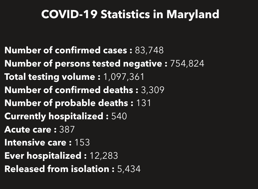
So how are these numbers different? Let’s calculate all of them … Today, the Maryland Department of Health COVID-19 dashboard indicates:
Screenshot of part of the MDHealthDept COVI-19 dashboard on July 25, 2020
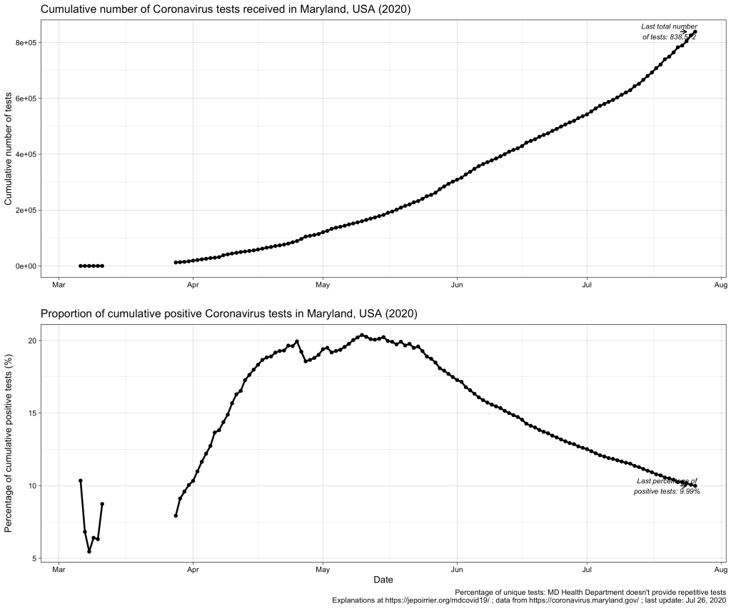
This gives a total of 838,572 cumulative unique tests (# confirmed cases + # persons tested negative) since the beginning of the pandemic. And it gives an overall unique positivity rate of 10.06% (# unique confirmed cases / # unique total). I added “unique” as all these numbers are only counting each person once per test (if someone is tested negative several times, he/she will show up only for 1 negative test). As shown in the chart below, this overall unique positivity rate is growing up fast when cases are increasing but is very slow to go down when cases are diminishing. In consequence, this overall positivity rate will reach 0% in a very, very distant future (almost never will as we will always have cases from the beginning).
Now we may be interested in the total testing volume (1,097,361 today): this is the total of all tests, whether results are always the same or different for the same person. Imagine a doctor being tested every week for COVID-19; for 3 weeks, she is negative (= 1 unique negative test but 3 negative tests in total) until she is found positive on week 4 (= 1 unique positive test = 1 positive test in total); after 2 weeks in quarantine at home, she is again tested negative before returning to work (= 1 unique negative test but 1 positive and 4 negative tests in total). The total testing volume is simply the addition of all tests ever done in Maryland. If you divide the # of unique confirmed cases by the total testing volume, you have an overall positivity rate of 7.64%. I personally don’t like this metric because it mixes unique positive cases with repetitive total cases. As seen in the plausible example above, the total number of unique positive tests and the total number of all positive tests is probably very close (unless positive people are tested positive several times) and it could give a good estimate of the positivity rate.
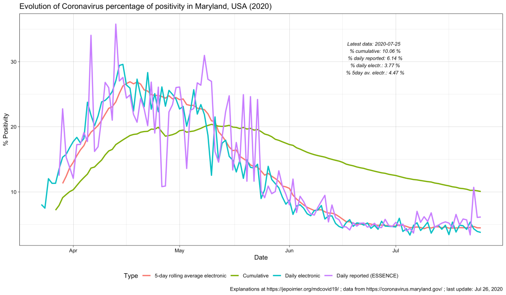
But to create even more confusion, positive cases are reported from ESSENCE (Electronic Surveillance System for the Early Notification of Community-based Epidemics, click on Biosurveillance here; they write weekly reports that are a trove of information – this may be for a later post). And negative cases are reported from NEDSS (National Electronic Disease Surveillance System, also from the CDC). And the total testing volume is given from all lab results transmitted electronically to the state. It is clearly stated that all results transmitted non-electronically are not taken into account. Having 3 different sources, counting cases differently, doesn’t help reporting – but this highlight the difficulty to present a comprehensive figure. If we plot them all on the same figure, this is what it gives:
As discussed above, the % positive from the cumulative count (green line) will always be high and go down slowly. The % positive of daily reported (violet line) is fluctuating a lot and seems to be often higher than the % positive of daily reported electronically (blue line). This high level of fluctuation is the reason why the MD Health Department has a 5-days average of the % positive of daily reported electronically (red line).
Understanding the positivity rate is important because it gives an indication of the severity of the disease. In this respect, we see that Maryland did well to reduce the severity of this disease, so far, with a positivity rate going down since early May. But the positivity rate can also be read as an indicator that the state is doing relatively good on testing (usually, a high positivity rate is associated with too few testing, only testing the most severe cases). But positivity rate can be influenced by many factors that cannot be understood from these graphs only … One of these factors is the test selection: now that Maryland allows anyone to be tested, one could reasonably thing that the samples tested are more representative of the disease in the state than when only a very restricted set of patients could have been tested (before May 19, 2020). Another key parameter is how long testing takes before giving results. All the numbers above are for when tests results were reported. When these tests were performed is not disclosed (there are discussions online that tests results take several days to several weeks to arrive – if this is true, the % positive we see now is merely a photo of what happened mid-July and not now or last week). And to add to the confusion, I’m sure tests results from different labs are reported at different speed.
All in all, data we see here is a fuzzy picture of what happened in a relatively close past. If figures go down, fine. If they tend to go up, we’ll have to be careful that we are not further up than estimated here.
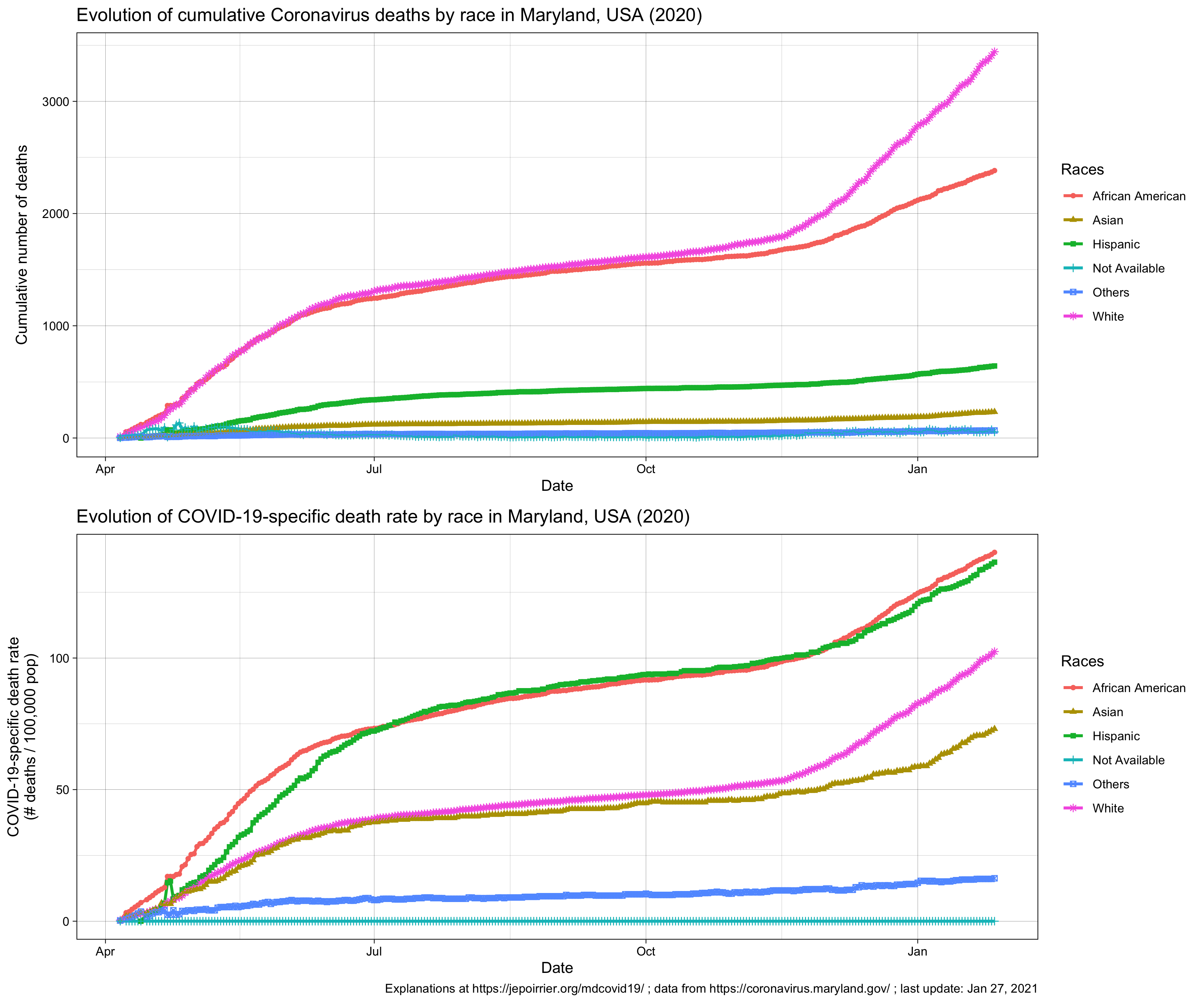
Better metrics for the severity of this COVID-19 pandemic may be deaths or intensive care unit admissions. I briefly wrote about COVID-19 deaths in Maryland related to counties, to races and inequalities, to age or to gender. It’s maybe time to look at ICU in a future post …
After my previous posts about age of COVID-19 cases and deaths in Maryland, it was logical that I write about the gender of these cases and deaths. Rest assured: this time, it will be much shorter 😉
Indeed, in a nutshell, in Maryland (like in the rest of the world), women are more impacted than men by the disease. But men are dying of the disease a little bit more than women.
Note: this post was updated on July 15, 2020, to fix an error in my code!
Now for the details …
In terms of positive COVID-19 tests / cases, the difference between men and women started early in April, with the number of positive tests or cases in women increasing faster than men over time. Today (July 15, 2020), Maryland counted a cumulative 39k positive cases for women and a cumulative 35.9k positive cases for men. The number of new cases in men and women in Maryland follows (of course) the trend in new cases, with peaks in May, a decrease until now and a fear for new increase of cases now (see bottom graph, below).
Even if we take into account the number of cases relative to the population of each gender, because there is approximately the same number of men and women in Maryland (2.9 mio men, 3.1 mio women, from the MD department of Planning), women always saw more cases than men (even if by just a little bit). Today, here is the data (also see graph below):
Cumulative COVID-19 cases / 100,000 pop.
Female
Male
July 15, 2020
1,230.8
1,211.3
In terms of deaths, we see the opposite trend: since the beginning of data reporting, there were always more men who died of COVID-19 than women. On a daily basis, it’s less clear (and since I’m not smoothing nor averaging anything, it’s a bit jagged) but the overall result remains the same.
Even when we consider deaths relative to the respective populations, men die in larger numbers to their population (than women) and this is consistently the case since the beginning of data availability (see also chart below):
Cumulative deaths per 100,000 pop.
Female
Male
July 15, 2020
49.6
54.8
These observations were already widely shared, for the general (i.e. non-MD) population, in the media. There could several factors to explain that more women are tested positive than men: men could be less enclined to be tested than women, women could be more concerned about their health than men (seeking more testing resulting in discovering more positive cases), … And there are two main hypotheses to explain that more men are dying of COVID-19 than women: women tend to have a stronger immune system than men, there are also “gender-based lifestyle choices” (e.g. more men are smoking than women, and smoking is, directly or indirectly, affecting the predisposition to complications due to COVID-19), … So, contrary to the perceived lack of manliness some men express about the mask, men should have even more reason to wear a mask, just to protect them (and others) from dying.
P.S. This post was amended a after its publication, thanks to a remark by W Jauquet on Twitter: the calculation for the relative number of cases and deaths was wrong. The code and text above were corrected to reflect that.
We recently heard in the US media that, if COVID-19 affected more the older population, beginning of 2020, the younger population was now more affected, especially young adults (various reasons were mentioned: the various academic breaks, being more active or “forced” to work, the sentiment of invincibility …). I wanted to see if one could see a similar trend in Maryland.
If you look at the section of the Maryland population by age (graph below), as of today (July 9, 2020), you see that cumulatively, people 30-39 have the majority of cases, followed by people aged 40-49, 50-59 and 20-29 years old. There are relatively few cases above 70 years old and fewer cases below 20 years old.
This snapshot doesn’t show a trend we indeed saw in the past few weeks. In the chart below, representing the cumulative cases by age categories, one can see a faster increase of cases in 20-29 years old (than the increase in, let’s say, 40-49 years old) – since mid-May. This fast increase is such that one could predict that 20-29 years old will soon have more cases than 40-49 years old and become the 3rd age group with most cases.
Two other age groups also saw their number of new cases accelerates, at a lower rate than 20-29 but still: children (both groups below 20 years old) seem to catch up with the older group (both group above 70 years old). This needs to be watched and, ideally, prevented!
Note the bottom graph shows the number of daily new cases. Although it’s messy, we can see that all age groups are now adding less cases than in May but the middle aged groups (20-59) sill add more cases every day than the younger (< 20) or older (> 70) ones. I could smooth it with a 7- or 14-days average but then we wouldn’t see new trends emerge.
The direct impact of COVID-19 cases on each age category can be better grasped in the next chart, where the evolution of cases is again displayed but this time relative to the respective population in each age category. These populations by age were found from a projection from 2018, for 2020 by the Maryland Department of Planning. This demographic spread is a bit odd because all age groups below 70 years old are between 700k and 800k (I would have expected more a bell/Gaussian distribution):
Age group (years old)
Projected total population by 2020
0-9
727,307
10-19
778,417
20-29
800,843
30-39
844,607
40-49
754,794
50-59
851,548
60-69
726,078
70-79
427,998
80+
230,216
Age pyramid of Maryland, projection from 2018 for the year 2020 From the Maryland Department of Planning, August 2018 / OpenData Maryland
In the top chart, below, one can see the evolution of cumulative cases relative to the total number of people (sick and healthy) in each age category (for instance: how many cases 70-79 years old relative to 100,000 individuals in this age category). Because of the relatively constant number of people in each age category (see table above), we find back approximately the same mix of curves. However, we should first note the high toll of people 80+ who have the highest number of cases per 100,000. We should also note the fast increase of the 20-29 years old population: they were just above the less than 20 years old in the beginning of the pandemic; they are now the 4th age group in relative cases. The table below indicates the relative cases for yesterday (July 8, 2020):
Age group (years old)
Relative COVID-19 cases (cases / 100,000 pop.)
0-9
299.6
10-19
486.4
20-29
1,336.1
30-39
1,569.4
40-49
1,654.1
50-59
1,295.4
60-69
1,082.8
70-79
1,160.5
80+
1,996.4
Cumulative number of COVID-19 cases relative to population, by age group, in Maryland, on July 8th, 2020.
Another way to look at it is to see the relative importance of each age groups compared to the total number of cases. This is done in the last chart, above. We can see that around mid-April, COVID-19 cases in adults 80+ “carved” their share of number of cases. Starting in May, the share of COVID-19 cases in children below 20 also started to increase (from 1.9% on March 29 to 8.5% on July 8). Despite this, 20-29 increased their share of cases (from 13.3% on March 29 to 15.1% on July 8); 30-39 also increased their share of cases (from 16.3% on March 29 to 18.7% on July 8).
All this indicates a shift in new cases, with more and more new cases being discovered in the young adult population. This can be due to a number of factors … The first one is probably that tests were not restricted (or became widely available, without restriction) mid-May: this would have allowed people younger to be tested and therefore would have increased their share of cases. Another parameter could be that younger adults are still in the workforce and therefore more exposed and more often exposed than older adults. A last parameter could also be that some younger adults may care less about their health, may be less willing to follow state and federal rules, may be composed of more Hispanics or African-Americans – two populations specifically at risk for COVID-19 … Nevertheless, this increase / these populations should be watched carefully and reminded that they are also at risk of COVID-19 (maybe less deaths – that’s for a follow-up post – but the disease itself and its long-term consequences).
Since the beginning of the COVID-19 pandemic, we suspected and saw that nursing homes and other facilities where people are grouped together (prisons, …) could be at higher risk of transmission. The focus on nursing homes was because deaths seem to disproportionately affect the older population that also resides there. And nursing homes are also home for frail people with comorbidities.
Besides the weekly update (contrasting with the daily update on the main dashboard), the strange thing is that curves are going down! If it was a true cumulative curve, it would keep either growing (new cases are added) or it will go flat where it reached (no new case, we keep the total from last day or week).
Then you read the note below the dashboard (before the tables) and it says:
Facilities listed above report at least one confirmed case of COVID-19 as of the current reporting period. Facilities are removed from the list when health officials determine 14 days have passed with no new cases and no tests pending.
I could imagine that the reason is pragmatic: somewhere, someone stops adding cases (or deaths) if the facility doesn’t send new case (or new death) count for 14 days. But it doesn’t make sense to actively remove the facility from the list and therefore remove the cases (or deaths) that were reported earlier. Especially if the dashboard leads viewers in error by stating “Total # of Cases” as y-axis:
Regarding congregate facility data, @baltimoresun reported that dashboard isn’t cumulative for reason you note but data for download are cumulative. @riccimike can confirm https://t.co/FMvjVj5t8g
— Melissa Schweisguth (@maschweisguth) June 25, 2020
The article quotes the Department of Health mentioning that the other data presented is cumulative but I couldn’t find this … Indeed all datasets available include the same caveat that facilities not reporting within 14 days are removed:
If I take an example in the first few facilities that reported cases, we clearly see that this one (whichever it is, it doesn’t matter here) started to report cases up to June 10. Since I’m writing this on June 25, there are more than 14 days that they stopped reporting, the dataset doesn’t include this facility anymore (the latest data points in the dataset are for June 24):
This is a pity because, besides the difference between residents and staff, these datasets also present cases and deaths among youth and inmates. It would have been nice to understand the evolution of the burden of COVID-19 in these populations. But the curve is clearly not cumulative, as we can seen on the charts below: after about June 2nd-10th, curves going down probably indicate removal of facilities in the total count.
As mentioned in the Baltimore Sun article, with this kind of reporting, you cannot know the real toll in nursing home, prisons and other congregate facility settings and therefore you cannot respond to it appropriately (i.e. the toll is now underestimated).
Also, you can’t put things in perspective because you can’t have a reliable proportion of cases in congregate facility settings compared to the total number of COVID-19 cases in Maryland. This total number of cases is cumulative and we see an artificial decrease in % of cases in these facilities, as illustrated below:
Now, what can we do? One clear solution is that the Maryland Department of Health changes its reporting and really report the correct cumulative number of cases in congregate facility settings. Besides that, I have a technical solution in mind but I had no time today to code it yet …
Post-scriptum on June 26, 2020: the day after I posted this, Maryland Governor Larry Hogan announceda safe and phased reopening plan for Maryland’s assisted living facilities. Although I welcome any initiative targeting the protection of everyone and especially the most vulnerable populations, the 2 first prerequisites are still tied to this absence of new cases in 14 days (which is fine) – this is still not a reason to intentionally remove facilities from the count. And I couldn’t see the phased approach – but I guess this will be followed up in another post here. To be continued …
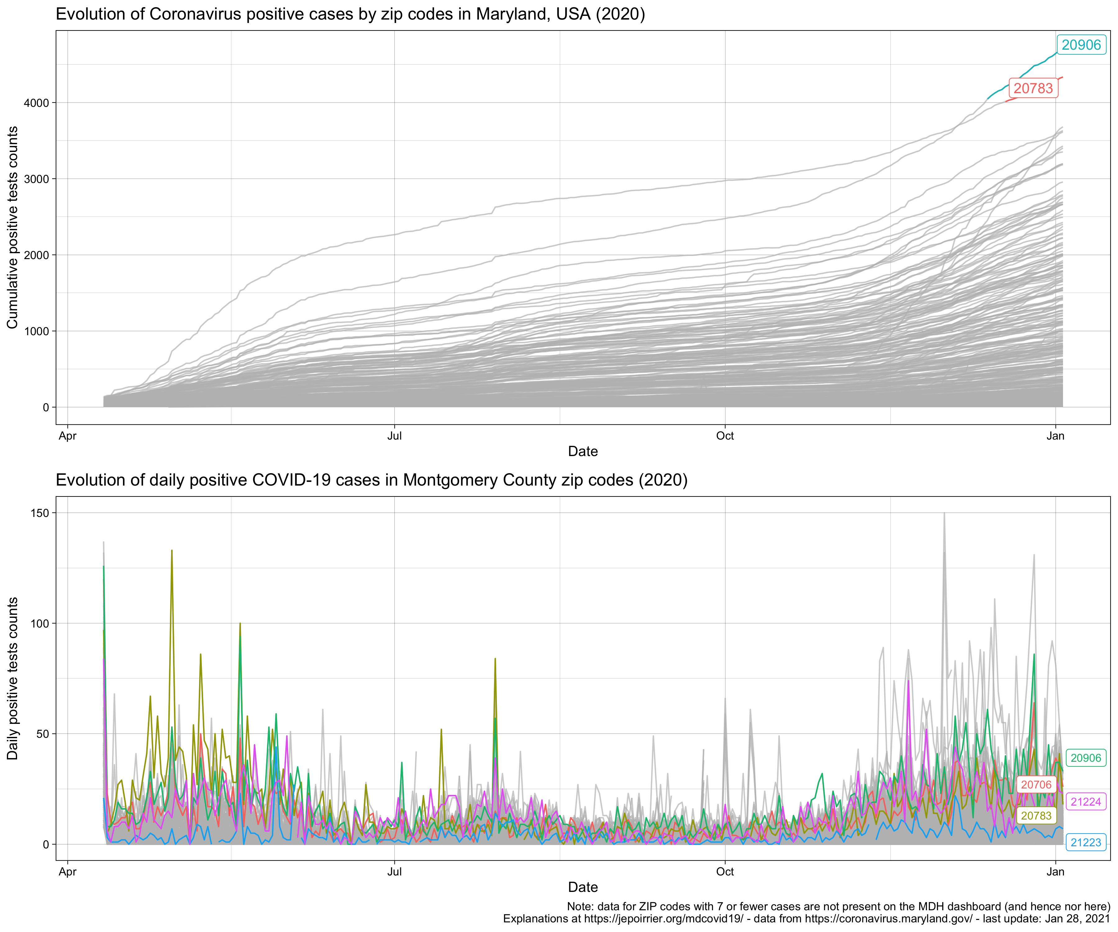
A publicly-available MD COVID-19 metrics that I didn’t investigate much is cases per ZIP code. I created a dashboard where you can highlight one zip code at a time. Tyler Fogarty built a cool Treemap Explorer. Silver Chips has a nice heatmap of all zip codes as part of their extensive dashboard (a bit like the MDH dashboard). How can we make sense of all this?
(you may need to click on the image to see better)
Today (May 30, 2020), 4 ZIP codes have more than 1,000 cumulative cases: 2 in Prince George’s county (20783, Hyattsville, and 20706, Lanham) and 2 in Montgomery county (20906 and 20902, both in Silver Spring). But among the ZIP codes with the most recent daily positive cases, 21223 and 21224 are also in the top 5, both in Baltimore City. All these ZIP codes are in counties that are closed or partially opened, highlighting the need for these regions to remain vigilant and enforce stay at home, wearing a mask and social distancing (at least).
I’m looking at protests in Baltimore and I can’t imagine how detrimental the spread of coronavirus will be and will add to the other issues. Here is what Prof. Murray advise to protect protested (on top of any other precautions):
Harm reduction for protests in a pandemic: •wear your mask + eye protection + heat resistant gloves •yelling can spread droplets, choose signs, drums, or similar noise makers •stick with a buddy group to keep your unknown contacts low •carry water + hand sanitizer + bandages
Since my previous post (May 21), tests were broadened in some drive-thru locations for anyone to be tested (5/19 actually) and new testing sites were opened (map of sites here) and we had the Memorial Day weekend (5/25). On May 28, Gov. Hogan mentioned that “hospitalizations, ICUs, and testing positivity rates are the key metrics in determining Maryland’s road to recovery”. On May 27, Gov. Hogan announced that further reopening were taking place (outdoor dining, some outdoor activities for kids allowed, …) but still within Stage 1 (I called it “Stage 1b”).
In terms of hospitalizations, the graph above shows the number of patients currently hospitalized (green line). Since beginning of May, hospitalizations decreased, especially thanks to the decrease of patients in acute care (red line). Patients in ICU (Intensive Care Unit) decreased much slowly. This is probably due the severity of these patients, making them stay for a long time and released from ICU at a slower rate than patients in other departments. And the graph also shows that Maryland never needed the additional hospital beds prepared for a worst scenario.
The third key metric the Governor is looking at is testing positivity rate. The chart above represents, on top, the total number of tests reported on the MD Health Department dashboard (adding positive and negative test results). We learned that the Governor is actually not looking at the same positivity rate than the one we can compute from the dashboard:
The dashboard report unique positive and negative tests. If someone was tested twice or more with the same result, it would have been reported only once. If the test result would change, it would have been reported once in each category.
The Governor is looking at all positive and negative tests. If someone was tested twice or more, independently of the result, all tests results would have been counted here.
This difference probably explain why we see a daily number lower than 10,000, despite 500,000+ tests received by Governor from South Korea. But we can’t really say in which direction this difference would drive the testing positivity rate. If more positive tests were under-counted (i.e. counted once instead of the several times they were performed/received), the Governor would have seen a higher positivity rate than on the dashboard. More likely, if more negative tests were under-counted (i.e. negative people tested several times, but counted once), the Governor would have seen a lower positivity rate than on the dashboard. This last option would explain why the Governor decided to go on Stage 1 sooner than expected by just watching the dashboard.
Technically, as a side note, the data for the testing positivity rate that the Governor is looking at is not publicly shared. There is just a PDF with graphs. This difference in what is reported may also explain why, since test broadening (5/19), there was 5 days of ups and downs after which the rate stayed at about 10%.
At the level of the State of Maryland, we are not yet looking at the full picture: the last element (that doesn’t seem to be part of the key metrics) is deaths. So far (since mid-March), there have been 2,390 deaths due to COVID-19 in Maryland with a majority of them occurring in congregated facilities (nursing homes, prisons, etc.). With an about-weekly pattern (see below), the daily number of confirmed deaths also seem to decrease (although much slower than hospitalizations or positivity rate).
But if things seem good at the State level, the decision to reopen Maryland came with the empowerment of Counties (the government level below State) to follow or not the reopening. As noted before, if most counties followed the State in Stage 1, some counties did not (some like Prince Georges and Montgomery even remained “closed”). There is no straightforward way to follow hospitalizations in counties (they are not reported on the MD dashboard). But we can follow deaths in counties in the graph below. There it is a bit surprising to see that counties that re-opened, the % of deaths compared to May 15 is actually increasing (i.e. more daily deaths in counties that re-opened) (see blue dots and average in the blue line). On the other hand, % of daily deaths seems to decrease in counties that partially reopened or remained closed. But one should also note the huge confidence intervals around these averages.
Finally, about counties, the situation is about to get messier: since yesterday, Anne Arundel, Baltimore City and Howard counties further allowed some outdoor activities; and starting June 1st, Montgomery and Prince George’s counties, initially closed, will also start to allow some outdoor activities.
So, will it be the end of Stage 1 in Maryland? I think so. Most metrics that are publicly available are pointing in the right direction and, provided there is no outbreak in “pneumonia” like in California, I could see a cautious switch to Stage 2 in the coming days. Gov. Hogan tweeted that he could see Stage 2 during the first week of June.
In my previous post, I was wondering if Maryland was ready to reopen, ready to enter Stage 1 of COVID-19 recovery. I also mentioned, in the end, that if Gov. Hogan announced the reopening of Maryland, he also gave counties the power to “fully” open, to be partially open or even to remain closed. You can see more info about Maryland Strong: Roadmap to Recovery: there is a map of what Counties decided.
Here is a first attempt to look at the fate of the different counties. My idea here is to set the number of cases in all counties on May 14, 2020 (start date of Stage 1) to 100% and see how counties evolve in terms of number of new daily cases.
On top of the figure below, I represent the cumulative, 7-day average (*) daily new COVID-19-confirmed cases in the different counties of Maryland. The chart at the bottom assign the number of daily cases on May 14, 2020 to 100% for each state and follow the % evolution over the next day. In this chart, the blue lines represents counties that follow Stage 1 (e.g. Garrett or Ken), the green line represents counties that partially follow Stage 1 (e.g. Anne Arundel or Frederick) and the red line represents counties that remain “closed” (Baltimore City, Charles, Prince Georges and Montgomery). The counties that remain closed are the ones that have the most cases and deaths.
(static chart updated on May 31, 2020)
I must say that 6 days after Stage 1 (May 20), there is no clear trend. First, it’s normal because any downward or upward trend in number of cases will take a few day to appear (transmission or absence of transmission, incubation, decision to consult and tests, and lag in test reporting). It’s too early to see something. We will also see a confounding factor with the recent decision by the Governor to allow testing of people who do not present any symptoms (in some testing sites). Nevertheless, I was expecting to “see something”; here it just seems it’s the same.
But another reason for “not seeing anything” might be that the cases are not a relevant metric. We can already see that it is fluctuating widely every day. There are even days when less cases were reported than the day before (it might have been a data entry error on my side). The only other parameter that the MDH displays in its dashboard is the number of deaths by counties. I plotted this and it’s the same bizarre chart. How to improve this? Any idea? Don’t hesitate to comment below or to send me an email.
Update on May 24, 2020: I updated the chart of cases after Stage 1 (see above). Currently the confidence intervals (the shades) are so overlapping that differences that we could see are meaningless. Cases may not be a good metric.
I also created the same chart for deaths (see below). Here we see clearly a positive picture: in all counties that are partially open or closed, the mean number of deaths is decreasing. Note however that we are only 10 days (today is 5/24) from May 15 and this may just be a trend that existed before and not something new due to the decision to remain (partially) closed.
(static chart updated on May 31, 2020)
In counties that are in Stage 1, the mean number of deaths is actually increasing. The same comment applies: it may be too early to actually see an impact of the opening (especially deaths could be far from the case detection). Besides, the confidence intervals (the blue shades) are very wide. Hopefully things may become clearer in a few days (and for the best, given we are talking about a disease and people dying from it).
Following up on my two previous posts (here and here), I am writing a third post on COVID-19 in Maryland because I believe we enter a new phase.
Before continuing, please note that the same disclaimer as in my previous post applies here (in short: read the CDC and MDH websites for official information).
In the first phase, the importance was to detect and make sure COVID-19 patients were treated (also: make sure not to overwhelm the healthcare system, flatten the curve, lower the baseline, & stay at home!). My two previous posts were following these efforts, thanks to daily data released by the Maryland Department of Health (MDH) on its dashboard. My second post will still be updated with the latest data from there, go read it!
This first phase is not over yet but we started to see metrics states and governments will consider in order to “reopen”. Hence this second phase is adding specifically these metrics, again thanks to the Maryland Department of Health (MDH) on its dashboard (and probably other data sources that will be linked as I use them).
In Maryland, the Governor issues a Roadmap to Recovery on April 24, 2020. In this (easy to read) document, a lot of aspects are introduced and here is what will be tracked and for how long:
“state public health officials should review the numbers of new COVID-19 daily case counts, hospitalizations, and deaths carefully” and “The results of reopening decisions will take 2 to 3 weeks to be reflected in those numbers.“
“the White House’s gating guidelines state that a 14-day downward trajectory of benchmark metrics – or at least a plateauing of rates – is required before recovery steps can begin, and before each additional recovery step can move forward“
That’s why Governor Larry Hogan tweeted his focus on April 24:
The key numbers we are most focused on are on the rate of hospitalizations and the number of patients admitted to ICU. If these numbers continue to plateau, Maryland could be ready to begin the recovery in early May. This data is updated daily at https://t.co/Shy9A0czWz.
States should consider initiating the reopening process when (1) the number of new cases has declined for at least 14 days; (2) rapid diagnostic testing capacity is sufficient to test, at minimum, all people with COVID-19 symptoms, including mild cases, as well as close contacts and those in essential roles; (3) the healthcare system is able to safely care for all patients, including providing appropriate personal protective equipment for healthcare workers; and (4) there is sufficient public health capacity to conduct contact tracing for all new cases and their close contacts
On April 27, 2020, this is what we currently have … On the first chart, the number of positive tests is increasing (probably due to the increase of testing done), hospitalizations and deaths are slowly going up, overall. On the third chart, it seems the number of people in ICU is plateauing. Below these charts, I’ll post the updated charts as days are passing …
Updated charts (look at the date at the bottom right):
Following up on my previous post, here are updated trends in Coronavirus cases in Maryland (USA), the state I live in. I am writing a second post because the Maryland Department of Health (MDH) updated its dashboard with way more data than before (more on this below). Before continuing, please note that the same disclaimer as in my previous post applies here (in short: read the CDC and MDH websites for official information).
The new type of data that the MDH released is: the total number of hospitalizations and releases, more granular age categories and the number of cases by sex. And on March 28, we saw the return of the number of negative tests!
Here are the plots that I will try to update daily (check the bottom right of charts to see when it was last updated):
On March 28, MDH reintroduced the total number of negative cases (11,516). Having the total number of cases done is important because it allows to understand better the disease dynamic than just the number of positive cases …
Suppose you have 992 positive cases (like on March 28) but no total number of cases tested. It’s a lot – or maybe it’s not much, who knows? It depends on how many were tested. Up to that day, imagine that only 1,000 people were tested – this becomes a lot of positive cases because 99% of people tested turned out to be positive. Now, MDH said they actually tested 12,508 people – this means that 7.9% of people tested turn out to be positive. Given the few tests available, testing is reserved for people who are believed to be at risk (more or less ; read the MDH testing FAQ here). So less than 10% of people tested (thought to be at risk) turn out to be actually infected. That’s good!
End of March, the MDH also released more granular data on the age categories of the people tested positive. Age groups 30-39 and 40-49 have the most cases. Therefore, mostly adults are impacted, probably among people working (who are not or can’t do social distancing). Given hospitalization and death rates are lower in these age groups than in older adults (most hospitalizations, ICU admissions and deaths are occurred among adults aged ≥65 years with the highest percentage of severe outcomes among persons aged ≥85 years, according to the March 26 CDC paper), we’ll hopefully see less dreadful cases in adults than in older adults.
On March 30, the MD governor decided that everyone should stay at home, except for food and medicine shopping. The recent days see an increase in cases but especially an increase of deaths, due to an outbreak in a nursing home.
We entered April and the number of cases continued to increases. On April 3rd, the MDH page on coronavirus got enriched with a very nice dashboard with a lot of data:
On April 5, we could see that all numbers are continuing to climb. Frederick County and Baltimore County are shooting up (with Frederick County now being the first county in number of cases). I’ve added a chart with the daily number of cases and it’s hard to grasp that nearly 500 people received a positive COVID-19 test result today (in 1 day) (that’s about an entire elementary school, except the age category doesn’t match)! And we are not even in a state where the number of cases explode … We also see that all adults [30-59] have most of the cases, less for older adults and even less for children and teenagers.
On April 7, Maryland continues to see an increase in all cases, hospitalizations, in all counties and all age groups. Since yesterday, we have more than 1,000 hospitalizations. We went about 100 deaths today. And, for the first time, Prince George’s County has more than 1,000 positive cases of COVID-19 (+104 from yesterday).
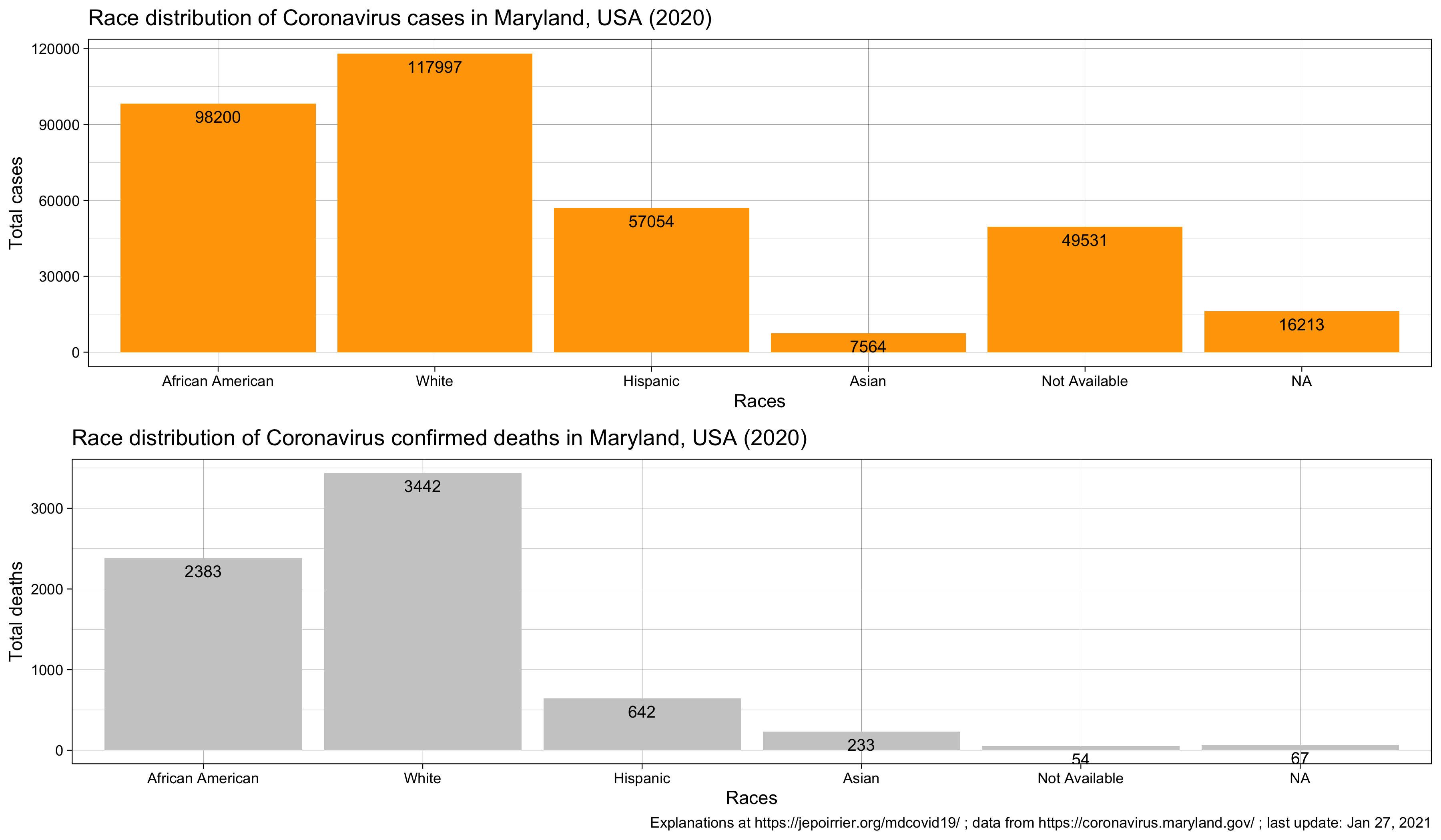
On April 9, Maryland continues to see an increase in all cases, hospitalizations, in all counties and all age groups. Today, the MDH started to display the number of cases and number of deaths by race/ethnicity. The African-American community has the most number of cases, followed by the White community – but we shouldn’t forget about the “Other” and “Data Not Available” categories. On top, as usual, although it’s unfortunately not surprising that the African-American community is harshly impacted, one should keep in mind that without the total number of tests done by community, there is little we can say. Given the percentage of positive tests is about 15% overall, one should see if this percentage is similar by community or not.
As the number of cases continues to increase and the data made available by the Maryland Department of Health also increases, I went back to the code and changed a few things (mainly to help maintain it on a daily basis). One choice I made is kind of breaking things: from now on, the trend by age group will not start at the same date as all charts. That’s because MDH changed their reporting of age structure on March 27. I no longer report the previous data (for age groups). I also added the trends of number of deaths by county and the gender distribution.
On April 12, the total number of positive cases in Prince George’s County is now above 2,000. I added the number of hospitalized. This is approximately the number of patients in hospital each day (equation: total # hospitalized – total # released) as a proxy for the number of patients currently sick (this is not perfect because of the lag in reporting, the data not available since the beginning, etc.). MDH also started to report the # of positive tests by zip code (this is very labor-intensive to transcribe these, I won’t do any chart with this data unless there is an easy way to download the data).
On April 13, cases continued to increase, with a small dip (maybe due to the weekend). Dorchester and St-Mary’s counties reported their first death due to COVID-19. On the good news side, the number of new patients released today (+147) was higher than the number of new patients hospitalized (+115). This reduced a little bit the number of patients currently hospitalized.
On April 14, I found a way to get data by ZIP code without too much hassle. I added the data to the Github repository and added the chart above. Any idea to improve the chart is welcome! (Straightforward idea: displaying ZIP codes as a map – but then we lose the temporal aspect)
On April 15, MDH added probable deaths. According to the CDC, death due to COVID-19 with certainty should use ICD-10 code U07.1. Where the cause of death is established with a clinical or epidemiological diagnostic (but with inconclusive or without lab results), the ICD-10 code U07.2 is proposed. There is a 3rd level of uncertainty, when the cause of death is “probable” or “likely” COVID-19. There, this guidance doesn’t specify what to do (it doesn’t mean that future guidance wouldn’t refine the algorithm). I assumed here that MDH “probable deaths” are coded with U07.2. Actually, it’s easier than that: Kata D. Hall mentioned in a tweet that a “death is classified as probable if the person’s death certificate lists #COVID19 as the cause of death, but it has not yet been confirmed by a laboratory test“. In total, today, probable deaths due to COVID-19 represents 18.3% of deaths due with certainty to COVID-19.
This had implications for the death count by county. Confirmed deaths diminished in some counties (e.g. Prince George’s: -7, Montgomery: -10, Baltimore County: -14) while the number of “probable” deaths in most counties doesn’t counterbalance these loss (e.g. Prince George’s: 11, Montgomery: 14, Baltimore County: 5). This is because new deaths occurred and a new category appeared: Data Not Available (i.e. deaths for which we don’t know the county, strange).
On April 15, we also see the cumulative number of positive cases to be over 10,000 for the first time (10,032). It took 38 days to reach that number. MDH also started to report cases and deaths in the Hispanic community. One can see they were reported in the “Other” community before.
On April 16, cases and deaths are still up. Montgomery County is now over 2,000 confirmed cases. Following this article in NPR (The New Coronavirus Appears To Take A Greater Toll On Men Than On Women), I was interested to see what we could see in Maryland. We have more positive cases in women than in men; that would go in the same direction as in the article: if women seek more testing than men (something we can’t see with MDH data), it’s normal more women would turn positive than men. What the article didn’t show (and what we can see at least in Maryland) is that, of all positive tests, men seem to die in greater number (4.1% instead of 3.2%) – see table below. Note that it can be due to a higher risk of dying for men and/or simply due to the lower number of tests done in men (increasing the proportion of more urgent cases).
On April 17, we reached a total of more than 50,000 negative cases, more than 11,000 positive cases, more than 400 deaths and no new patients released. Not a good day. I stop reporting the negative tests on the charts with cases in order to better look at the cases. Negative tests are indirectly on the % of positive tests.
On April 18, all numbers are still going up. However, even if testing is progressing (but not accelerating yet), the percentage of positive cases seems to have difficulties going above 18-19% of all tests.
On April 19, numbers are still going up. At the bottom of the graph, today see more 30-39 years old dead due to COVID-19 than 40-49 years old (2 more) although this age category “benefited” from the inclusion of “age not available (DnA below). I don’t know if it’s a temporary glitch or an actual trend? Also, there seems to be a cycle of ~6 days where the daily approximate # of COVID-19 patients remaining in hospital decreases (less hospitalization and/or more releases). But it’s maybe an effect of the weekend?
On April 20, Maryland Governor Hogan announced he procured 500,000 COVID-19 tests from South Korea. Hopefully this will increase the testing capabilities in Maryland. All data still going up.
On April 21, MDH released current and past data on the number of patients daily in hospital and broken down by acute care department and ICU. I therefore removed the previous way to compute this data as it’s not useful anymore (and I overestimated this number in recent days).
On April 22, the number of total positive ever done in MD was above 60,000 (but still no drastic improvement due to the 500k tests delivered last weekend). And we have now more than 600 deaths. Baltimore County has now more than 2,000 cases since the beginning of the pandemic. And Montgomery and Prince George’s counties have both the same number of deaths (58). The number of confirmed deaths in the 80+ age group is growing fast while we still don’t see any deaths below 20 years old (that’s great!). Also, MDH played a bit with past hospitalization data on the dashboard. Thanks to Tyler Fogarty for spotting it and correcting it directly in the GitHub repo (no need to check the dashboard and re-copy past data :-))!
On April 23, cases continues to accrue and no sign yet that the tests ordered by Gov. Logan from South Korea are impacting results. However, if hospitalization and discharge procedures didn’t change, we can see a second day of decline in the number of people in hospital. Also: it’s been there since a few days now, the zip code 20783 (Hyattsville, MD: NE of Washington DC) is surging in number of cases and overtook 21215 (Baltimore, MD: MW region) today (309 cases vs. 293).
On April 26, we see the trend in testing increasing again (+7,542, we are now close to 100,000 tests since the beginning of this count). Since the last 24 hours, we saw a huge increase of negative reports and a decrease of negative reports, bringing the % of positive test at 19.22% of all tests. However, the acute care beds were increasing (+63 in the last 24h) and therefore the total number of beds occupied today too. I added the proportion of positive and negative cases and it seems that, on a daily basis, it slowly decreases.