Month: July 2020

What is the COVID-19 positivity rate in Maryland?

Every day, Governor Hogan and members of his team are communicating news on the COVID-19 situation in Maryland via Twitter (and other media): @GovLarryHogan, @riccimike, @katadhall, … (and of course: @MDHealthDept too!). A number of data enthusiasts are also parsing the MD Department of Health data: @TylerFogarty7, @MikeBReporter, @JauquetW, @PrayagGordy, … and of course: @jepoirrier) … And this is only on Twitter!

But also every day, there is one thing that constantly changes: how everyone is calculating the COVID-19 positivity rate. Today (July 26), for instance, the different daily positivity rates announced are: 3.77% (Hogan), 4.47% (Hogan again in the same tweet, Hall, Ricci, MD Health Department, Fogarty) and ~6% (for me, the exact number behind the ~ is 6.14%). This doesn’t show the 7-days (or n-days) averages and other measures. And this is only on Twitter.

Why are these numbers different? Which one is correct?

First, let me get rid of the second question: all of them are mathematically correct. What value you give to them is highly depending on what you are looking at or looking for.

So how are these numbers different? Let’s calculate all of them … Today, the Maryland Department of Health COVID-19 dashboard indicates:

Screenshot of part of the MDHealthDept COVI-19 dashboard on July 25, 2020

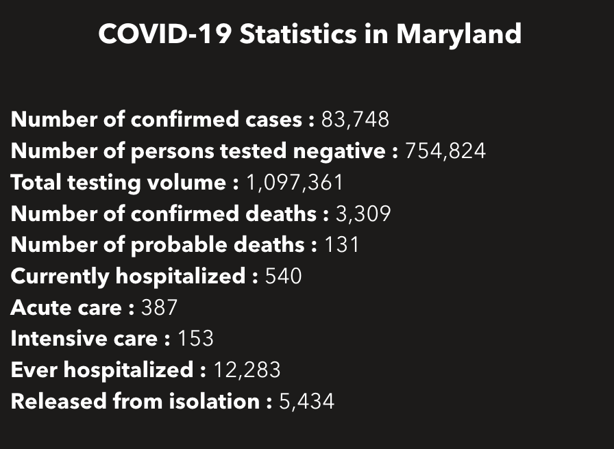
This gives a total of 838,572 cumulative unique tests (# confirmed cases + # persons tested negative) since the beginning of the pandemic. And it gives an overall unique positivity rate of 10.06% (# unique confirmed cases / # unique total). I added “unique” as all these numbers are only counting each person once per test (if someone is tested negative several times, he/she will show up only for 1 negative test). As shown in the chart below, this overall unique positivity rate is growing up fast when cases are increasing but is very slow to go down when cases are diminishing. In consequence, this overall positivity rate will reach 0% in a very, very distant future (almost never will as we will always have cases from the beginning).

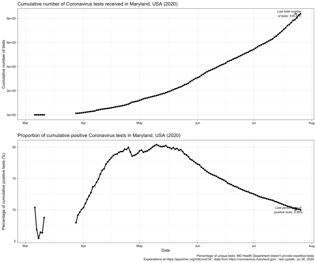
Now we may be interested in the total testing volume (1,097,361 today): this is the total of all tests, whether results are always the same or different for the same person. Imagine a doctor being tested every week for COVID-19; for 3 weeks, she is negative (= 1 unique negative test but 3 negative tests in total) until she is found positive on week 4 (= 1 unique positive test = 1 positive test in total); after 2 weeks in quarantine at home, she is again tested negative before returning to work (= 1 unique negative test but 1 positive and 4 negative tests in total). The total testing volume is simply the addition of all tests ever done in Maryland. If you divide the # of unique confirmed cases by the total testing volume, you have an overall positivity rate of 7.64%. I personally don’t like this metric because it mixes unique positive cases with repetitive total cases. As seen in the plausible example above, the total number of unique positive tests and the total number of all positive tests is probably very close (unless positive people are tested positive several times) and it could give a good estimate of the positivity rate.

But to create even more confusion, positive cases are reported from ESSENCE (Electronic Surveillance System for the Early Notification of Community-based Epidemics, click on Biosurveillance here; they write weekly reports that are a trove of information – this may be for a later post). And negative cases are reported from NEDSS (National Electronic Disease Surveillance System, also from the CDC). And the total testing volume is given from all lab results transmitted electronically to the state. It is clearly stated that all results transmitted non-electronically are not taken into account. Having 3 different sources, counting cases differently, doesn’t help reporting – but this highlight the difficulty to present a comprehensive figure. If we plot them all on the same figure, this is what it gives:

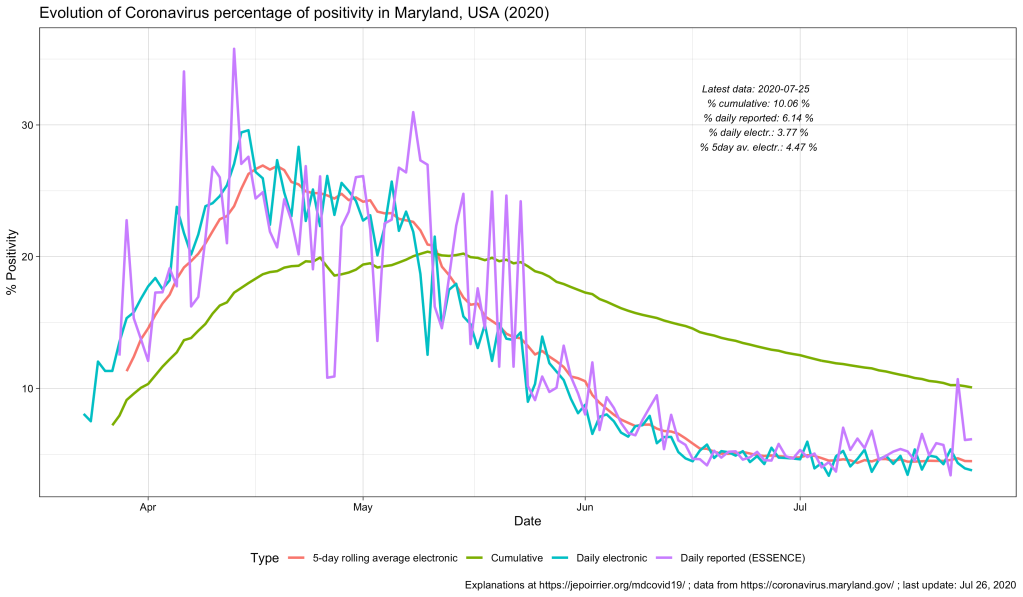
As discussed above, the % positive from the cumulative count (green line) will always be high and go down slowly. The % positive of daily reported (violet line) is fluctuating a lot and seems to be often higher than the % positive of daily reported electronically (blue line). This high level of fluctuation is the reason why the MD Health Department has a 5-days average of the % positive of daily reported electronically (red line).

Understanding the positivity rate is important because it gives an indication of the severity of the disease. In this respect, we see that Maryland did well to reduce the severity of this disease, so far, with a positivity rate going down since early May. But the positivity rate can also be read as an indicator that the state is doing relatively good on testing (usually, a high positivity rate is associated with too few testing, only testing the most severe cases). But positivity rate can be influenced by many factors that cannot be understood from these graphs only … One of these factors is the test selection: now that Maryland allows anyone to be tested, one could reasonably thing that the samples tested are more representative of the disease in the state than when only a very restricted set of patients could have been tested (before May 19, 2020). Another key parameter is how long testing takes before giving results. All the numbers above are for when tests results were reported. When these tests were performed is not disclosed (there are discussions online that tests results take several days to several weeks to arrive – if this is true, the % positive we see now is merely a photo of what happened mid-July and not now or last week). And to add to the confusion, I’m sure tests results from different labs are reported at different speed.

All in all, data we see here is a fuzzy picture of what happened in a relatively close past. If figures go down, fine. If they tend to go up, we’ll have to be careful that we are not further up than estimated here.

Better metrics for the severity of this COVID-19 pandemic may be deaths or intensive care unit admissions. I briefly wrote about COVID-19 deaths in Maryland related to counties, to races and inequalities, to age or to gender. It’s maybe time to look at ICU in a future post …

To be continued …

As usual, you’ll find other graphs on my page about COVID-19 in Maryland (and figures above are updated with new data as they appear) and the data, code and figures are on Github (including these ones).

Gender of COVID-19 cases and deaths in Maryland

After my previous posts about age of COVID-19 cases and deaths in Maryland, it was logical that I write about the gender of these cases and deaths. Rest assured: this time, it will be much shorter 😉

Indeed, in a nutshell, in Maryland (like in the rest of the world), women are more impacted than men by the disease. But men are dying of the disease a little bit more than women.

Note: this post was updated on July 15, 2020, to fix an error in my code!

Now for the details …

In terms of positive COVID-19 tests / cases, the difference between men and women started early in April, with the number of positive tests or cases in women increasing faster than men over time. Today (July 15, 2020), Maryland counted a cumulative 39k positive cases for women and a cumulative 35.9k positive cases for men. The number of new cases in men and women in Maryland follows (of course) the trend in new cases, with peaks in May, a decrease until now and a fear for new increase of cases now (see bottom graph, below).

Even if we take into account the number of cases relative to the population of each gender, because there is approximately the same number of men and women in Maryland (2.9 mio men, 3.1 mio women, from the MD department of Planning), women always saw more cases than men (even if by just a little bit). Today, here is the data (also see graph below):

Cumulative COVID-19 cases / 100,000 pop.FemaleMale
July 15, 20201,230.81,211.3

In terms of deaths, we see the opposite trend: since the beginning of data reporting, there were always more men who died of COVID-19 than women. On a daily basis, it’s less clear (and since I’m not smoothing nor averaging anything, it’s a bit jagged) but the overall result remains the same.

Even when we consider deaths relative to the respective populations, men die in larger numbers to their population (than women) and this is consistently the case since the beginning of data availability (see also chart below):

Cumulative deaths per 100,000 pop.FemaleMale
July 15, 202049.654.8

These observations were already widely shared, for the general (i.e. non-MD) population, in the media. There could several factors to explain that more women are tested positive than men: men could be less enclined to be tested than women, women could be more concerned about their health than men (seeking more testing resulting in discovering more positive cases), … And there are two main hypotheses to explain that more men are dying of COVID-19 than women: women tend to have a stronger immune system than men, there are also “gender-based lifestyle choices” (e.g. more men are smoking than women, and smoking is, directly or indirectly, affecting the predisposition to complications due to COVID-19), … So, contrary to the perceived lack of manliness some men express about the mask, men should have even more reason to wear a mask, just to protect them (and others) from dying.

To be continued …

As usual, you’ll find other graphs on my page about COVID-19 in Maryland (and figures above are updated with new data as they appear) and the data, code and figures are on Github (including these ones).

P.S. This post was amended a after its publication, thanks to a remark by W Jauquet on Twitter: the calculation for the relative number of cases and deaths was wrong. The code and text above were corrected to reflect that.

Age of COVID-19 deaths in Maryland

After my previous post on the age of COVID-19 cases in Maryland, it was logical that I write about the age of COVID-19 deaths in Maryland. So far, media and State Departments of Health all agreed that the older someone is, the more risk this person has to die from coronavirus.

So far, this is unfortunately also true in Maryland. In the graph below, we clearly see that people 50-59 years old have more than 250 deaths, people 60-69 have more than 500 deaths, people 70-79 have more than 750 deaths and people 80+ have nearly … 1,5000 deaths! The graph at the bottom also clearly shows that people in age categories 60 and above provide most of the new daily deaths due to COVID-19 (even if we came back down from a peak at about 40 deaths in 80+ at the end of April).

The simpler section at the latest date for which death data by age is available (i.e. today, July 9th, 2020) also shows this curve highly skewed towards older age groups (at the bottom, compare that to cumulative cases, on top):

The two graphs below confirm that people in old age are at much higher risk of death due to COVID-19. On top, if we report the deaths in each age group by the population they actually are in Maryland, we also see that deaths in 80+ disproportionaly affect this age group, reaching a COVID-19-specific mortality rate of 629 per 100,000 pop.!!! The table under the graph gives all the data points.

And when we look at it to see the relative importance of each age groups compared to the total number of cases, we see again that people aged 80+ have 46% of all deaths, followed by people 70-79 (25%) and people 60-69 (16%).

Age group (years old)COVID-19-specific mortality rate (per 100,000 pop.)
0-90
10-190.1
20-292.2
30-394.9
40-4913.1
50-5928.8
60-6970.8
70-79180.1
80+629.8
COVID-19-specific mortality rate, by age group, in Maryland, on July 9th, 2020

As opposed to cases by age, we don’t see here any shift in most affected age group: the older some is, the more risk of dying from COVID-19 exists (and part of the problem is the close living conditions in nursing homes). There aren’t 1,000 solutions to protect them: wear a mask and practice physical distancing, especially when there is a risk to meet elderly people and transmit the disease to them!

To be continued …

As usual, you’ll find other graphs on my page about COVID-19 in Maryland (and figures above are updated with new data as they appear) and the data, code and figures are on Github (including these ones).

Age of COVID-19 cases in Maryland

We recently heard in the US media that, if COVID-19 affected more the older population, beginning of 2020, the younger population was now more affected, especially young adults (various reasons were mentioned: the various academic breaks, being more active or “forced” to work, the sentiment of invincibility …). I wanted to see if one could see a similar trend in Maryland.

If you look at the section of the Maryland population by age (graph below), as of today (July 9, 2020), you see that cumulatively, people 30-39 have the majority of cases, followed by people aged 40-49, 50-59 and 20-29 years old. There are relatively few cases above 70 years old and fewer cases below 20 years old.

This snapshot doesn’t show a trend we indeed saw in the past few weeks. In the chart below, representing the cumulative cases by age categories, one can see a faster increase of cases in 20-29 years old (than the increase in, let’s say, 40-49 years old) – since mid-May. This fast increase is such that one could predict that 20-29 years old will soon have more cases than 40-49 years old and become the 3rd age group with most cases.

Two other age groups also saw their number of new cases accelerates, at a lower rate than 20-29 but still: children (both groups below 20 years old) seem to catch up with the older group (both group above 70 years old). This needs to be watched and, ideally, prevented!

Note the bottom graph shows the number of daily new cases. Although it’s messy, we can see that all age groups are now adding less cases than in May but the middle aged groups (20-59) sill add more cases every day than the younger (< 20) or older (> 70) ones. I could smooth it with a 7- or 14-days average but then we wouldn’t see new trends emerge.

The direct impact of COVID-19 cases on each age category can be better grasped in the next chart, where the evolution of cases is again displayed but this time relative to the respective population in each age category. These populations by age were found from a projection from 2018, for 2020 by the Maryland Department of Planning. This demographic spread is a bit odd because all age groups below 70 years old are between 700k and 800k (I would have expected more a bell/Gaussian distribution):

Age group (years old)Projected total population by 2020
0-9727,307
10-19778,417
20-29800,843
30-39844,607
40-49754,794
50-59851,548
60-69726,078
70-79427,998
80+230,216
Age pyramid of Maryland, projection from 2018 for the year 2020
From the Maryland Department of Planning, August 2018 / OpenData Maryland

In the top chart, below, one can see the evolution of cumulative cases relative to the total number of people (sick and healthy) in each age category (for instance: how many cases 70-79 years old relative to 100,000 individuals in this age category). Because of the relatively constant number of people in each age category (see table above), we find back approximately the same mix of curves. However, we should first note the high toll of people 80+ who have the highest number of cases per 100,000. We should also note the fast increase of the 20-29 years old population: they were just above the less than 20 years old in the beginning of the pandemic; they are now the 4th age group in relative cases. The table below indicates the relative cases for yesterday (July 8, 2020):

Age group (years old)Relative COVID-19 cases (cases / 100,000 pop.)
0-9299.6
10-19486.4
20-291,336.1
30-391,569.4
40-491,654.1
50-591,295.4
60-691,082.8
70-791,160.5
80+1,996.4
Cumulative number of COVID-19 cases relative to population, by age group, in Maryland, on July 8th, 2020.

Another way to look at it is to see the relative importance of each age groups compared to the total number of cases. This is done in the last chart, above. We can see that around mid-April, COVID-19 cases in adults 80+ “carved” their share of number of cases. Starting in May, the share of COVID-19 cases in children below 20 also started to increase (from 1.9% on March 29 to 8.5% on July 8). Despite this, 20-29 increased their share of cases (from 13.3% on March 29 to 15.1% on July 8); 30-39 also increased their share of cases (from 16.3% on March 29 to 18.7% on July 8).

All this indicates a shift in new cases, with more and more new cases being discovered in the young adult population. This can be due to a number of factors … The first one is probably that tests were not restricted (or became widely available, without restriction) mid-May: this would have allowed people younger to be tested and therefore would have increased their share of cases. Another parameter could be that younger adults are still in the workforce and therefore more exposed and more often exposed than older adults. A last parameter could also be that some younger adults may care less about their health, may be less willing to follow state and federal rules, may be composed of more Hispanics or African-Americans – two populations specifically at risk for COVID-19 … Nevertheless, this increase / these populations should be watched carefully and reminded that they are also at risk of COVID-19 (maybe less deaths – that’s for a follow-up post – but the disease itself and its long-term consequences).

To be continued …

As usual, you’ll find other graphs on my page about COVID-19 in Maryland (and figures above are updated with new data as they appear) and the data, code and figures are on Github (including these ones).