Category: Reading

Medicines coming soon at a printer near you!

The terminator may not come at any time soon but medicines should be coming soon at a printer near you …

Mid last year, Gartner mentionedmedical applications [of 3D printing] will have the biggest impact in the next two to five years“. With 3D printing you can already create a lot of physical artifacts and medical applications go from building medical equipments to prosthetic parts, but also blood vessels, bone, heart valve, cartilage, etc. Complete organs are not too far, with companies like Organovo already printing functional liver assays, prospects to restore a body by replacing or consolidating personalized parts seem interesting.

Gartner-hype-cycle-3d-printing

On the other side, restoring a body function by providing personalized molecules was a dream so far. Preventing body malfunction via similar systems is too.

Plan view of Cronin's robotic systemI recently watched and read about Lee Cronin’s laboratory work and these dreams may come true, one of these days. In a TEDxGateway video in 2013, Prof. Cronin explained briefly how he did it. Last December, they published their method with a basic application in Nature Communications. What I also liked is that, beyond the technical capabilities, this research is based on common components (right) and free software that are available for everyone. And Cronin also insisted on compatibility between “recipes” and the possibilities to exchange them as well as source code – one day, will their software be released on Github like some of their 3D models as STL files?

Cronin also talks about pharmaceutical companies releasing blueprints for drugs that could save plenty of lives in emerging economies, for instance. In my opinion, this is however where the technology goes much faster than the ideological framework we live in: pharma companies will not likely suddenly release recipes for drugs that bring them money (no for-profit company in any other sector would, by the way) and the regulatory framework for healthcare is far from ready to accommodate these advances.

Prevention could also benefit from these advances. Synthetic vaccines are in production since two decades at least. If safety is the first argument often put forward in their favor, rapid prototyping and versatile production could one day become possible. It seems it was already tested for flu vaccines. Now imagine to move the “engineering” part in a computer, sending the recipe for the best-adapted vaccine directly to “vaccine printers” in regions where health hazards are likely to occur or as early as they occur … We would also face many corporate and regulatory hurdles. But it wouldn’t be the first field where technology would push broader changes …

Will we see more babies named George in England and Wales?

A few days ago Prince William and Duchess Catherine of Cambridge gave birth to Prince George. Today at the office we were wondering if we will see more babies names George in UK. Very important question indeed!

So I went to the UK National Statistics website and looked for baby names in UK. Let’s focus on England and Wales only. There are two datasets for what we are looking for: one for the period 1904-1994 (by 10 years steps) and one for 2004 (if we want to be consistent with the 10 years step in the first dataset). I extracted the ranking relevant for us here: for babies called William, George (and Harry, William’s brother). The data is here.

If we plot these rankings we see for William that there could be a “Prince effect”. Indeed this name was less and less used in the 20th century (blue dots) until Prince William’s birth in 1982 (blue dotted line). Idem for the name Harry (green dots) that didn’t even made it into the top 100 in 1964, 1974 and 1984 ; but it reappeared at the 30th rank in 1994 (he was born in 1984, green dotted line).

Evolution of ranking of baby name popularity - William, Harry and GeorgeNow for the name George, it’s a bit different. The name was also going down the ranking until 1974 when it reached the 83rd rank. After that it went up again. So does it invalidate the “Prince effect” mentioned earlier? Maybe it’s more a “famous effect” since other famous Georges were famous (George Michael, George Clooney, George Best, George Weasley, … from Yahoo!). Maybe the appearance of television shows in colour (1966 for BBC) made this name popular? Do you see other reason? But even from the already high 17th in popularity now I still expect the name George to gain even more popularity.

Btw I discovered that The Guardian ran a similar story (excluding Harry however).

Any free solution for the demise of Google Reader?

Last week Google announced it will shut down its Reader service. It is a web-based RSS reader. It therefore allows to be kept updated of news from around the net in a central location. I liked the service for 3 reasons (on top of the fact it’s free, 0$, to use):

  1. It’s web-based, accessible from anywhere/everywhere with a simple browser;
  2. It’s text-based, you can quickly scan headlines and use the powerful search function from Google;
  3. It’s backed by an API so you can use it via different apps on different platforms and they all stay synchronised (the web/mobile version of Reader is not as efficient as the web/desktop version; hence the proliferation of apps using Reader as a backbone).

Of course it frustrated a lot of people, from scientists to consultants … to name a few only. People are looking for alternative (you can do a search on Google while the Search service is still working). Feedly is cited very often as the next best alternative. However its nice, graphical interface conflicts with my second reason to like Google Reader: it’s text-based. The Old Reader looks also interesting, it is text-based but no apps on different platforms yet. But both are also proprietary and can be turned off (or changed to a pay-for-use model) at any moment 😦

An interesting solution could be an Evernote RSS reader. Evernote has already a portfolio of application ranging from a note-taking software, screenshots, drawing, food, … They have a synchronisation process in place. Why not a RSS reader then?

Back to the main track … Fortunately – in a way – Google Takeout allows you to retrieve all your data from Reader, along with an OPML file containing all your subscriptions. You can feed this file in another reader and you can go forward. Starred items are also retrieved (but which reader can use them?). And if you are interested The Guardian has an interesting article about the average duration of Google free services (1459 days, see below) and other nice facts. I guess they will keep Search alive 😉

130325-Google_Keep_Guardian

But what can be done for free (as in free speech)? One of the solution is Owncloud (AGPL) and they recently released a RSS reader add-on. Another solution could be pyAggr3g470r, a news aggregator written in Python. And I was wondering why there isn’t just a simple API that would allow any kind of application to connect, update and display RSS feed. Something like the NewsCredNews API but free, simpler to use than Owncloud and with apps/website interface for mobile devices. And a poney with that, please.

Do you have any other solution?

Map of GAVI eligible countries in R

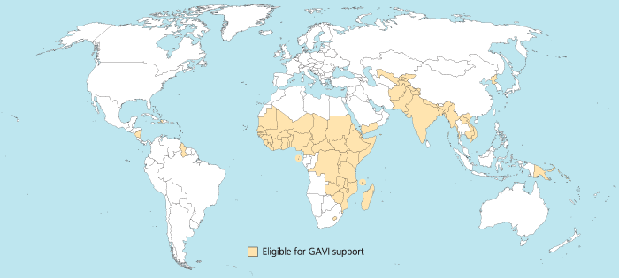
I was trying to reproduce the map of the GAVI Alliance eligible countries (btw I was surprised India is eligible – but that’s the beauty of relying on numbers only and not assumptions) in R. This is the original map (there are 57 countries eligible):

map_GAVI-eligible_countries_700x315_700

I started to use the R package rworldmap because it seemed the most appropriate for this task. Everything went fine. Most of the time was spent converting the list of countries from plain English to plain “ISO3” code as required (ISO3 is in fact ISO 3166-1 alpha-3). I took my source from Wikipedia.

Well, that was until joinCountryData2Map gave me this reply:

54 codes from your data successfully matched countries in the map
3 codes from your data failed to match with a country code in the map
189 codes from the map weren’t represented in your data

I should have better simply read the documentation: there is another small command that needs not to be overlooked, rwmGetISO3. What are the three codes that failed to match?

Although you can compare visually the map produced with the map above, R (and rworldmap) can indirectly give you the culprits:

tC2 = matrix(c("Afghanistan", "Bangladesh", "Benin", "Burkina Faso", "Burundi", "Cambodia", "Cameroon", "Central African Republic", "Chad", "Comoros", "Congo, Dem Republic of", "Côte d'Ivoire", "Djibouti", "Eritrea", "Ethiopia", "Gambia", "Ghana", "Guinea", "Guinea Bissau", "Haiti", "India", "Kenya", "Korea, DPR", "Kyrgyz Republic", "Lao PDR", "Lesotho", "Liberia", "Madagascar", "Malawi", "Mali", "Mauritania", "Mozambique", "Myanmar", "Nepal", "Nicaragua", "Niger", "Nigeria", "Pakistan", "Papua New Guinea", "Rwanda", "São Tomé e Príncipe", "Senegal", "Sierra Leone", "Solomon Islands", "Somalia", "Republic of Sudan", "South Sudan", "Tajikistan", "Tanzania", "Timor Leste", "Togo", "Uganda", "Uzbekistan", "Viet Nam", "Yemen", "Zambia", "Zimbabwe"), nrow=57, ncol=1)
apply(tC2, 1, rwmGetISO3)

In the results, some countries are actually given in a slightly different way by GAVI than in R. For instance “Congo, Dem Republic of” should be changed for rworldmap in “Democratic Republic of the Congo” (ISO3 code: COD). Or “Côte d’Ivoire” should be changed for rworldmap in “Ivory Coast” (ISO3 code: CIV). An interesting resource for country names recognised by rworld map is the UN Countries or areas, codes and abbreviations. Once you correct this, you can have your map of GAVI-eligible countries:

GAVIcountries-eligibles-map3-jepoirrier

And here is the code:

# Displays map of GAVI countries
library(rworldmap)
theCountries <- c("AFG", "BGD", "BEN", "BFA", "BDI", "KHM", "CMR", "CAF", "TCD", "COM", "COD", "CIV", "DJI", "ERI", "ETH", "GMB", "GHA", "GIN", "GNB", "HTI", "IND", "KEN", "PRK", "KGZ", "LAO", "LSO", "LBR", "MDG", "MWI", "MLI", "MRT", "MOZ", "MMR", "NPL", "NIC", "NER", "NGA", "PAK", "PNG", "RWA", "STP", "SEN", "SLE", "SLB", "SOM", "SDN", "SSD", "TJK", "TZA", "TLS", "TGO", "UGA", "UZB", "VNM", "YEM", "ZMB", "ZWE")
GaviEligibleDF <- data.frame(country = c("AFG", "BGD", "BEN", "BFA", "BDI", "KHM", "CMR", "CAF", "TCD", "COM", "COD", "CIV", "DJI", "ERI", "ETH", "GMB", "GHA", "GIN", "GNB", "HTI", "IND", "KEN", "PRK", "KGZ", "LAO", "LSO", "LBR", "MDG", "MWI", "MLI", "MRT", "MOZ", "MMR", "NPL", "NIC", "NER", "NGA", "PAK", "PNG", "RWA", "STP", "SEN", "SLE", "SLB", "SOM", "SDN", "SSD", "TJK", "TZA", "TLS", "TGO", "UGA", "UZB", "VNM", "YEM", "ZMB", "ZWE"),
GAVIeligible = c(1, 1, 1, 1, 1, 1, 1, 1, 1, 1, 1, 1, 1, 1, 1, 1, 1, 1, 1, 1, 1, 1, 1, 1, 1, 1, 1, 1, 1, 1, 1, 1, 1, 1, 1, 1, 1, 1, 1, 1, 1, 1, 1, 1, 1, 1, 1, 1, 1, 1, 1, 1, 1, 1, 1, 1, 1))
GAVIeligibleMap <- joinCountryData2Map(GaviEligibleDF, joinCode = "ISO3", nameJoinColumn = "country") mapCountryData(GAVIeligibleMap, nameColumnToPlot="GAVIeligible", catMethod = "categorical", missingCountryCol = gray(.8))

Android is catching up iOS

121221-android-mba-rWell, there is nothing new in this statement. The smartphone OS Android is catching up and even overtaking its rival iOS in many domains:

  • more activated products per day and per year in 2011,
  • more Samsung Galaxy S3 (running Android) sold in Q3 2012 than iPhone4 and 5S (running iOS),
  • more devices worldwide,
  • catching up Apple’s market share in tablets,

All this is summarised in an infographics MBA Online designed (the original address is here: http://www.mbaonline.com/android/click at your own risk). It is sweet and colorful, with lots of numbers and some references in the end. Unfortunately these references are embedded in the image so you cannot click on them if you ever want to read more info.

Also as I mentioned previously (for an infographics coming from a similar type of website), I didn’t like much the fact it was very, very long (see reduced copy on the right). It makes things easily read while scrolling down. But ymmv I would have like something a bit more different. For instance I would have seen this more as a succession of slides, a-la Pechakucha maybe (except there is a lot of text). But the restrictive license (CC-by-nc-nd) prohibits derivative works.

So I like my Android device. I like when people promote it, are proud that Android is a success and talk about it. And the web is full of these infographics: a similar story about taking over the world, the successive Android versions (again very long), tastes of Android users (versus iOS users’), a broader smartphone comparison (again very long), a Google search for it, … Choose the one you like!

Forget pills, here comes e-pills!

The US FDA recently approved Proteus Digital Health Ingestion Event Marker (IEM). Basically, it’s a pill with some electronics attached (very tiny electronics: around 0.5mm in diameter for a total weigth of 5mg, see picture below). Once activated the pill transmit a signal and, coupled with a detector, you know when the pill got into your body.

Edible sensor for electronically confirming adherence to oral medications.
Edible sensor for electronically co-encapsulated with a drug product using a sensor-enabled capsule carrier (from Au-Yeung et al. at Wireless Health 2010)

When you think of it, it seems very interesting. The direct potential application (Proteus is only making the IEM, not the pill itself on which the IEM is attached) is to monitor when a patient actually take her/his pills. Or for the patient, just to remember if the pill was taken already or not (you can also use boxes with specific places for each day). Some people see here a plot against human health in general – maybe. But as I use to say: watch the use, don’t punish the tools. The IEM could of course be used to ensure patient’s compliance and increase the surveillance. But on the other end, the IEM could also help decide if a properly taken medication (from “Big Pharma” or from “natural products”) is indeed efficacious.

Another direct application is the correct identification of pills before consumption. There are a lot of websites that will help us correctly identify pills found outside boxes at home (see here for instance). If you activate the IEM on a pill, the signal emitted can directly tell you which medication it is. Provided the signal emitted contains an unique signature.

And there I have some questions … Kit Yee Au-Yeung and her colleagues published an abstract (PDF) at Wireless Health 2010 about the technology. The detailed paper explains well some aspects of the IEM like the way the battery actually uses the patient’s body fluids to power a redox reaction (very simple – hence clever to use it here). But the paper doesn’t say the distance at which the signal can be recorded nor how this signal is encoded.

Antenna Antenna montaggio completo (amplificatore e elementi radianti)How far can you measure the signal from this IEM? The paper states that the “communication process remains entirely within the body; it is unnoticed by and not detectable beyond the patient consumer“. It goes into several measures during the reported clinical studies but does not mention how far the signal can be measured. In my opinion, the IEM signal cannot be detected from very far for various reasons: the statement copied above, the output of this type of redox reaction and size of substrate used and the way they define their scheduling adherence. In this definition, a “sensor-enabled medication was considered taken “on-time” when ingested within ± 1 hour and ± 2 hours of the specified time“. Since the IEM is activated as soon as in contact with body fluids and the sensor/detector is placed approximately next to the stomach, I guess the sensor only detects the IEM signal when the IEM actually reaches the stomach. I wonder if one would place the sensor just below the throat, will the time-to-detection be shortened?

COS6100A OSCILLOSCOPE 100MHZHow is the signal encoded? The paper reports an identification accuracy of 100%, meaning all detected sensors were correctly identified. It also reports a sensitivity of 97.7%, meaning the study did not detect the negative controls in 97.7% of cases of ingested negative controls. Good. Now what happens if you ingest several different medications at the same time? They will most probably reach the stomach at the same time too and their respective signals will be detected at the same time. The paper says that the sensor/detector “interprets the information from the edible sensor, identifies it as unique“. How? We don’t know. From previous experiment I know it is feasible to encode a somehow unique signal in 5mm of electronics. Up to how many different signals can be encoded (and decoded, given a weak signal)? This will give the maximum number of e-pills you can ingest at the same time.

Although the FDA only approved it for placebo pills so far, it is a very interesting first step towards the control/cure of chronic diseases, sometimes requiring to follow a long-term medication plan. Although the pill is kind of passive and the whole system (*) only measures when a pill is actually ingested, more active e-pills will come to market, for instance only releasing one of their drugs when receiving a signal or delivering a dose adapted to the environment in which they are. Later on you can imagine e-pills acting like Proteus (sic!) in the Fantastic Voyage

A video for the end? There is an official video on Vimeo but I like this one:

(*) the whole system involves a wearable sensor/detector/patch as well as a “social” application on smartphone. The sensor was already approved by the FDA a long time ago (under the name of “Raisin Personal Monitor”). From the official screenshot the app also reports activity (including sleep), heart beat, blood pressure, etc. (as many other apps around now). Could be cool to try this!

Photo credits: antenna picture by Giacomo Boschi on Flickr (CC-by) and oscilloscope signal by Mikael Alternark on Flickr (CC-by).

Effects of Tobacco on health – visualized

As you probably know I am interested in both diseases (and health in general) as well as visualization. Recently Online Nursing Programs (*) invited me to have a look at their latest infographics about the effects of tobacco on health (directly to figure).

Although numbers seem correct (references are at the bottom), although they intelligently re-use the presentation of some well-known tobacco companies, there is one thing that I don’t like that much: like this sentence, the figure is very, very long. You have to scroll many pages in order to see everything. It may look like a story but it is not presented as such (I mean: there are no clear marks of different steps in the story, except the three “chapters”). On the right is the complete figure in exactly 800 pixels of height – can you read something? GOOD.is solved this issue by using a Flash player that allows the viewer to woom in/out and go to different sections of the figure (see here for instance).

Now, about smoking … Smokers do what they want with their health. Of course, I criticise the physical dependency, the effects on social security and indirectly on everyone’s capacity to react to other health issues. And of course I hope that people could stop smoking. But in my opinion the most disgusting thing about tobacco is secondhand smoking (aka. passive smoking): the inhalation of smoke by persons other than the active smoker. This passive smoking is especially harmful in young children. The CDC estimated that it is responsible for an estimated 150,000–300,000 new cases of bronchitis and pneumonia annually, as well as approximately 7,500–15,000 hospitalizations annually in the United States – both in children below 18 months. And in adults, passive smoking increase the risk of heart disease and lung cancer by 20-30%. Without doing anything – just inhaling smoke from your neighbour.

So it was a very nice idea from them to draw people’s attention to these health issues. It could have been better if the figure would have been more “readable” IMHO.

(*) Unfortunately for them, “Online Nursing Programs” sounds like a website that will just ask for your credit card number although they publish nice infographics – like this other one about sanitation. The About page that doesn’t say who they are add to these doubts.

Created by Online Nursing Programs, license CC-…

World book and copyright day, 23 April

Today is World book and copyright day. UN mentions a lot about books and the diversity of values they bring along but very few words are written on copyright per se. It’s true that books are vectors of values and knowledge, depositories of the intangible heritage. But in a world progressively going towards digital books, it could be worth having a real debate about what type of knowledge we want to preserve for the next generations, in which formats, under what types of conditions.

I was in New York recently and I was happily surprised to see the number of people still reading something (real books but also magazines, e-books, and of course their e-mails). E-book readers are more and more common, especially in planes and other public transport. Every big book store on 5th Avenue has its own e-reader, even web-based book stores promote their own e-readers. Most if not all of those e-readers promote its own closed, freedom-depriving file format.

Bill Blass Public Catalog Room - NYPL

We’ve all in mind pictures of the Rose Main Reading Room of the NYPL Schwarzman Building, where the beautiful room is packed with people reading and their laptops. I was also surprised to see the amount of computers available in other rooms (like the Bill Blass Public Catalog Room above). Books – real ones, made of paper and cardboard – are consigned to the walls, very few people are actually browsing through them. We now look for books in electronic catalog ; these books are stored in more functional room for librarians to find them. We now expose our collection of books in “social bookshelves” like librarything.

It’s not a reaction of an old man (well, maybe …). It’s more that we should think about what we want to create and what we want to leave for the next generations. It’s good to have a business plan to allow customers to have the best possible experience while reading your e-books for the next 2 years ; it’s even better if you would allow the same customers to keep their library open, transparent and “sharable” with others. Gutenberg’s invention allowed books and knowledge to be widely shared ; don’t let the “digital revolution” take that freedom back!

Eat meat or not?

It all started with a strong statement in the LA Times:

If early humans had been vegans we might all still be living in caves.

It says nothing and everything at the same time … Not eating meat would have stopped our “evolution” from early humans? Not eating meat would make us dumber? Or does it have something else to do? It does.

The original article on PLoS ONE is in fact a study about the impact of carnivory on human development and evolution. And the method used is a model of weaning in Mammals (thus no intelligence test per se). Psouni and her colleagues showed that:

  • Brain mass is a better fundamental predictor of time to weaning than is female body mass (figure 2);
  • Limb biomechanics is a predictor of time to weaning (figure 3);
  • Dietary profile is a predictor of time to weaning (figure 4) and that
  • Time to weaning in humans is quantitatively predictable from a carnivorous diet (figure 5).

So eating meat made human women wean more rapidly than if we stayed vegetarian. Their model suggests that “the contribution of carnivory was to shorten the duration of lactation and suckling despite the overall prolongation of development associated with increased adult brain mass”. Nothing about intelligence thus.

However this paper came to my knowledge after OAD published a (quite long) infographics about the dangers of red meat (not meat in general). On the presentation-side, I’m not sure such long vertical banner is powerful enough: after some time you are tired to scroll down. On the content-side, it’s a well-known fact that red meat comes with a lot of healthy risks. On top of that, the infographics focuses a lot on the USA, one of the countries where the consumption of red meat is high. This reminded me a TV programme from Jamie Oliver where he showed how meat is processed in the USA …

It’s “good” to be reminded of all this only once you’ve come back from there …

Key messages? Always read the original paper (even diagonally it’s better than general press) and know what you eat!

Edited on May 12, 2013 to remove the link to the original infographics (as it was not present anymore).

About stacked bar graphs

This afternoon I received a bunch of data accompanied by stacked bar graphs for each dataset. For example, this one:

Stacked bar graph example

The chart shows the incidence of disease X in various age ranges. That incidence is split by 8 severity levels. The chart shows that the disease especially affects age ranges 4 and 5, at different severity levels. However I didn’t feel comfortable …

  • what are the different levels of severity in age ranges 1, 2 and 3?
  • how can we compare levels C, D and E in age ranges 4 and 5?
  • is there anywhere some severity A?
  • (it’s even worst when some age ranges don’t have any incidence at all: what is happening?)
  • etc.

I looked on the web but couldn’t find much information apart from the fact “The Economist says they’re so bad at conveying information, that they’re a great way to hide a bad number amongst good ones” (but are still using them in their graphic detail section) or “a stacked column chart with percentages should always extend to 100%” (this doesn’t really apply here). Then in a post on Junk Charts, someone mentioned Steven Few who would have said “not to use stacked bar charts because you cannot compare individual values very easily and as a rule [he] avoid[s] stacked bars with more than six or seven divisions”. And Steven Few also participated in his forum here.

This reminded me I read a book written by Steven Few, a few years ago: Information Dashboard Design (O’Reilly Media, 2006). Inside, on pages 135-136, one can read stacked bar graphs are the right choice only when you must display multiple instances of a whole and its parts, with emphasis primarily on the whole. And that this type of graph shouldn’t be used if the distribution changes must be shown more precisely.

If one wants to clearly display both the whole and its parts, Steven Few recommends to either use two graphs next to each other or a combination bar and line graph (with two quantitative scales).

As I’m not really interested in the whole but mainly in the parts and their relative distribution, I suggest another way to present the data. This isn’t really new. Actually everything was already in the table. You just format the table nicely and add some colour gradient. And voilà:

Simple table with data - instead of stacked bar graph

You still see where the incidence is the highest (in age ranges 4 and 5), what levels of severity are the most important (C, with lower but approximately similar levels of D, E and H). In addition to the graph above, one can notice there isn’t any severity levels A, B, F and G represented and we can quickly grasp the proportions between the different incidences.

Of course, if your criteria for “sexiness” is that there shouldn’t be any digit on your chart, then this chart is not sexy. But I find this presentation really more appealing and meaningful than the stacked bar graph. Isn’t it?