The Python script (in src/ in the MD-coronavirus repo on Github) just fills in the latest data for days where data is missing. On a side note, it also fix some basic issues like a reporting date in year “0200” (instead of “2020”). You can play with the fixed data file here.
To take the same example again, below is the graph of the number of cases in Sterling Care Frostburg Village according to the official data file (“GH” means “group housing”). Between mid-June and mid-September, there is no data point. Therefore, it’s impossible to calculate a cumulative number of cases in all congregate living facilities. You can see in the old post that the cumulative curve is actually going down after June.
On the fixed version below, you can see data points added between mid-June and mid-September:
Note also that the MDH could have reset the count of cases between periods of 14+ days without reporting. Fortunately, it didn’t do that and you can see the facility re-appears in the file, mid-September, with 11 cases (or 2 more than in June), instead of just 2 cases in residents.
This version now allows to correctly display the cumulative count of COVID-19 cases in congregate living facilities:
We can see that, during the first wave, in May 2020, the number of cases increased a lot, especially among residents of nursing homes. Then the curves increased at a slower pace. Since the beginning, nursing homes counted for the bulk of congregate living facilities cases. But the increase in cases happens in all facilities.
There are still some issues to be solved. For instance, some facilities seem coded under different names. Our example above is coded in 2 different ways (and I need time to go through the 200+ facilities in the list):
Sterling Care – Frostburg Village
Sterling Care Frostburg Village
For a human, they are clearly the same facility. For a computer script, it still needs to be told so. And talking about computer script, this one still needs to be cleaned …
In Wallonia (Southern part of Belgium), universities are already back to only giving online classes, schools will be closed two additional days after the Autumn holidays (so November 2-11), and secondary schools (12-18 years-old children) will be virtual for the 3 days before the Autumn holidays (so October 28-30). The reason? The exploding number of COVID-19 cases in schools.
So far, the students in secondary school (12-18 years old) are the worst hit with a total of 6,258 positive cases since September 2020 (I’m writing this on October 27), followed by teachers and other personnel (total: 2,497 positive cases).
Is it a lot? Consider this: for the week ending on October 18, incidence in primary school (6-11 years old) is 365 / 100,000, incidence in secondary school (12-17 years old) is 1,117 / 100,000 while the average incidence over the last 14 days in the whole Belgian population is 1,289 / 100,000 (epidemiological bulletin of Oct. 26). Adolescents are therefore a driver of the incidence.
But one can see on the charts below that all age categories are exponentially seeing new cases:
Unfortunately, when you read the press releases, you realize that these numbers are minima. Indeed, the situation is actually worse but there are several reasons why numbers are not completely reported:
Health services in schools are not staffed to face a pandemic, they were not prepared and now some personnel also got the virus.
As a consequence, data is not completely transmitted to ONE since mid-October (it’s apparently worse for quarantine data, not shown here: at least 21% of cases don’t have data associated with potential follow-up quarantine in the last (7th) report).
Since October 1st, protocols (quarantine decreased at 7 days, definitions of close contact, etc.) changed.
Children below 6 years are exceptionally tested.
Children between 6 and 12 years (primary school) are tested only if they meet some conditions (symptoms, contacts in the family, or if 2 cases in the class).
It seems there are issues with reporting in students 18+ (“écoles supérieures“).
Universities are not reported in this count.
For adults (here: 18+ students, teachers and personnel), Belgium is back at testing only symptomatic patients since October 19, 2020.
So the additional days of holidays and making a few additional days of virtual school for secondary students is meant to try to break transmission of COVID-19 in schools.
Talking about transmission, it seems there is a kind of exploration on sources of infection in the ONE reports. It is not reported systematically nor in a similar way but the source of infection for reported cases is the school (close contact with a student, a teacher or a personnel) in 16-20% of cases.
I really hope this extended holidays will reduce transmission. It seems the younger a child is, the less symptoms he/she’ll display, it therefore seems ok for them to get the disease. But children remain important transmission vectors and we don’t want them to transmit the disease to more vulnerable groups of the population, like grand-parents but also adults and children with co-morbidities or immune diseases. Let’s not add a COVID-19 burden to the usual disease associated with winter (like flu).
Recently (I’m writing this on October 20), the (new) Belgian government decided to apply more stringent prophylaxis measures to contain COVID-19. One of the controversial measure is to close bars and restaurants for a month.
Unfortunately, in a way, at approximately the same time, AVIQ released its latest poll on COVID-19 clusters in Wallonia (AVIQ is the Walloon agency for well-being, health, handicap and family). I wrote it was unfortunate because I read and heard several people who criticized the closing of bars and restaurants by citing this poll. But this poll cannot answer in favor or against this closure; it doesn’t look at that …
Here are the results:
From the meager press release, here is what we can reconstruct … AVIQ looked at the 5,043 COVID-19 clusters in Wallonia so far and went to interview one or several patients from these clusters (AVIQ defines a cluster as a place where there are 2 or more confirmed COVID-19 cases). The question was, more or less, where did you go before getting COVID-19? (in French: “collectivités que les personnes covid-19 positives ont déclaré avoir fréquentées“).
From there, nearly 84% of clusters were families, far ahead from schools (4%), companies/bars/restaurants (3%), and other places (note schools are still open in Belgium, except universities starting today).
First, bars and restaurants are amalgamated with companies (where home working was encouraged). One cannot easily disentangle them, unfortunately. Then all places are linked and the virus didn’t suddenly appear in the family – but one is more inclined to remember it’s in the family because it is close to dear people (spouse, children, parents, …). Also, there is the potential recollection bias (a classical limitation of interviews), interviewees willing to please the interviewer or simply not willing to disclose behaviors that may be frowned upon. A recent example of this was when the previous Belgian Prime Minister announced she was positive:
Le résultat de mon test Covid est positif. Une contamination probablement survenue au sein de mon cercle familial vu les précautions prises en dehors de mon foyer.
Well, back to our clusters … My last points for this AVIQ poll is that unfortunately there is no more details than this. We don’t know much about the methodology, it was minimally put in context and there was little caution against wild interpretations (just a “[Ces données] restent toutefois parcellaires compte tenu de ce qu’elles sont déclaratives et tributaires des délais de testing“).
On the other side of Belgium, Zorg en Gezondheid (~AVIQ in the Flemish Region) did a similar poll but gave a bit more details about how they did it and provided more explanations in the results. For instance, they started by asking the index patient where he/she thinks he/she was contaminated: in the chart below, most patients didn’t know (“onbekend” – at least it was an option) but family (“gezin“) and workplace (“werk“) are respectively second and third in the places where they think they most likely got infected (but quite behind “unknown”).
What is interesting is that Zorg en Gezondheid then asked in which social places were these patients before self-isolating. And then we see (below) than most mention bars (“cafés“), restaurants, sports and then only the rather vague “public activities”. It is striking to note that none of these activities are related to school (maybe they only interviewed adults?).
And again, as it was mentioned elsewhere, these are interesting results but it doesn’t show the contagiousness or risk of contamination of these places.
Attention: pas de conclusions trop rapides. Ces graphiques ne disent rien sur le taux de contagion selon le secteur!
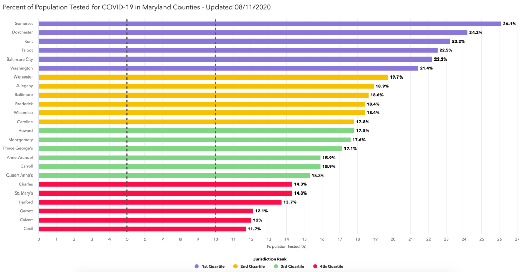
Sometimes, you think that you found something interesting but the Maryland Department of Health is already presenting it on its COVID-19 dashboard 😀
For instance, I calculated the percentage of residents of the different counties ever tested (regardless of the test result). I found out that a third of Maryland counties (8/24) tested at least once more than 25% of their residents. Indeed, as of yesterday (August 10), here are the counties in that category:
County (alphabetical order)
% population ever tested
Baltimore
25.8%
Baltimore City
30.2%
Dorchester
30.4%
Kent
30.6%
Somerset
30.8%
Talbot
28.6%
Washington
27.7%
Wicomico
25%
Maryland counties with more than 25% of their population tested for COVID-19 on August 10, 2020
While we are at it, here are the 5 counties with less than 20% of their population tested (still as of August 10, 2020):
County (alphabetical order)
% of population ever tested
Calvert
14.9%
Cecil
15.3%
Charles
18.6%
Harford
18.1%
Queen Anne’s
19.4%
Maryland counties with less than 20% of their population tested for COVID-19 on August 10, 2020
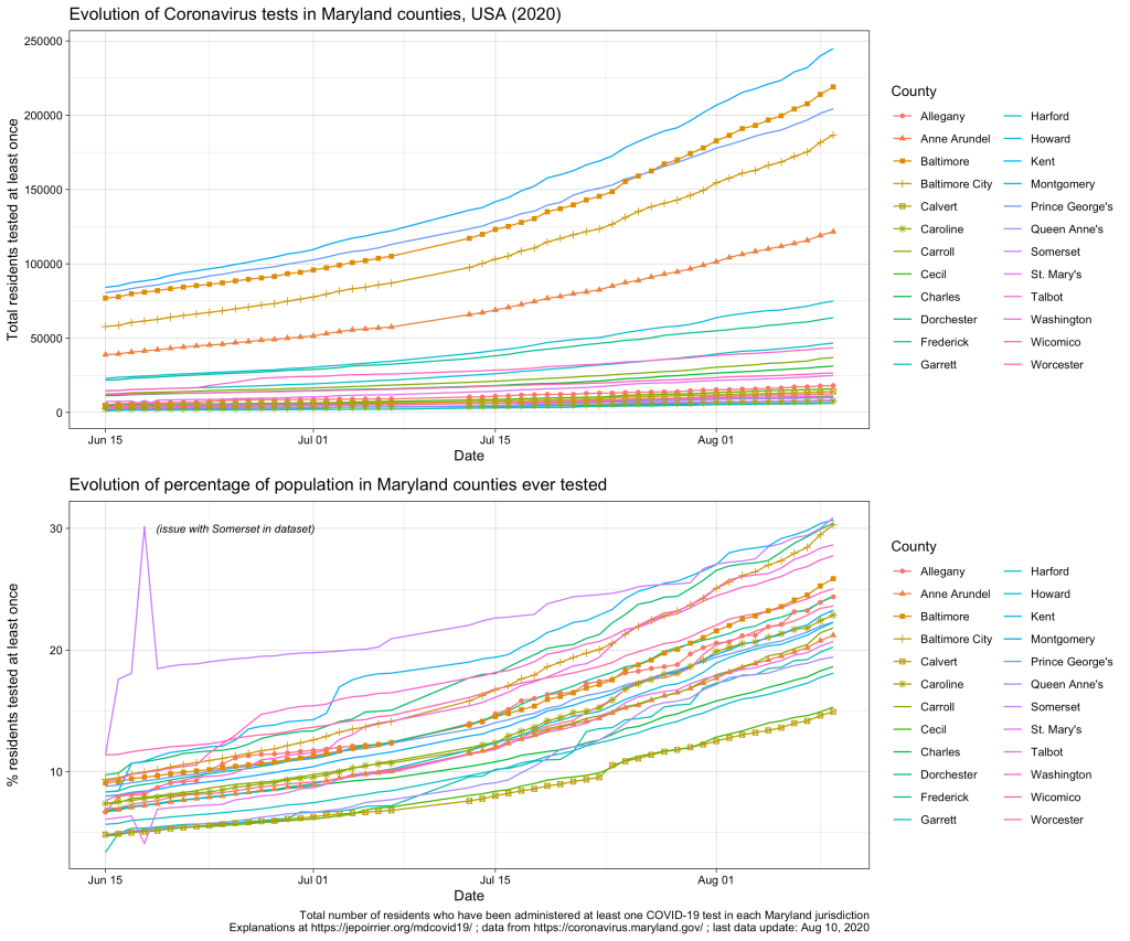
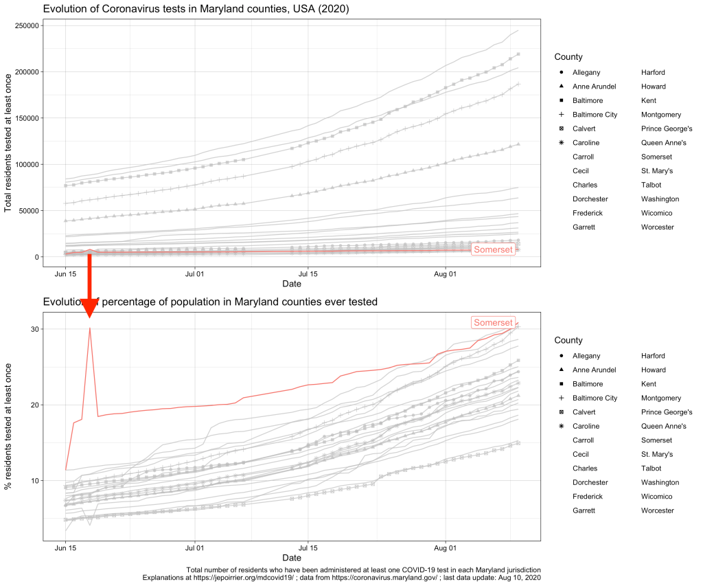
Graphically, we see that all counties are testing more and more, and increasing at approximately the same speed:
As you can see, there are 2 minor issues with the dataset from the MDH API. First, Somerset reported more than double the normal number of tests on June 18, 2020; it went back to “normal” on the next day (I suspect an encoding error here, see highlight below). Then, there is no data after July 7; data resumes on July 13 (a posteriori, I don’t recall reading any issue about county data collection during that time). None of these prevents looking at the current data.
Now, as I mentioned, the official dashboard has already this data, presented by quartile, as a kind of competition between counties 😉 … (the % are slightly different, probably because we are using different sources for the population totals – I’m using the population projections from the Maryland Department of Planning).
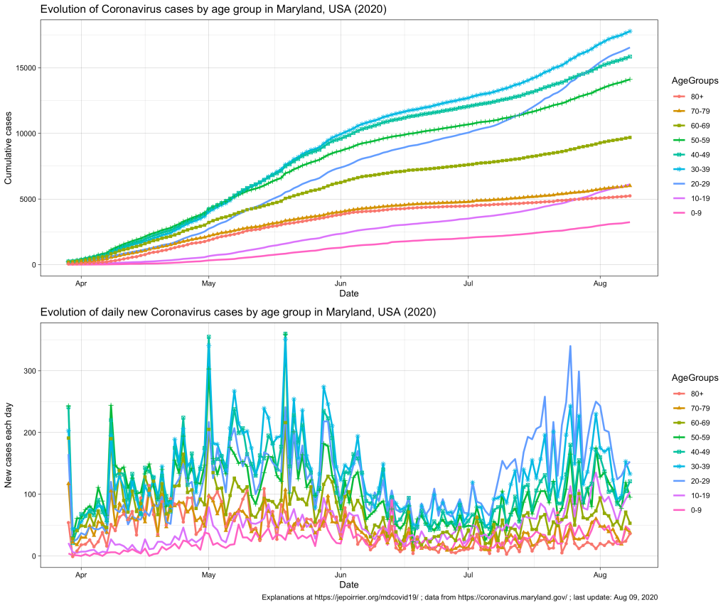
Since mid-July 2020 in Maryland, we understood that the 20-59 yr age group was problematic, especially the 20-29 yr age group that is racing to overtake all age groups in terms of number of COVID-19 cases (relative to their population, see top chart below).
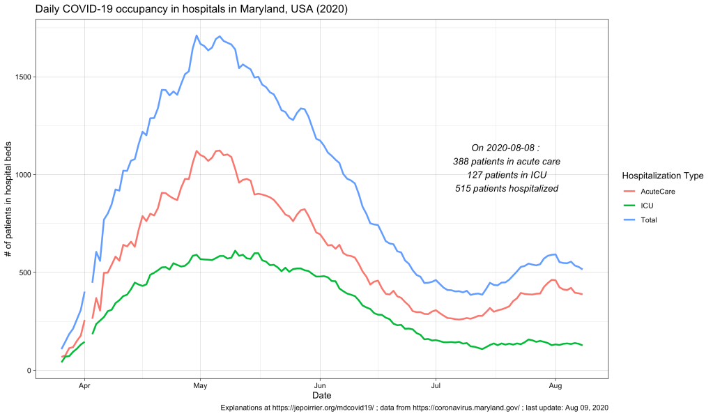
In terms of COVID-19 hospitalizations, we also saw a small rebound (see chart below; it seems that it subsides since beginning of August).
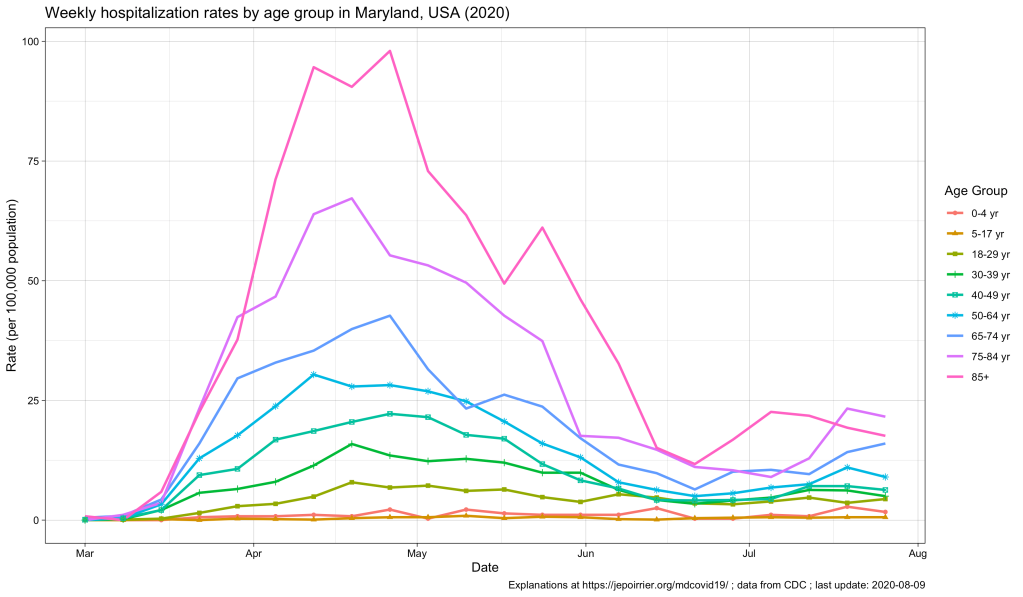
But what we didn’t know (for this small peak as well as since the beginning) was what is the age of these hospitalized populations. Did these hospitalizations impacted more the older adults? The younger ones? Or the children? The Maryland Department of Health COVID-19 dashboard doesn’t report that information (nor in the API).
Now, the CDC also has an interactive graph where you can see and filter the data by yourself. Here is the situation up to August 9, 2020, for Maryland:
The peak of April-May is well represented, with the 85+ population reaching a peak at nearly 100 weekly hospitalizations per 100,000 pop. All the other age groups increased during that time, the older the higher (unfortunately).
Now, since July, we see some of these age groups increase again. At the end of July:
Age group
Weekly hospitalization rate
65-74 yr
16.0
75-84 yr
21.6
85+ yr
17.6
Weekly hospitalization rates for the week of July 27, 2020 in Maryland, MD, USA
This, in my opinion, reinforce the view that, cases might be increasing in the younger population (also thanks to testing being more available) and children and young adults might be less impacted when infected. But the older population is the first impacted by any increase in cases. It was true in April-May. It is again the case with this small peak. If we should take preventative measures to contain COVID-19, it is for us – but especially for the older population, our parents.
We moved our family from the US (Maryland, just in case you didn’t know yet) to Belgium – no big deal. During the COVID-19 pandemic, in July-August 2020 – now we’re talking …
I wrote this post to document our journey. We were (and still are) extremely privileged to have been able to do this, in the conditions we did it. The journey is not over. I’ll update and continue to document it until we fall back into something more “normal” … [long post]
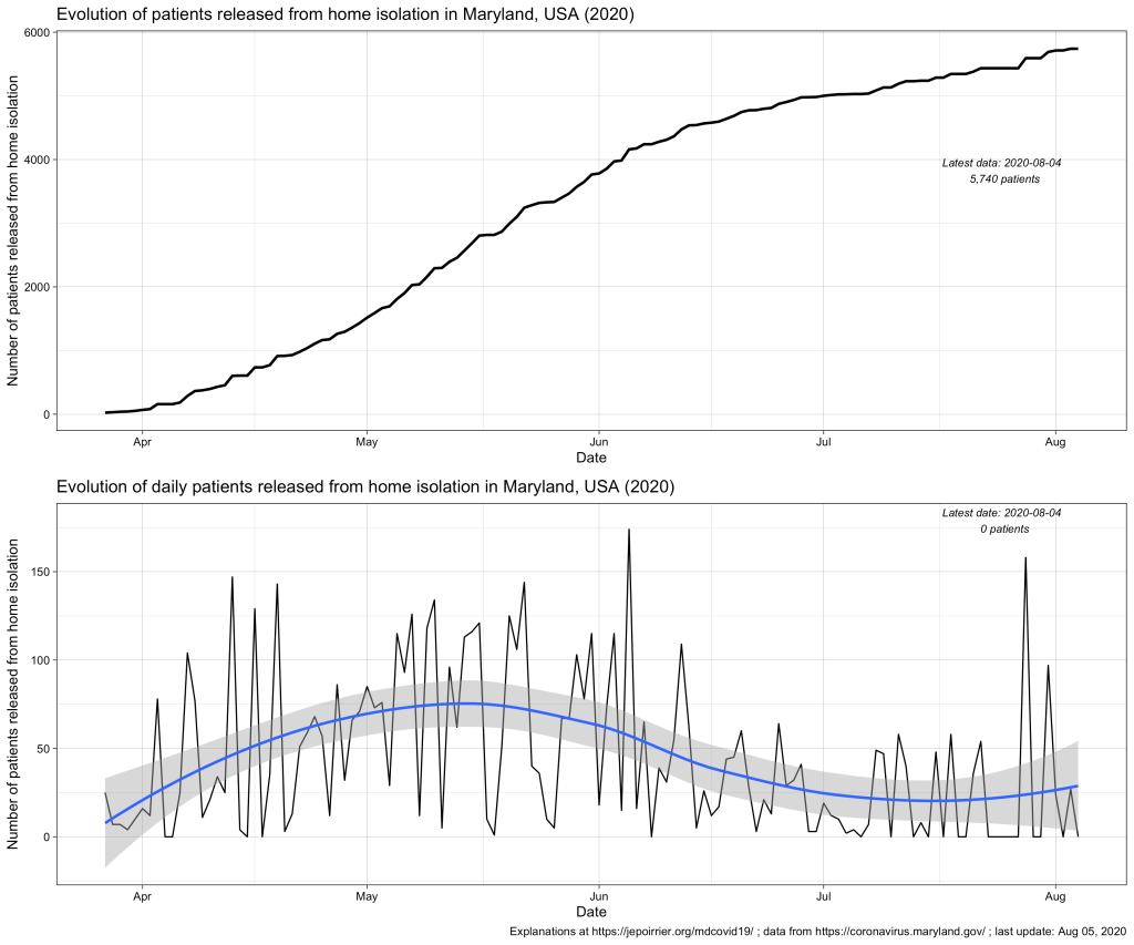
Total Number Released from Isolation data layer is a collection of the statewide cumulative total of individuals who tested positive for COVID-19 that have been reported each day by each local health department via the ESSENCE system as having been released from home isolation. As “recovery” can mean different things as people experience COVID-19 disease to varying degrees of severity, MDH reports on individuals released from isolation. “Released from isolation” refers to those who have met criteria and are well enough to be released from home isolation. Some of these individuals may have been hospitalized at some point.
Definition of “release from isolation” according to the MDH API (emphasis is mine)
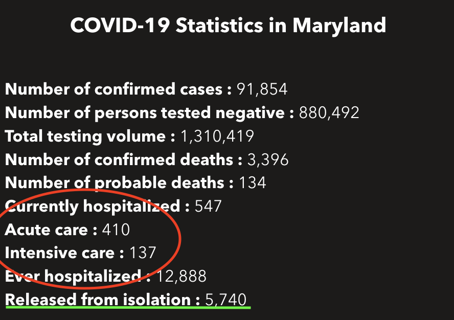
Therefore, mentioning the number of patients released from (home) isolation just below the current number of patients in hospital (as it is currently the case on the MDH dashboard) is a bit misleading: this metric is related to home isolation, which is very different than isolation in hospital.
According to the MDH FAQ on isolation and quarantine, there is no mandate to isolate newly diagnosed positive COVID-19 cases. These cases should follow their healthcare provider’s guidance. In the same document, it also appears that there is no mandate to be notified of the end of isolation. There is a guidance with 3 conditions from the CDC (≥ 10 days since first symptoms, ≥ 24 hours without fever and all COVID-19 symptoms are better – note they don’t need to disappear). These are exactly the conditions written in the CDC Guidance on Discontinuing Home Isolation for Persons with COVID-19 (consulted on August 5, 2020). So I don’t know exactly how this “released from isolation” data is collected.
To add to the confusion, the API page indicates that the data is provided by Maryland’s ESSENCE (Electronic Surveillance System for the Early Notification of Community-based Epidemics). But this system takes most if its data from Maryland acute care hospitals. So would that mean that hospitals direct the end of home isolation and report these numbers? It could be patients released from hospital and asked to isolate at home: so far, there were a total of 12,888 hospitalizations due to COVID-19 in Maryland. It would mean less than half of these patients would have been asked to continue to isolate at home after their hospital release (up to August 4, 2020, the data says that a total of 5,740 COVID-19 cases were released from home isolation). This is 1/20th of the total of positive cases so far (91,854) so I’m not sure we can link these two metrics.
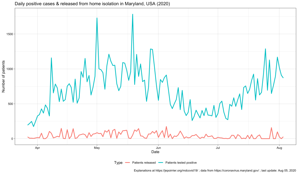
On a daily basis, the second chart (above) shows a kind of cycle with a peak around mid-May – early-June and a trend that increases again end of July. This blue, smoothed curve really looks like the curve of positive cases so I plotted them both below (cases in blue, releases in red). We can see the 2 peaks for both curves but we can’t really distinguish any relay in patients released (red), compared to the positive cases (blue) (this would have made sense since releases follow reporting of cases, by definition – a confounding factor may be the delay in case reporting that may blur the time difference). But the graph also shows us the difference in magnitude between the number of cases (high) and, indirectly, the number of people that were in isolation at home (then released – low).
So I still don’t really know what to think of this metric. If you have any idea, please tell me! Thanks!
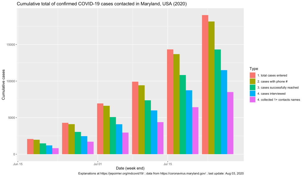
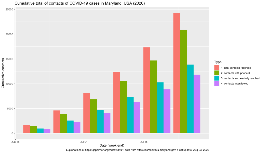
I may have missed when the data was first released but I discovered the Maryland Department of Health (MDH) is publishing some data about COVID-19 contact tracing (in Maryland). This data is not on the main COVID-19 dashboard but on the contact tracing page (and in the datasets that can be downloaded). Here is a first insight of what happened so far …
Note: if you just look for where to get tested in Maryland, the official information is here.
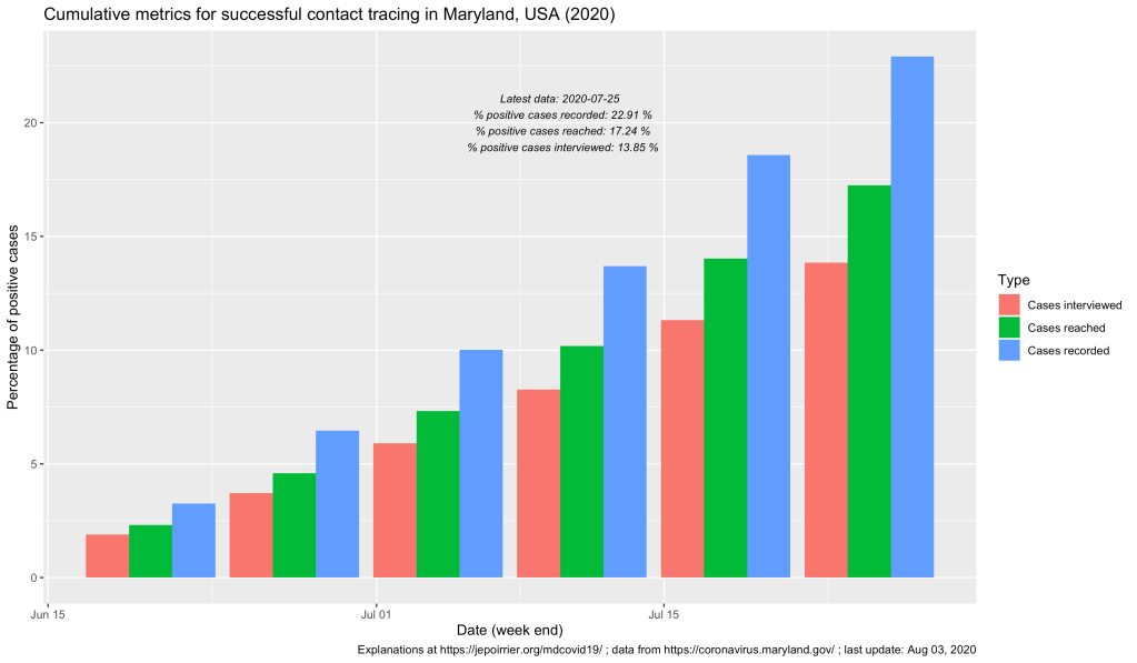
On the graph above, one can see that, up to the week ending on July 25, a bit more than 19,000 COVID-19 cases were recorded in covidLINK, Maryland’s contact tracing initiative. However, only a bit more than 18,000 of these cases had a phone number registered and only 11,504 were successfully interviewed (this take into account people who refused to be interviewed, who cannot be accessed, etc.). If the number of cases registered and the ultimate number of cases interviewed keep increasing (something good), one should remember that, on July 25, Maryland counted 83,054 positive cases (reported in ESSENCE). This leads us to only 22% of all positive cases were reported in covidLINK (blue bars below) and only 13% of all positive cases were interviewed (pink bars below). These trends increased (good) but if only 1/7th of all cases are interviewed, that’s not a lot and we are missing a lot of potential transmissions.
The MDH also report some information on contacts from these cases. One can see below that more and more contacts are … contacted (!) and their interviews are also increasing. At the end of the week (ending on) July 25, 24,260 contacts were registered by all cases and 11,816 of these contacts were interviewed. If cases who are also contacts are not counted in the two datasets, it’s so far a total of more than 23,000 cases and contacts who were interviewed for their symptoms and contacts in relation to COVID-19!
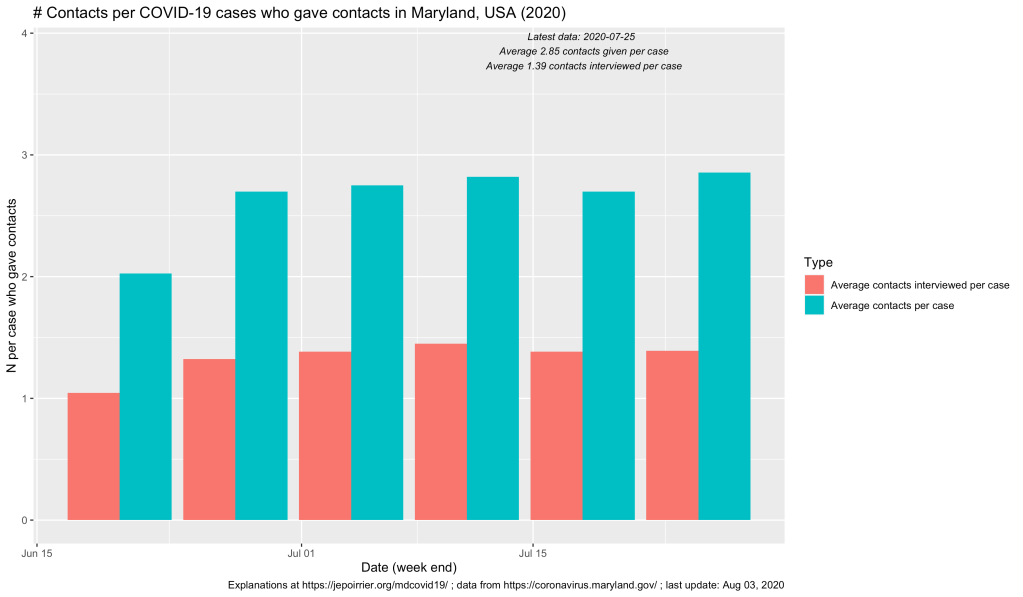
Now, we reach an average of 2.85 contacts declared by positive case (that’s not a lot! The covidLINK FAQ doesn’t mention how far in the past contact tracers go back, just that they “may ask about your whereabouts for a specific period of time”). And on average, 1.39 contact per case are interviewed …
That’s a already gigantic work that has been done by the 1,350 contact tracers! More resource and more cooperation will increase these metrics (and it’s badly needed!). But that’s already a first look at the necessary contact tracing operation in Maryland.
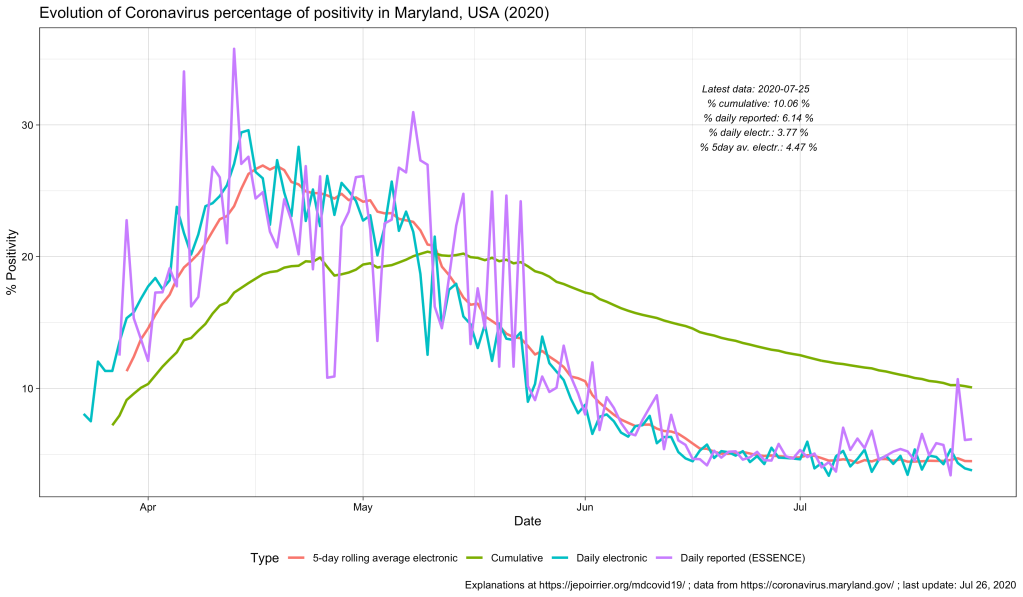
But also every day, there is one thing that constantly changes: how everyone is calculating the COVID-19 positivity rate. Today (July 26), for instance, the different daily positivity rates announced are: 3.77% (Hogan), 4.47% (Hogan again in the same tweet, Hall, Ricci, MD Health Department, Fogarty) and ~6% (for me, the exact number behind the ~ is 6.14%). This doesn’t show the 7-days (or n-days) averages and other measures. And this is only on Twitter.
Why are these numbers different? Which one is correct?
First, let me get rid of the second question: all of them are mathematically correct. What value you give to them is highly depending on what you are looking at or looking for.
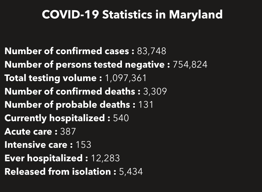
So how are these numbers different? Let’s calculate all of them … Today, the Maryland Department of Health COVID-19 dashboard indicates:
Screenshot of part of the MDHealthDept COVI-19 dashboard on July 25, 2020
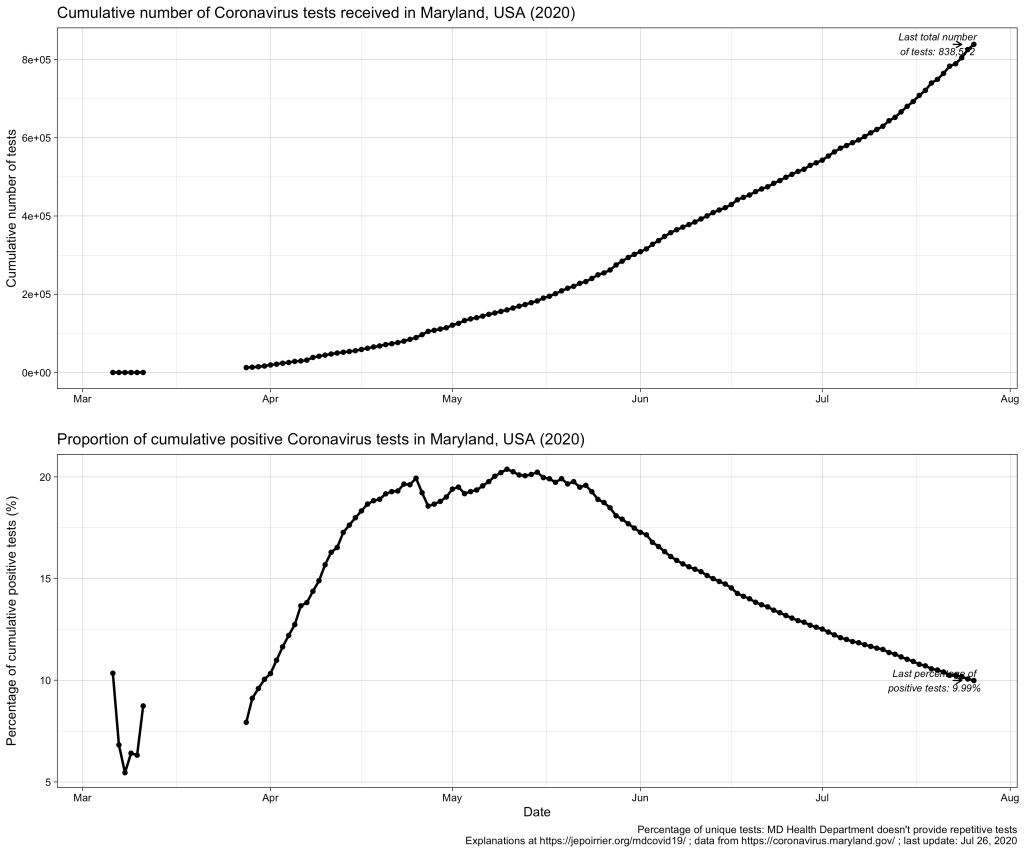
This gives a total of 838,572 cumulative unique tests (# confirmed cases + # persons tested negative) since the beginning of the pandemic. And it gives an overall unique positivity rate of 10.06% (# unique confirmed cases / # unique total). I added “unique” as all these numbers are only counting each person once per test (if someone is tested negative several times, he/she will show up only for 1 negative test). As shown in the chart below, this overall unique positivity rate is growing up fast when cases are increasing but is very slow to go down when cases are diminishing. In consequence, this overall positivity rate will reach 0% in a very, very distant future (almost never will as we will always have cases from the beginning).
Now we may be interested in the total testing volume (1,097,361 today): this is the total of all tests, whether results are always the same or different for the same person. Imagine a doctor being tested every week for COVID-19; for 3 weeks, she is negative (= 1 unique negative test but 3 negative tests in total) until she is found positive on week 4 (= 1 unique positive test = 1 positive test in total); after 2 weeks in quarantine at home, she is again tested negative before returning to work (= 1 unique negative test but 1 positive and 4 negative tests in total). The total testing volume is simply the addition of all tests ever done in Maryland. If you divide the # of unique confirmed cases by the total testing volume, you have an overall positivity rate of 7.64%. I personally don’t like this metric because it mixes unique positive cases with repetitive total cases. As seen in the plausible example above, the total number of unique positive tests and the total number of all positive tests is probably very close (unless positive people are tested positive several times) and it could give a good estimate of the positivity rate.
But to create even more confusion, positive cases are reported from ESSENCE (Electronic Surveillance System for the Early Notification of Community-based Epidemics, click on Biosurveillance here; they write weekly reports that are a trove of information – this may be for a later post). And negative cases are reported from NEDSS (National Electronic Disease Surveillance System, also from the CDC). And the total testing volume is given from all lab results transmitted electronically to the state. It is clearly stated that all results transmitted non-electronically are not taken into account. Having 3 different sources, counting cases differently, doesn’t help reporting – but this highlight the difficulty to present a comprehensive figure. If we plot them all on the same figure, this is what it gives:
As discussed above, the % positive from the cumulative count (green line) will always be high and go down slowly. The % positive of daily reported (violet line) is fluctuating a lot and seems to be often higher than the % positive of daily reported electronically (blue line). This high level of fluctuation is the reason why the MD Health Department has a 5-days average of the % positive of daily reported electronically (red line).
Understanding the positivity rate is important because it gives an indication of the severity of the disease. In this respect, we see that Maryland did well to reduce the severity of this disease, so far, with a positivity rate going down since early May. But the positivity rate can also be read as an indicator that the state is doing relatively good on testing (usually, a high positivity rate is associated with too few testing, only testing the most severe cases). But positivity rate can be influenced by many factors that cannot be understood from these graphs only … One of these factors is the test selection: now that Maryland allows anyone to be tested, one could reasonably thing that the samples tested are more representative of the disease in the state than when only a very restricted set of patients could have been tested (before May 19, 2020). Another key parameter is how long testing takes before giving results. All the numbers above are for when tests results were reported. When these tests were performed is not disclosed (there are discussions online that tests results take several days to several weeks to arrive – if this is true, the % positive we see now is merely a photo of what happened mid-July and not now or last week). And to add to the confusion, I’m sure tests results from different labs are reported at different speed.
All in all, data we see here is a fuzzy picture of what happened in a relatively close past. If figures go down, fine. If they tend to go up, we’ll have to be careful that we are not further up than estimated here.
Better metrics for the severity of this COVID-19 pandemic may be deaths or intensive care unit admissions. I briefly wrote about COVID-19 deaths in Maryland related to counties, to races and inequalities, to age or to gender. It’s maybe time to look at ICU in a future post …
After my previous posts about age of COVID-19 cases and deaths in Maryland, it was logical that I write about the gender of these cases and deaths. Rest assured: this time, it will be much shorter 😉
Indeed, in a nutshell, in Maryland (like in the rest of the world), women are more impacted than men by the disease. But men are dying of the disease a little bit more than women.
Note: this post was updated on July 15, 2020, to fix an error in my code!
Now for the details …
In terms of positive COVID-19 tests / cases, the difference between men and women started early in April, with the number of positive tests or cases in women increasing faster than men over time. Today (July 15, 2020), Maryland counted a cumulative 39k positive cases for women and a cumulative 35.9k positive cases for men. The number of new cases in men and women in Maryland follows (of course) the trend in new cases, with peaks in May, a decrease until now and a fear for new increase of cases now (see bottom graph, below).
Even if we take into account the number of cases relative to the population of each gender, because there is approximately the same number of men and women in Maryland (2.9 mio men, 3.1 mio women, from the MD department of Planning), women always saw more cases than men (even if by just a little bit). Today, here is the data (also see graph below):
Cumulative COVID-19 cases / 100,000 pop.
Female
Male
July 15, 2020
1,230.8
1,211.3
In terms of deaths, we see the opposite trend: since the beginning of data reporting, there were always more men who died of COVID-19 than women. On a daily basis, it’s less clear (and since I’m not smoothing nor averaging anything, it’s a bit jagged) but the overall result remains the same.
Even when we consider deaths relative to the respective populations, men die in larger numbers to their population (than women) and this is consistently the case since the beginning of data availability (see also chart below):
Cumulative deaths per 100,000 pop.
Female
Male
July 15, 2020
49.6
54.8
These observations were already widely shared, for the general (i.e. non-MD) population, in the media. There could several factors to explain that more women are tested positive than men: men could be less enclined to be tested than women, women could be more concerned about their health than men (seeking more testing resulting in discovering more positive cases), … And there are two main hypotheses to explain that more men are dying of COVID-19 than women: women tend to have a stronger immune system than men, there are also “gender-based lifestyle choices” (e.g. more men are smoking than women, and smoking is, directly or indirectly, affecting the predisposition to complications due to COVID-19), … So, contrary to the perceived lack of manliness some men express about the mask, men should have even more reason to wear a mask, just to protect them (and others) from dying.
P.S. This post was amended a after its publication, thanks to a remark by W Jauquet on Twitter: the calculation for the relative number of cases and deaths was wrong. The code and text above were corrected to reflect that.