Tag: CDC

COVID-19 hospitalization by age in Maryland

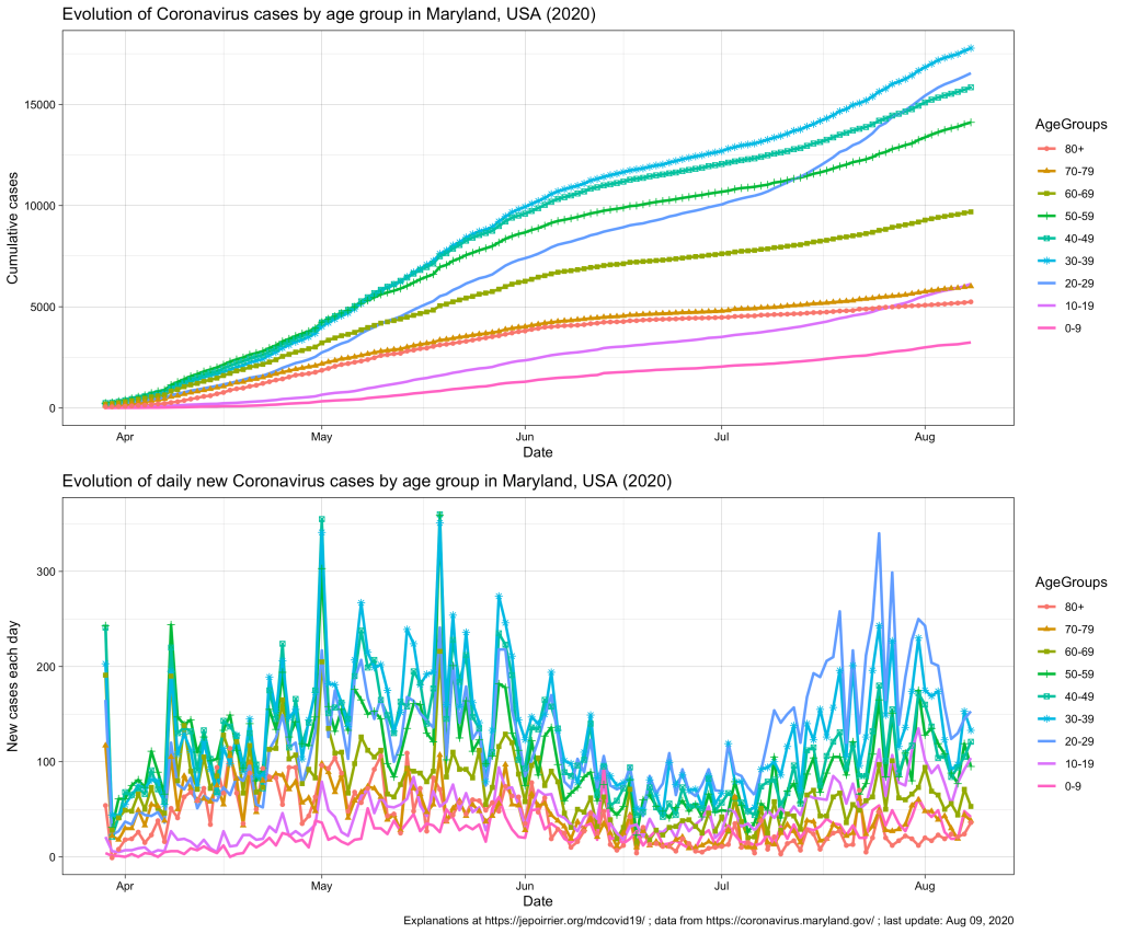
Since mid-July 2020 in Maryland, we understood that the 20-59 yr age group was problematic, especially the 20-29 yr age group that is racing to overtake all age groups in terms of number of COVID-19 cases (relative to their population, see top chart below).

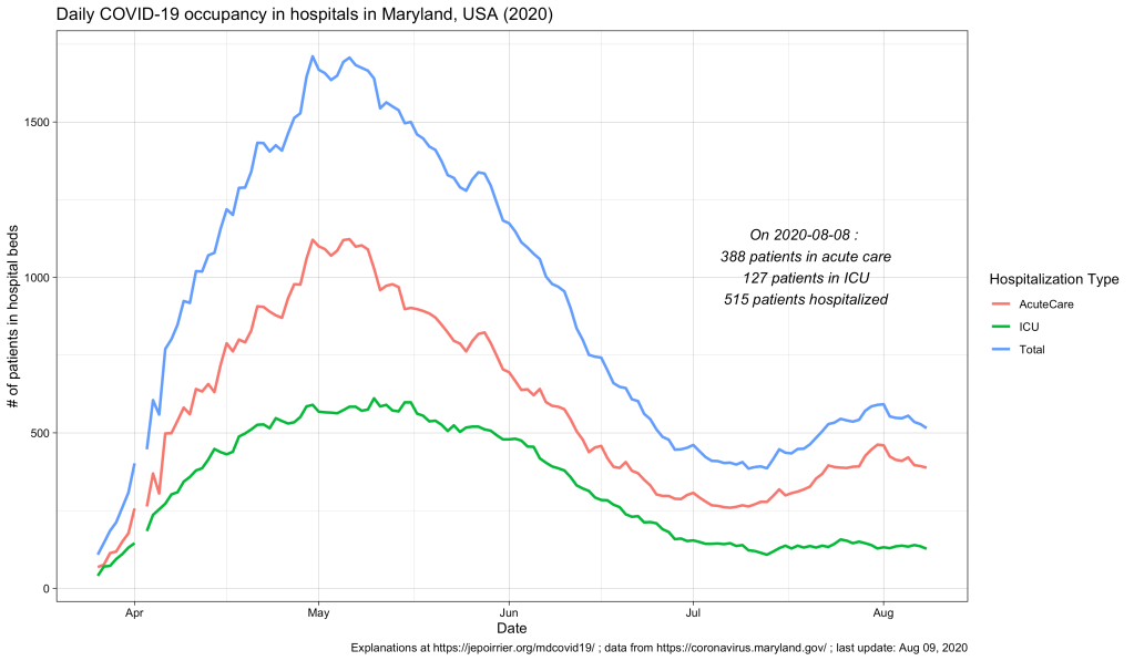
In terms of COVID-19 hospitalizations, we also saw a small rebound (see chart below; it seems that it subsides since beginning of August).

But what we didn’t know (for this small peak as well as since the beginning) was what is the age of these hospitalized populations. Did these hospitalizations impacted more the older adults? The younger ones? Or the children? The Maryland Department of Health COVID-19 dashboard doesn’t report that information (nor in the API).

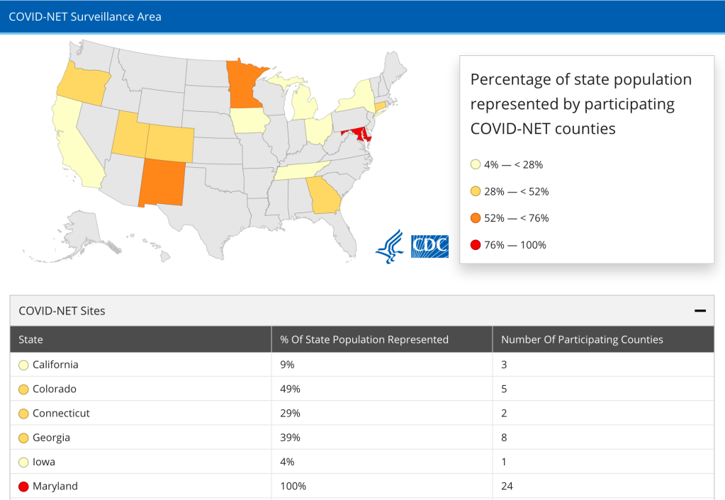
Despite the recent issue about switching hospitalization reporting from CDC to HHS, it seems that CDC is still reporting hospitalization data at COVID-NET (Coronavirus Disease 2019-Associated Hospitalization Surveillance Network), at least until the end of July. There, it is interesting to note that Maryland is the only state which reporting represents 100% of the population (24 counties) – that’s good!

Screenshot of COVID-NET method description showing that 100% of the Maryland population is represented

Now, the CDC also has an interactive graph where you can see and filter the data by yourself. Here is the situation up to August 9, 2020, for Maryland:

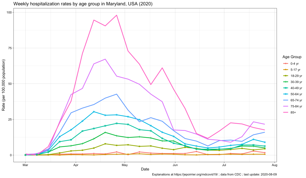
The peak of April-May is well represented, with the 85+ population reaching a peak at nearly 100 weekly hospitalizations per 100,000 pop. All the other age groups increased during that time, the older the higher (unfortunately).

Now, since July, we see some of these age groups increase again. At the end of July:

Age groupWeekly hospitalization rate
65-74 yr16.0
75-84 yr21.6
85+ yr17.6
Weekly hospitalization rates for the week of July 27, 2020 in Maryland, MD, USA

This, in my opinion, reinforce the view that, cases might be increasing in the younger population (also thanks to testing being more available) and children and young adults might be less impacted when infected. But the older population is the first impacted by any increase in cases. It was true in April-May. It is again the case with this small peak. If we should take preventative measures to contain COVID-19, it is for us – but especially for the older population, our parents.

To be continued …

As usual, you’ll find other graphs on my page about COVID-19 in Maryland (and figures above are updated with new data as they appear) and the data, code and figures are on Github (including these ones).

Increasing certainty in flu vaccine effectiveness

According to CDC data, studies are getting better at estimating the influenza vaccine effectiveness.

With the 2017-2018 flu season still going on in the USA, there are already some indication that vaccines have some effectiveness (although its target strains were mismatched). The CDC reports how it measures vaccine effectiveness here and I was interested in their confidence intervals (the interval that takes into account uncertainties to extrapolate to the broader, unknown population).

Here is the same graph as on the CDC page, but with confidence interval:

180223-Flu-vaccine-effectiveness-USA-influenza-season
* 2016-2017 VE are still estimates. ** 2017-2018 interim early estimates may differ from final end-of-season estimates.

You can already notice it above but the graph below confirms that the confidence interval becomes narrower with the various flu season. This can come from various reasons. One obvious reason is that early seasons (< 2007-08) had a very small sample size (< 1,000). But overall, we can notice a gain of certainty around the effectiveness (the lower the line below, the more certainty).

180223-Flu-vaccine-effectiveness-USA-confidence-interval-influenza-season
* 2016-2017 VE are still estimates. ** 2017-2018 interim early estimates may differ from final end-of-season estimates.

As usual, the dataset (and code to generate the graphs above) are on my Github repo.

Effects of Tobacco on health – visualized

As you probably know I am interested in both diseases (and health in general) as well as visualization. Recently Online Nursing Programs (*) invited me to have a look at their latest infographics about the effects of tobacco on health (directly to figure).

Although numbers seem correct (references are at the bottom), although they intelligently re-use the presentation of some well-known tobacco companies, there is one thing that I don’t like that much: like this sentence, the figure is very, very long. You have to scroll many pages in order to see everything. It may look like a story but it is not presented as such (I mean: there are no clear marks of different steps in the story, except the three “chapters”). On the right is the complete figure in exactly 800 pixels of height – can you read something? GOOD.is solved this issue by using a Flash player that allows the viewer to woom in/out and go to different sections of the figure (see here for instance).

Now, about smoking … Smokers do what they want with their health. Of course, I criticise the physical dependency, the effects on social security and indirectly on everyone’s capacity to react to other health issues. And of course I hope that people could stop smoking. But in my opinion the most disgusting thing about tobacco is secondhand smoking (aka. passive smoking): the inhalation of smoke by persons other than the active smoker. This passive smoking is especially harmful in young children. The CDC estimated that it is responsible for an estimated 150,000–300,000 new cases of bronchitis and pneumonia annually, as well as approximately 7,500–15,000 hospitalizations annually in the United States – both in children below 18 months. And in adults, passive smoking increase the risk of heart disease and lung cancer by 20-30%. Without doing anything – just inhaling smoke from your neighbour.

So it was a very nice idea from them to draw people’s attention to these health issues. It could have been better if the figure would have been more “readable” IMHO.

(*) Unfortunately for them, “Online Nursing Programs” sounds like a website that will just ask for your credit card number although they publish nice infographics – like this other one about sanitation. The About page that doesn’t say who they are add to these doubts.

Created by Online Nursing Programs, license CC-…

OS need an immune system and not a CDC-like

In an IT World article, Tom Henderson gives many details about a US-government-led CDC-like organisation to fight malware. In summary, he states that companies and consultants providing security and prevention around operating systems don’t have any real motivation to eradicate malware. And in case of an “outbreak” of these malware, he added one needs a US government body to look after every computer “health”, coordinate the surveillance and the response. He even pushes the comparison with the human medical system by introducing a Hippocratic Oath for computer healthcare.

With all the respect I have for someone I’ve never heard of before, I think Tom Henderson misses one crucial point that make his flight of lyricism totally irrelevant. The missed point is that human beings (as well as every animal species and especially vertebrates) have a immune system. It’s our immune system that gives the first answer to any external “invasion”, it’s our immune system that can adapt to the diversity of threats out there, it’s our immune system that allow our body to recover.

Today computers have a nice body, nice mechanics. Operating systems are behaving like we tell them, not as separate entities. We constantly add foreign bodies (software) and they are constantly in contact with potential external aggressions (via file exchanges, media insertion, network connections). What we begin to give them are sentinels monitoring critical parts of the system, a kind of basic neural system. We invented the body-in-the-body (virtualization) to prevent one failing organ (software) to contaminate the remaining parts of the body (a.o.). We also give some vitamins (firewalls e.g.), strengthening  some defences. And finally we think that “anti-virus software” are enough while it’s only some kind of very basic, un-natural innate immune system.

Before thinking of a CDC-like body for our computers security, one should maybe think of adding a immune system to our computers. At least a basic one, where there is a response even to currently unknown threats. Then we might think of something more sophisticated, with memory and specific response. Look, there was no network, no communication outside: the body/computer can easily cope with the threat by itself. Research is already looking at such applications. And, yes, finally, if you insist, bring your CDC-like organism.

The Top 5 Killers of Men

From Delicious, I saw that Yahoo had an article about the top 5 killers of men. I thought it would be nice to see from where they get there data.

First, I have to mention that the article is really about American men, nothing else (not about mankind, not about men around the world, not about women, children, etc.). The article is related to the US National Men’s Health Week (the US National Women’s Health Week was in May 8-14, 2011). Although the article is giving advices, there are no sources of information.

However, it’s rather easy to obtain these numbers …

For the US, the CDC FastStats website is a hub to data about health in the US. Here is the CDC ranking for the top 5 killers in 2007 (in both US women and men):

  1. Heart disease: 616,067 deaths
  2. Cancer: 562,875 deaths
  3. Stroke (cerebrovascular diseases): 135,952 deaths
  4. Chronic lower respiratory diseases: 127,924 deaths
  5. Accidents (unintentional injuries): 123,706 deaths

If you look at the whole world (data from the UN), the picture is somehow different! The UN ranking for the top 5 killers in 2008 (in both women and men) is:

  1. Lower respiratory infections: 1.05 million deaths
  2. Diarrhoeal diseases: 0.76 million deaths
  3. HIV/AIDS: 0.72 million deaths
  4. Ischaemic heart disease: 0.57 million deaths
  5. Malaria: 0.48 million deaths

All of them causes more than 45% of deaths around the world. These diseases with high-mortality vary in an important manner when we compare the USA and the whole world. The main caveat is that the data I presented above are for men and women. It would be interesting to use the UN data API project to dig further into details.