Creating presentations with non-WYSIWYG tools

I work in a company that shifted from being R&D-driven to being project-driven. It is official since this 2013 but we saw it coming: the main pieces of memory are Powerpoint slides since a few years.

Everything is in Powerpoint, from agendas, discussions, presentations to minutes. Even when modelers want to show some results, they put them on a slide deck first …

For presentations I used to use Beamer but installing the LaTeX toolchain on a restricted, company-owned Windows laptop was a long and cumbersome process. I made a first presentation in Reveal.js this week. And I love it!

I prefer Beamer, Reveal.js and similar tools because a) it forces you to think of your message and its structure first and b) it forces you to reuse material that is already produced (rather than creating new things in / for the presentation medium). Therefore the presentation is a real presentation of something that really exists, that was really thought outside of the context of the presentation (and before it!).

The additional benefit (IMHO) of Reveal.js is that you just need a text editor and a browser. All restricted company laptops provide you with these tools.

The memory of my projects remains in my models, my notes and reports. The context, next steps and consequences are there. The project evolution is better understood (in reviews, audits and simple chats with colleagues).

Belgium doesn’t score well in the Open Data Index (not speaking about health!)

The Open Knowledge Foundation (OKF) released the Open Data Index, along with details on how their methodology. The index contains 70 countries, with UK having the best score and Cyprus the worst score. In fact the first places are trusted by the UK, the USA and the Northern European countries (Denmark, Norway, Finland, Sweden).

And Belgium? Well, Belgium did not score very well: 265 / 1,000. The figure below shows its aggregated score (with green: yes, red: no, blue: unsure).

Open Data Index - Belgium

The issue with this graph is that you may first think it’s a kind of progress bar. For instance, in transport timetables, it seems Belgium reached 60% of a maximum. But the truth is that each bar represents the answer to a specific question. So the 9 questions are, from left to right:

  1. Does the data exist?
  2. Is it in digital form?
  3. Is it publicly available?
  4. Is it free of charge?
  5. Is it online?
  6. Is it machine readable (e.g. spreadsheet, not PDF)?
  7. Is it available in bulk?
  8. Is it open licensed?
  9. Is it up-to-date?

With the notable exceptions of government spending and postcodes/zipcodes, nearly all Belgian data is available in a way or another. That’s already a start – but … None of them are available in bulk nor machine readable nor openly licenced and only few of them are up to date. Be sure to read the information bubbles on the right of the table if you are interested in more details.

The national statistics category leads to a page of tbe Belgian National Bank. And here is one improvement that the OKF could bring to this index: there should be a category about health data. For Belgium we are stuck with some financial data from the INAMI (in PDF, not at all useful as is) but otherwise we have to rely on specific databases or the WHO, the OECD or the World Bank. The painful point is that these supranational bodies often rely on statistics from states themselves – but Belgium doesn’t publish these data by itself!

If you are interested in the topic, three researchers from the Belgian Scientific Institute of Public Health published a study about health indicators in publicly available databases, 2 years ago [1]. Their conclusions were already that Belgium should improve on Belgian mortality and health status data. And the conclusion goes on about politically created issues for data collection, case definition, data presentation, etc.

I was recently in a developping country (Vietnam) where we try to improve data collection: without reliable data collection it is difficult to know what are the issues and to track potential improvements. In the end, this is also applicable in Belgium: we feel proud of our healthcare system ; but on the other hand it is difficult to find health-related data in an uniform way. It is therefore difficult to track trends or improvements.

[1] Vanthomme K, Walckiers D, Van Oyen H. Belgian health-related data in three international databases. Arch Public Health. 2011 Nov 1;69(1):6.

Privacy -vs- information conservation time

In my opinion privacy issues are a by-product of information conservation times reaching infinite.

For centuries and more humans were used to their own type of memory. When information reaches the brain, it is stored in short-term memory. When relevant and/or repeated, it is gradually consolidated into long-term memory (this is roughly the process).

Schematic memory consolidation process

The invention of oral transmission of knowledge, written transmission (incl. Gutenberg) and, to a certain extend, internet, all these successively increased the duration of retention of information shared with others. The switch from oral to written transmission of knowledge also sped up the dissemination of information as well as its fixed, un-(or less-) interpreted nature.

Duration of information over time

With the internet (“1.0” in order to put some buzzword) the duration of information is also extended but somehow limited ; it was merely a copy of printing (except speed of transmission). Take this blog, for instance: information stored here will stay as long as I maintain or keep the engine alive. The day I decide to delete it, information is gone. And the goal of internet was to be able to reach information where it is issued, even if there are troubles in communication pipes.

However on top of this internet came a serie of tools like search engines (“Google”) and centralized social networks (“Facebook”). Now this information is copied, duplicated, reproduced, either because of the digital nature of the medium that allows that with ease. But also because these services deliberately concentrate the information otherwise spread. Google concentrate (part of) the information in its own datacenters in order to extract other types of information and serves searches faster. Facebook (and other centralized social networks) asks users to voluntarily keep their (private) information in their own data repository. And apparently the NSA is also building its own database about us at its premises.

In my opinion, whenever we were sharing information before, privacy issues were already there (what do you share? to whom? in which context? …). But the duration of information is now becoming an issue.

Is it so difficult to maintain a free RSS reader?

A few months ago Google decided to retire its Google Reader (it stopped working on July 1st, 2013). As it was simple, effective and good-looking, a lot of people complained about this demise. A few days ago The Old Reader, one of the most successful replacement for Google Reader, also announced it will close its gates, only to keep early registered users. And today Feedly, another successful alternative, announced it is introducing a pro version at 5.00 USD per month.

One of the reasons often evoked is the difficulty for these relatively small projects (before Google Reader demise) to handle the many users who migrated to their platform. Difficulties in terms of hardware resources but also human resources, finances, etc.

So, to answer my own question, yes, it looks like it’s difficult to maintain a free RSS reader with an extensive number of users. And free software alternatives like Tiny Tiny RSS, pyAggr3g470r or Owncloud can be difficult for users to install (and especially maintain – same type of difficulties: necessity to have a host and technical capabilities, time, money (even if at a different scale), …).

Two thoughts on this. Fist people are used to free products on the internet (count myself among them). And we take for granted that services on the web are and will remain free. RSS and its associated readers were a great inventions to keep track of information coming from various sources. However with the explosion of the number of these sources is RSS still a valid tool? One solution is to restrict ourselves to some, carefully selected sources of information. The other is to imitate statistics: summary statistics exist for raw data, datamining should become as easy to use for raw information (but I don’t think datamining is as easy as summary statistics).

Which leads me to my second thought: aren’t this just signs of the end of RSS as we know it? People thought of it because of a giant web service provider removed its “support” for RSS. What if it is just the end of RSS because it is not adapted anymore to “modern” use?

Let me try a comparison. E-mail is an older system than RSS. It is however still there. It serves another purpose: one-to-one or one-to-few communication. But since its origin e-mail clients tried to innovate by adding features, among which is automated classification of e-mail. Spam filters exist since a long time. Rules can be defined in most e-mail clients. GMail (again from Google) is now classifying your own e-mail with “Priority”, “Social” etc. These tools help us to de-clutter our Inbox and keep only relevant e-mails in front of us when we need them. I think RSS would benefit from similar de-clutter/summarizing tools. We just need to find / invent them.

Will we see more babies named George in England and Wales?

A few days ago Prince William and Duchess Catherine of Cambridge gave birth to Prince George. Today at the office we were wondering if we will see more babies names George in UK. Very important question indeed!

So I went to the UK National Statistics website and looked for baby names in UK. Let’s focus on England and Wales only. There are two datasets for what we are looking for: one for the period 1904-1994 (by 10 years steps) and one for 2004 (if we want to be consistent with the 10 years step in the first dataset). I extracted the ranking relevant for us here: for babies called William, George (and Harry, William’s brother). The data is here.

If we plot these rankings we see for William that there could be a “Prince effect”. Indeed this name was less and less used in the 20th century (blue dots) until Prince William’s birth in 1982 (blue dotted line). Idem for the name Harry (green dots) that didn’t even made it into the top 100 in 1964, 1974 and 1984 ; but it reappeared at the 30th rank in 1994 (he was born in 1984, green dotted line).

Evolution of ranking of baby name popularity - William, Harry and GeorgeNow for the name George, it’s a bit different. The name was also going down the ranking until 1974 when it reached the 83rd rank. After that it went up again. So does it invalidate the “Prince effect” mentioned earlier? Maybe it’s more a “famous effect” since other famous Georges were famous (George Michael, George Clooney, George Best, George Weasley, … from Yahoo!). Maybe the appearance of television shows in colour (1966 for BBC) made this name popular? Do you see other reason? But even from the already high 17th in popularity now I still expect the name George to gain even more popularity.

Btw I discovered that The Guardian ran a similar story (excluding Harry however).

How to write data from R to Excel (even if you don’t have Excel)

Following my previous posts on how to read/write Excel files from Matlab here is the way I use to read/write Excel files from R. Again it seems the Apache POI java library made developers’life easy. I use here the simple-yet-powerful xlsx package (documentation here in PDF; project website).

Here you don’t need to install any additional files, installing the xlsx package from R does all the dirty work that for you. Then, reading an Excel file is very easy:

libary(xlsx)
inData <- read.xlsx2("input.xls", sheetName="Contactmatrix", header=FALSE)

I usually use read.xlsx2 instead of read.xlsx. It is said to be faster with large matrices and I had the opportunity to experience it – so I stick with this. You can read xls, xlsx and xlsm files without issue (well, with the simple formatting I usually use).

Writing to an Excel file is also very easy:

write.xlsx2(outData, "output.xls", sheetName="Random2", col.names=FALSE, row.names=FALSE)

Easy, isn’t it?

Any free solution for the demise of Google Reader?

Last week Google announced it will shut down its Reader service. It is a web-based RSS reader. It therefore allows to be kept updated of news from around the net in a central location. I liked the service for 3 reasons (on top of the fact it’s free, 0$, to use):

  1. It’s web-based, accessible from anywhere/everywhere with a simple browser;
  2. It’s text-based, you can quickly scan headlines and use the powerful search function from Google;
  3. It’s backed by an API so you can use it via different apps on different platforms and they all stay synchronised (the web/mobile version of Reader is not as efficient as the web/desktop version; hence the proliferation of apps using Reader as a backbone).

Of course it frustrated a lot of people, from scientists to consultants … to name a few only. People are looking for alternative (you can do a search on Google while the Search service is still working). Feedly is cited very often as the next best alternative. However its nice, graphical interface conflicts with my second reason to like Google Reader: it’s text-based. The Old Reader looks also interesting, it is text-based but no apps on different platforms yet. But both are also proprietary and can be turned off (or changed to a pay-for-use model) at any moment 😦

An interesting solution could be an Evernote RSS reader. Evernote has already a portfolio of application ranging from a note-taking software, screenshots, drawing, food, … They have a synchronisation process in place. Why not a RSS reader then?

Back to the main track … Fortunately – in a way – Google Takeout allows you to retrieve all your data from Reader, along with an OPML file containing all your subscriptions. You can feed this file in another reader and you can go forward. Starred items are also retrieved (but which reader can use them?). And if you are interested The Guardian has an interesting article about the average duration of Google free services (1459 days, see below) and other nice facts. I guess they will keep Search alive 😉

130325-Google_Keep_Guardian

But what can be done for free (as in free speech)? One of the solution is Owncloud (AGPL) and they recently released a RSS reader add-on. Another solution could be pyAggr3g470r, a news aggregator written in Python. And I was wondering why there isn’t just a simple API that would allow any kind of application to connect, update and display RSS feed. Something like the NewsCredNews API but free, simpler to use than Owncloud and with apps/website interface for mobile devices. And a poney with that, please.

Do you have any other solution?

Map of GAVI eligible countries in R

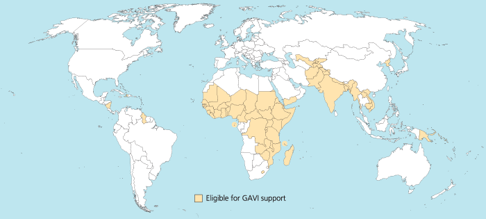
I was trying to reproduce the map of the GAVI Alliance eligible countries (btw I was surprised India is eligible – but that’s the beauty of relying on numbers only and not assumptions) in R. This is the original map (there are 57 countries eligible):

map_GAVI-eligible_countries_700x315_700

I started to use the R package rworldmap because it seemed the most appropriate for this task. Everything went fine. Most of the time was spent converting the list of countries from plain English to plain “ISO3” code as required (ISO3 is in fact ISO 3166-1 alpha-3). I took my source from Wikipedia.

Well, that was until joinCountryData2Map gave me this reply:

54 codes from your data successfully matched countries in the map
3 codes from your data failed to match with a country code in the map
189 codes from the map weren’t represented in your data

I should have better simply read the documentation: there is another small command that needs not to be overlooked, rwmGetISO3. What are the three codes that failed to match?

Although you can compare visually the map produced with the map above, R (and rworldmap) can indirectly give you the culprits:

tC2 = matrix(c("Afghanistan", "Bangladesh", "Benin", "Burkina Faso", "Burundi", "Cambodia", "Cameroon", "Central African Republic", "Chad", "Comoros", "Congo, Dem Republic of", "Côte d'Ivoire", "Djibouti", "Eritrea", "Ethiopia", "Gambia", "Ghana", "Guinea", "Guinea Bissau", "Haiti", "India", "Kenya", "Korea, DPR", "Kyrgyz Republic", "Lao PDR", "Lesotho", "Liberia", "Madagascar", "Malawi", "Mali", "Mauritania", "Mozambique", "Myanmar", "Nepal", "Nicaragua", "Niger", "Nigeria", "Pakistan", "Papua New Guinea", "Rwanda", "São Tomé e Príncipe", "Senegal", "Sierra Leone", "Solomon Islands", "Somalia", "Republic of Sudan", "South Sudan", "Tajikistan", "Tanzania", "Timor Leste", "Togo", "Uganda", "Uzbekistan", "Viet Nam", "Yemen", "Zambia", "Zimbabwe"), nrow=57, ncol=1)
apply(tC2, 1, rwmGetISO3)

In the results, some countries are actually given in a slightly different way by GAVI than in R. For instance “Congo, Dem Republic of” should be changed for rworldmap in “Democratic Republic of the Congo” (ISO3 code: COD). Or “Côte d’Ivoire” should be changed for rworldmap in “Ivory Coast” (ISO3 code: CIV). An interesting resource for country names recognised by rworld map is the UN Countries or areas, codes and abbreviations. Once you correct this, you can have your map of GAVI-eligible countries:

GAVIcountries-eligibles-map3-jepoirrier

And here is the code:

# Displays map of GAVI countries
library(rworldmap)
theCountries <- c("AFG", "BGD", "BEN", "BFA", "BDI", "KHM", "CMR", "CAF", "TCD", "COM", "COD", "CIV", "DJI", "ERI", "ETH", "GMB", "GHA", "GIN", "GNB", "HTI", "IND", "KEN", "PRK", "KGZ", "LAO", "LSO", "LBR", "MDG", "MWI", "MLI", "MRT", "MOZ", "MMR", "NPL", "NIC", "NER", "NGA", "PAK", "PNG", "RWA", "STP", "SEN", "SLE", "SLB", "SOM", "SDN", "SSD", "TJK", "TZA", "TLS", "TGO", "UGA", "UZB", "VNM", "YEM", "ZMB", "ZWE")
GaviEligibleDF <- data.frame(country = c("AFG", "BGD", "BEN", "BFA", "BDI", "KHM", "CMR", "CAF", "TCD", "COM", "COD", "CIV", "DJI", "ERI", "ETH", "GMB", "GHA", "GIN", "GNB", "HTI", "IND", "KEN", "PRK", "KGZ", "LAO", "LSO", "LBR", "MDG", "MWI", "MLI", "MRT", "MOZ", "MMR", "NPL", "NIC", "NER", "NGA", "PAK", "PNG", "RWA", "STP", "SEN", "SLE", "SLB", "SOM", "SDN", "SSD", "TJK", "TZA", "TLS", "TGO", "UGA", "UZB", "VNM", "YEM", "ZMB", "ZWE"),
GAVIeligible = c(1, 1, 1, 1, 1, 1, 1, 1, 1, 1, 1, 1, 1, 1, 1, 1, 1, 1, 1, 1, 1, 1, 1, 1, 1, 1, 1, 1, 1, 1, 1, 1, 1, 1, 1, 1, 1, 1, 1, 1, 1, 1, 1, 1, 1, 1, 1, 1, 1, 1, 1, 1, 1, 1, 1, 1, 1))
GAVIeligibleMap <- joinCountryData2Map(GaviEligibleDF, joinCode = "ISO3", nameJoinColumn = "country") mapCountryData(GAVIeligibleMap, nameColumnToPlot="GAVIeligible", catMethod = "categorical", missingCountryCol = gray(.8))

Android is catching up iOS

121221-android-mba-rWell, there is nothing new in this statement. The smartphone OS Android is catching up and even overtaking its rival iOS in many domains:

  • more activated products per day and per year in 2011,
  • more Samsung Galaxy S3 (running Android) sold in Q3 2012 than iPhone4 and 5S (running iOS),
  • more devices worldwide,
  • catching up Apple’s market share in tablets,

All this is summarised in an infographics MBA Online designed (the original address is here: http://www.mbaonline.com/android/click at your own risk). It is sweet and colorful, with lots of numbers and some references in the end. Unfortunately these references are embedded in the image so you cannot click on them if you ever want to read more info.

Also as I mentioned previously (for an infographics coming from a similar type of website), I didn’t like much the fact it was very, very long (see reduced copy on the right). It makes things easily read while scrolling down. But ymmv I would have like something a bit more different. For instance I would have seen this more as a succession of slides, a-la Pechakucha maybe (except there is a lot of text). But the restrictive license (CC-by-nc-nd) prohibits derivative works.

So I like my Android device. I like when people promote it, are proud that Android is a success and talk about it. And the web is full of these infographics: a similar story about taking over the world, the successive Android versions (again very long), tastes of Android users (versus iOS users’), a broader smartphone comparison (again very long), a Google search for it, … Choose the one you like!