Category: Health

Do you climb more floors when moving from an apartment to a house?

I continue to explore data about my physical activity in 2013 (see part 1). We moved from an apartment (on the third floor of a building) to a house (with two floors) on July 1st, 2013. I was wondering if the change would have an impact on the number of floors I climbed: I now have to climb to reach bedrooms and go down to go in the living room. A standard house.

Two things before diving into data … First I sometimes used to climb the stairs to the 3rd floor in my building (and I worked all the time at the same floor at the office). Then only the Fitbit One is collecting the number of floors you climb, not the Flex (you can enter them in the web interface but I don’t). So I don’t value the data after I lost my Fitbit One (Sep. 16). I don’t really know how the One determines the number of stairs I climb but I felt it was fairly accurate. For instance when I climbed 3 stairs in my building, the One always indicated +3 stairs on its counter.

So now the data. I updated the R scripts and here is what I get for the number of floors.

Number of floors climbed in 2013 - JepOn average I did not climb a lot of stairs. In general it is below 20. And if I compare the data before and after the move there is indeed a significant difference (p=2.49e-06)! But I was climbing more floors when I was in my apartment than when I was/am in a house (respective means of 12.59 and 7.37 floors)!

There are a few outliers, days when I climbed relatively more than others. Going back to my agenda, it corresponded to:

  • one day I took holidays just after the move in order to arrange things at home (strangely the days of the move doesn’t correspond to more of that activity);
  • one day when I came back from a business trip (I had to walk a lot to/in/from airports);
  • two days with no particular event.

The lessons I take are that you don’t necessarily need stairs in the area where you live to actually climb more floors (in my case it appears to be the opposite). And I don’t necessarily need to have a specific activity to climb more floors, hence it’s a question of willingness more than anything else.

Next post: how much sleep did I get in 2013!

2013 with Fitbits

2013 is near its end and it’s time to see what happened during the last 360 days or so. Many things happened (graduated from MBA, new house, holidays, ill a few days, …) but I wanted to know if one could quantify these changes and how these changes would impact my daily physical activity.

For that purpose I bought a Fitbit One in March 2013. I chose Fitbit over other devices available because of the price (99 USD at the time) and because it was available in Europe (via a Dutch vendor). At that time the Jawbone Up was unavailable (even in the USA) and the Nike Fuelband couldn’t track my sleep.

Basically the One is a pedometer (it tracks the number of steps you make per day) but also the number of floors climbed and the time asleep. Note you have to tell your device when you go to sleep and when you wake up ; it will substract automatically the times you were awake. The rest of the data presented are taken from these few observed variables: distance traveled, calories burnt, … The Fitbit website also categorizes your activity from ‘sedentary’ to ‘very active’.

Of course there is an app (for both iOS and Android) where you can also enter what you eat (it automatically calculate the number of calories ingested) and your weight (unless you buy a wifi scale from them). You can set goals on the website and then it tells you how many steps you have to make per day. All this data is stored on a Fitbit server and you can access it via your personal dashboard (yes your data is kept away from you but there are ways to get it …).

Fitbit dashboard beta

I liked the Fitbit One mainly because it is easy to use: you take it and forget it, it works in the pocket. There is a nice, easy to use web interface – great for immediate consumption (not really for long trend analysis). It is quite cheap to acquire the device (well, it is quite small anyway). It works with desktop software as well as mobile app (incl. synchronisation). The One can easily be forgot in a pocket (gives peace of mind) but it doesn’t work when you don’t have pockets (shower, pyjama, changing clothes, … ; I didn’t use the clip/holder at the waist).

That leads me to its disadvantages …

  • First it’s a proprietary system: you need to pay 50USD in order to get the data you generate, to get your data. Although it makes perfect sense from a business perspective, the device then costs 150USD (and not only 99USD for acquisition alone).
  • Then it also uses a proprietary interface to charge the device. This is problematic when you move house (the cable is somewhere in a box) or simply when the cable is lost (see messages on Twitter asking for such cable when lost). Most mobile phone manufacturers understood that and provide regular USB interface (for charging and syncing btw). I guess the small form factor has a price to pay.
  • Tracking of other activities than movement is tedious, especially the need for an internet connection in order to enter food eaten in the app (but otherwise that’s the drawback of logging: auto-vs-manual in general).
  • Then tracking is sometimes not practical. e.g. between wake up and dressed up or shower. So is there always some under-reporting? Probably there is as I don’t wear it when changing or in pyjama (no pocket). Of course the One comes with an armband-holder but I guess it records data differently.

But the last and main disadvantage that comes to my mind is linked with its advantage: it is so easy to use and to forget (in the washing machine), it can fall and you won’t notice it.

So of course I lost it. It was in a business trip in South-East Asia. I thought I put it in my suitcase when changing pants but I couldn’t find it anymore. So after a few hesitations I chose to get a Fitbit Flex.

Fitbit Flex with charger and armband

The Flex comes in another format: it’s like a small pill that you put in a plastic armband-holder. Therefore it is closer to the body (but not legs, to count steps) and therefore you don’t need pockets. However it doesn’t give time (if you have a watch you’ll have 2 devices at your left wrist? Fitbit now sell an evolution of the Flex – the Force – with LEDs displaying time a.o.). As it is always in its armband I feel it is less likely to be forgotten. And you don’t need pockets, it’s like a bracelet you receive at some concerts. The battery autonomy is approximately the same: around 7 days. You can read here another comparison of the two.

So, what about 2013?

In order to dig the past I could:

  1. use the Fitbit dashboard (see first picture of this post) and visually track what I did, making screenshots as I want to keep some results offline ;
  2. shelve 50USD for the Premium reports that can be downloaded and use whatever software to look at the data – note that you get more than just reports for that ;
  3. use the Fitbit API and figure out how to get my data out it.

Of course I chose the third option. It is a bit more complicated but helped with one of Ben Sidders’post I started coding my “app” in R, the statistical language. As there is a bit more than Ben is explaining I posted all my code on the Github repository of my app, jepsfitbitapp.

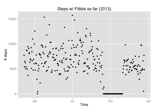
The first thing I wanted to see is the most obvious one: my steps. As you can see in the figure below I started to collect data in March 2013 (with the One), I stopped collecting data around October 2013 (when I lost the One) and I re-started later on (with the Flex). I usually walk between 5,000 and 10,000 steps per day, with a maximum on July 1st (the day we moved). 10,000 steps is the daily goal Fitbit gave me. There is a significant difference in the number of steps measured by the One (before October) and the Flex (after October): I cannot really say if it is due to the change in tracking device (and their different location on the body) or if I kind of reduced my physical activity (mainly because of more work, sitting in the office).

Fitbit steps over time - 2013

As always, I’ll promise to add some physical activity on top of this baseline as a New Year resolution. We’ll see next year how things evolve. In the meantime I’ll explore more what I can extract from my Fitbits in the following posts. Stay tuned!

Belgium doesn’t score well in the Open Data Index (not speaking about health!)

The Open Knowledge Foundation (OKF) released the Open Data Index, along with details on how their methodology. The index contains 70 countries, with UK having the best score and Cyprus the worst score. In fact the first places are trusted by the UK, the USA and the Northern European countries (Denmark, Norway, Finland, Sweden).

And Belgium? Well, Belgium did not score very well: 265 / 1,000. The figure below shows its aggregated score (with green: yes, red: no, blue: unsure).

Open Data Index - Belgium

The issue with this graph is that you may first think it’s a kind of progress bar. For instance, in transport timetables, it seems Belgium reached 60% of a maximum. But the truth is that each bar represents the answer to a specific question. So the 9 questions are, from left to right:

  1. Does the data exist?
  2. Is it in digital form?
  3. Is it publicly available?
  4. Is it free of charge?
  5. Is it online?
  6. Is it machine readable (e.g. spreadsheet, not PDF)?
  7. Is it available in bulk?
  8. Is it open licensed?
  9. Is it up-to-date?

With the notable exceptions of government spending and postcodes/zipcodes, nearly all Belgian data is available in a way or another. That’s already a start – but … None of them are available in bulk nor machine readable nor openly licenced and only few of them are up to date. Be sure to read the information bubbles on the right of the table if you are interested in more details.

The national statistics category leads to a page of tbe Belgian National Bank. And here is one improvement that the OKF could bring to this index: there should be a category about health data. For Belgium we are stuck with some financial data from the INAMI (in PDF, not at all useful as is) but otherwise we have to rely on specific databases or the WHO, the OECD or the World Bank. The painful point is that these supranational bodies often rely on statistics from states themselves – but Belgium doesn’t publish these data by itself!

If you are interested in the topic, three researchers from the Belgian Scientific Institute of Public Health published a study about health indicators in publicly available databases, 2 years ago [1]. Their conclusions were already that Belgium should improve on Belgian mortality and health status data. And the conclusion goes on about politically created issues for data collection, case definition, data presentation, etc.

I was recently in a developping country (Vietnam) where we try to improve data collection: without reliable data collection it is difficult to know what are the issues and to track potential improvements. In the end, this is also applicable in Belgium: we feel proud of our healthcare system ; but on the other hand it is difficult to find health-related data in an uniform way. It is therefore difficult to track trends or improvements.

[1] Vanthomme K, Walckiers D, Van Oyen H. Belgian health-related data in three international databases. Arch Public Health. 2011 Nov 1;69(1):6.

Map of GAVI eligible countries in R

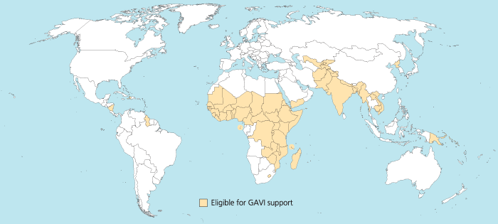
I was trying to reproduce the map of the GAVI Alliance eligible countries (btw I was surprised India is eligible – but that’s the beauty of relying on numbers only and not assumptions) in R. This is the original map (there are 57 countries eligible):

map_GAVI-eligible_countries_700x315_700

I started to use the R package rworldmap because it seemed the most appropriate for this task. Everything went fine. Most of the time was spent converting the list of countries from plain English to plain “ISO3” code as required (ISO3 is in fact ISO 3166-1 alpha-3). I took my source from Wikipedia.

Well, that was until joinCountryData2Map gave me this reply:

54 codes from your data successfully matched countries in the map
3 codes from your data failed to match with a country code in the map
189 codes from the map weren’t represented in your data

I should have better simply read the documentation: there is another small command that needs not to be overlooked, rwmGetISO3. What are the three codes that failed to match?

Although you can compare visually the map produced with the map above, R (and rworldmap) can indirectly give you the culprits:

tC2 = matrix(c("Afghanistan", "Bangladesh", "Benin", "Burkina Faso", "Burundi", "Cambodia", "Cameroon", "Central African Republic", "Chad", "Comoros", "Congo, Dem Republic of", "Côte d'Ivoire", "Djibouti", "Eritrea", "Ethiopia", "Gambia", "Ghana", "Guinea", "Guinea Bissau", "Haiti", "India", "Kenya", "Korea, DPR", "Kyrgyz Republic", "Lao PDR", "Lesotho", "Liberia", "Madagascar", "Malawi", "Mali", "Mauritania", "Mozambique", "Myanmar", "Nepal", "Nicaragua", "Niger", "Nigeria", "Pakistan", "Papua New Guinea", "Rwanda", "São Tomé e Príncipe", "Senegal", "Sierra Leone", "Solomon Islands", "Somalia", "Republic of Sudan", "South Sudan", "Tajikistan", "Tanzania", "Timor Leste", "Togo", "Uganda", "Uzbekistan", "Viet Nam", "Yemen", "Zambia", "Zimbabwe"), nrow=57, ncol=1)
apply(tC2, 1, rwmGetISO3)

In the results, some countries are actually given in a slightly different way by GAVI than in R. For instance “Congo, Dem Republic of” should be changed for rworldmap in “Democratic Republic of the Congo” (ISO3 code: COD). Or “Côte d’Ivoire” should be changed for rworldmap in “Ivory Coast” (ISO3 code: CIV). An interesting resource for country names recognised by rworld map is the UN Countries or areas, codes and abbreviations. Once you correct this, you can have your map of GAVI-eligible countries:

GAVIcountries-eligibles-map3-jepoirrier

And here is the code:

# Displays map of GAVI countries
library(rworldmap)
theCountries <- c("AFG", "BGD", "BEN", "BFA", "BDI", "KHM", "CMR", "CAF", "TCD", "COM", "COD", "CIV", "DJI", "ERI", "ETH", "GMB", "GHA", "GIN", "GNB", "HTI", "IND", "KEN", "PRK", "KGZ", "LAO", "LSO", "LBR", "MDG", "MWI", "MLI", "MRT", "MOZ", "MMR", "NPL", "NIC", "NER", "NGA", "PAK", "PNG", "RWA", "STP", "SEN", "SLE", "SLB", "SOM", "SDN", "SSD", "TJK", "TZA", "TLS", "TGO", "UGA", "UZB", "VNM", "YEM", "ZMB", "ZWE")
GaviEligibleDF <- data.frame(country = c("AFG", "BGD", "BEN", "BFA", "BDI", "KHM", "CMR", "CAF", "TCD", "COM", "COD", "CIV", "DJI", "ERI", "ETH", "GMB", "GHA", "GIN", "GNB", "HTI", "IND", "KEN", "PRK", "KGZ", "LAO", "LSO", "LBR", "MDG", "MWI", "MLI", "MRT", "MOZ", "MMR", "NPL", "NIC", "NER", "NGA", "PAK", "PNG", "RWA", "STP", "SEN", "SLE", "SLB", "SOM", "SDN", "SSD", "TJK", "TZA", "TLS", "TGO", "UGA", "UZB", "VNM", "YEM", "ZMB", "ZWE"),
GAVIeligible = c(1, 1, 1, 1, 1, 1, 1, 1, 1, 1, 1, 1, 1, 1, 1, 1, 1, 1, 1, 1, 1, 1, 1, 1, 1, 1, 1, 1, 1, 1, 1, 1, 1, 1, 1, 1, 1, 1, 1, 1, 1, 1, 1, 1, 1, 1, 1, 1, 1, 1, 1, 1, 1, 1, 1, 1, 1))
GAVIeligibleMap <- joinCountryData2Map(GaviEligibleDF, joinCode = "ISO3", nameJoinColumn = "country") mapCountryData(GAVIeligibleMap, nameColumnToPlot="GAVIeligible", catMethod = "categorical", missingCountryCol = gray(.8))

Today is world diabetes day (Merck ends MK-0431E)

As WHO and other organisations are celebrating World Diabetes Day (WDD) it is always sad to read that a new potential drug is stopped.

This time Merck & co. stopped the clinical trial MK-0431E studying the co-administration of Sitagliptin and Atorvastatin in inadequately controlled Type 2 Diabetes Mellitus. Merck cites “business reasons” without further explanations.

Sitagliptin is sold under the trade name Januvia. It is an oral antihyperglycemic and one of the (if not the) best selling product of Merck with US$975 million revenue in the third quarter of 2012. On the other hand Atorvastatin is a statin lowering blood cholesterol. It was a blockbuster for Pfizer (sold under the trade name of Lipitor) until its patent expired.

Combining these two molecules made biological sense in order to reduce the number of medications that diabetic patients take. Of course combining two blockbusters (including one which patent expired) is a nice attempt to maintain drugs and positions on market.

Happy Halloween! (Pharma Q3 results and job losses so far)

Happy Halloween! It’s the season for Q3 reports a bit everywhere so also in Pharma: Abbott (↑), Elan (↑), Eli Lilly (↓), Bristol-Myers Squibb (↓), Sanofi (↓), Novartis (↓), Shire (↑), AstraZeneca (↓), Merck & Co (↑), Novo Nordisk (↑), GlaxoSmithKline (↓), …

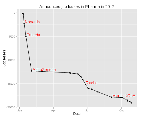
At approximately the same time came a FirstWord List about the largest layoffs in Pharma so far (2012) … I just plotted the losses so far below. Spooky!

Layoffs in Pharma so far (2012)

Idea shared #2 – the feedback toothbrush

After the T-shirt that measures your sleep better than an app, here is idea #2: the toothbrush that provides some feedback.

The idea is simple – so simple it was already applied elsewhere. The idea is to provide feedback about the quality of the way people brush their teeth. The Brushduino focuses on entertaining kids to keep them brushing at the right place for the right amount of time. Other projects (with many variants) focus specifically on time spent brushing.

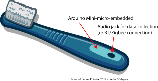
I think embedded projects can go an extra mile (provided they are small enough). You can embark a gyroscope and take into account the types and amount of movements you make while brushing your teeth. This way you also have the time you did it anyway. The toothbrush could communicate with a computer to transmit the data. I guess being offline would save some space at the price of direct feedback. This direct feedback could also come in a simplified way, a bit like the Nike+ Fuelband does: it is not an exact measure that you need but merely the fact you brushed vigorously enough and during enough time. The way a gyroscope work should give the space covered – indirectly if you covered every teeth (to be checked). Connection of the toothbrush to a smartphone or a computer could provide the numerical data as well as some social features (as long as you think brushing your teeth can be something shared with your friends).

In terms of design it could look simply like this:

This kind of device will not replace advices given by dentists. But it can help / accompany people during their daily activities.

Would you buy this device?

Creative Commons Licence
This work is licensed under a Creative Commons Attribution-ShareAlike 3.0 Unported License.

Idea shared #1 – measure your sleep

I don’t consider having more or better ideas than others. But I gradually realized I have less and less time for some activities like programming, electronics etc. Maybe that’s how we realize we are getting older now adults. So I decided to share these ideas rather than fueling the illusory idea that I will implement them one day.

So idea 1 is about measuring sleep. I recorded animals’sleep during my Ph.D. – but it was thanks to an EEG device. I think that if you want to understand or improve something you have to first measure it in a way or another. So I started to try to measure my own sleep with an app (Sleep Cycle). But despite its good reviews it doesn’t work, at least for me.

For instance the chart below is supposed to represent my sleep cycle for the night of the September 14th, 2012. I was certainly not in deep sleep at 1.30AM (baby did not want me to sleep immediately). I also woke up around 4AM (baby was again the reason). And I woke up at 6.45 (with a backup clock – had to wake up for work)?

My Sleep Graph with Sleep Cycle app for September 14th, 2012 night

The last version of the Sleep Cycle app improves things a bit by providing more statistics (so at last you can rely on the approximate time slept and compare your “sleep” across days etc.), more beautiful gaphs and the ability to download raw data. Don’t be fooled however, “raw data” means only start time, end time, sleep quality (how is it measured?), time in bed, number of wake ups and sleep notes. You unfortunately won’t be able to reproduce anything like the graph above.

Hardware devices like the Wakemate or the Zeo might give better results because part of the solution is using a real accelerometer. But the Up story shows that not everything is obvious in this world.

For me the fundamental flaw is to rely only on body movements to detect, quantify and even score sleep. Of course there is an abundant scientific literature about how muscle tone (of different muscles) is related to sleep stages (see here and here for introductory texts). But this is often measured by electrodes glued on your body.

So I think it could be very easy to develop a simple, cheap “sleep T-shirt” with light electrodes that will just stick to your body when you sleep (and you put enough of them so at any time at least some of them are connected). In fact it might happen that the Rest SleepShirt would already do the job – it’s a pity they don’t elaborate more on how they measure and collect data (but I understand they will want to sell the product later on ;-)). In my idea light wires would then go to a small pouch where they would be connected to something like a LilyPad Arduino (because it is flexible and can be sewed to a T-shirt – there may be other devices available). The LilyPad would serve as data collector or as data transmitter to a computer / a smartphone / a specific receiver (coupled to a real clock, like the Zeo). The advantage would be to remain sole owner of your sleep data – but of course the business plan should include some “social” features 😉

In the end it should look a bit like this:

Idea shared #1 - measure your sleep with sleep T-shirtThe other advantage would be that in such way you may also measure electrical activity through the body.

Will it work? I’m sure of it. Will it be enough to sleep correctly? I don’t think so: it’s not because you measure something that it improves. But at least you will have some clue on what is going on. Some other advices may be interesting. And for the moment nothing replaces a visit to a real doctor / sleep specialist!

Creative Commons Licence
This work is licensed under a Creative Commons Attribution-ShareAlike 3.0 Unported License.

Forget pills, here comes e-pills!

The US FDA recently approved Proteus Digital Health Ingestion Event Marker (IEM). Basically, it’s a pill with some electronics attached (very tiny electronics: around 0.5mm in diameter for a total weigth of 5mg, see picture below). Once activated the pill transmit a signal and, coupled with a detector, you know when the pill got into your body.

Edible sensor for electronically confirming adherence to oral medications.
Edible sensor for electronically co-encapsulated with a drug product using a sensor-enabled capsule carrier (from Au-Yeung et al. at Wireless Health 2010)

When you think of it, it seems very interesting. The direct potential application (Proteus is only making the IEM, not the pill itself on which the IEM is attached) is to monitor when a patient actually take her/his pills. Or for the patient, just to remember if the pill was taken already or not (you can also use boxes with specific places for each day). Some people see here a plot against human health in general – maybe. But as I use to say: watch the use, don’t punish the tools. The IEM could of course be used to ensure patient’s compliance and increase the surveillance. But on the other end, the IEM could also help decide if a properly taken medication (from “Big Pharma” or from “natural products”) is indeed efficacious.

Another direct application is the correct identification of pills before consumption. There are a lot of websites that will help us correctly identify pills found outside boxes at home (see here for instance). If you activate the IEM on a pill, the signal emitted can directly tell you which medication it is. Provided the signal emitted contains an unique signature.

And there I have some questions … Kit Yee Au-Yeung and her colleagues published an abstract (PDF) at Wireless Health 2010 about the technology. The detailed paper explains well some aspects of the IEM like the way the battery actually uses the patient’s body fluids to power a redox reaction (very simple – hence clever to use it here). But the paper doesn’t say the distance at which the signal can be recorded nor how this signal is encoded.

Antenna Antenna montaggio completo (amplificatore e elementi radianti)How far can you measure the signal from this IEM? The paper states that the “communication process remains entirely within the body; it is unnoticed by and not detectable beyond the patient consumer“. It goes into several measures during the reported clinical studies but does not mention how far the signal can be measured. In my opinion, the IEM signal cannot be detected from very far for various reasons: the statement copied above, the output of this type of redox reaction and size of substrate used and the way they define their scheduling adherence. In this definition, a “sensor-enabled medication was considered taken “on-time” when ingested within ± 1 hour and ± 2 hours of the specified time“. Since the IEM is activated as soon as in contact with body fluids and the sensor/detector is placed approximately next to the stomach, I guess the sensor only detects the IEM signal when the IEM actually reaches the stomach. I wonder if one would place the sensor just below the throat, will the time-to-detection be shortened?

COS6100A OSCILLOSCOPE 100MHZHow is the signal encoded? The paper reports an identification accuracy of 100%, meaning all detected sensors were correctly identified. It also reports a sensitivity of 97.7%, meaning the study did not detect the negative controls in 97.7% of cases of ingested negative controls. Good. Now what happens if you ingest several different medications at the same time? They will most probably reach the stomach at the same time too and their respective signals will be detected at the same time. The paper says that the sensor/detector “interprets the information from the edible sensor, identifies it as unique“. How? We don’t know. From previous experiment I know it is feasible to encode a somehow unique signal in 5mm of electronics. Up to how many different signals can be encoded (and decoded, given a weak signal)? This will give the maximum number of e-pills you can ingest at the same time.

Although the FDA only approved it for placebo pills so far, it is a very interesting first step towards the control/cure of chronic diseases, sometimes requiring to follow a long-term medication plan. Although the pill is kind of passive and the whole system (*) only measures when a pill is actually ingested, more active e-pills will come to market, for instance only releasing one of their drugs when receiving a signal or delivering a dose adapted to the environment in which they are. Later on you can imagine e-pills acting like Proteus (sic!) in the Fantastic Voyage

A video for the end? There is an official video on Vimeo but I like this one:

(*) the whole system involves a wearable sensor/detector/patch as well as a “social” application on smartphone. The sensor was already approved by the FDA a long time ago (under the name of “Raisin Personal Monitor”). From the official screenshot the app also reports activity (including sleep), heart beat, blood pressure, etc. (as many other apps around now). Could be cool to try this!

Photo credits: antenna picture by Giacomo Boschi on Flickr (CC-by) and oscilloscope signal by Mikael Alternark on Flickr (CC-by).

Effects of Tobacco on health – visualized

As you probably know I am interested in both diseases (and health in general) as well as visualization. Recently Online Nursing Programs (*) invited me to have a look at their latest infographics about the effects of tobacco on health (directly to figure).

Although numbers seem correct (references are at the bottom), although they intelligently re-use the presentation of some well-known tobacco companies, there is one thing that I don’t like that much: like this sentence, the figure is very, very long. You have to scroll many pages in order to see everything. It may look like a story but it is not presented as such (I mean: there are no clear marks of different steps in the story, except the three “chapters”). On the right is the complete figure in exactly 800 pixels of height – can you read something? GOOD.is solved this issue by using a Flash player that allows the viewer to woom in/out and go to different sections of the figure (see here for instance).

Now, about smoking … Smokers do what they want with their health. Of course, I criticise the physical dependency, the effects on social security and indirectly on everyone’s capacity to react to other health issues. And of course I hope that people could stop smoking. But in my opinion the most disgusting thing about tobacco is secondhand smoking (aka. passive smoking): the inhalation of smoke by persons other than the active smoker. This passive smoking is especially harmful in young children. The CDC estimated that it is responsible for an estimated 150,000–300,000 new cases of bronchitis and pneumonia annually, as well as approximately 7,500–15,000 hospitalizations annually in the United States – both in children below 18 months. And in adults, passive smoking increase the risk of heart disease and lung cancer by 20-30%. Without doing anything – just inhaling smoke from your neighbour.

So it was a very nice idea from them to draw people’s attention to these health issues. It could have been better if the figure would have been more “readable” IMHO.

(*) Unfortunately for them, “Online Nursing Programs” sounds like a website that will just ask for your credit card number although they publish nice infographics – like this other one about sanitation. The About page that doesn’t say who they are add to these doubts.

Created by Online Nursing Programs, license CC-…