How to write data from Matlab to Excel (especially when you don’t have Excel)

If you are using Matlab on a MS-Windows PC with MS-Excel installed, there is no problem reading and writing data to Excel (in case your users/customers only understand this software but you still want to do the computations in Matlab). Here is the code to read (1st line) and write (2nd line):

inputs = xlsread('inputfile.xls', 'inData', 'A1:B3');
[writeStatus, writeMsg] = xlswrite('outputfile.xls', myMatrix, 'outData', 'A1');

Now, there are several reasons why you may not be able to read and write directly to an Excel file: you have Matlab but

  • you are on MS-Windows but MS-Excel is not installed (if you use OpenOffice.org, csv files in general or on a server where even Microsoft discourage the use of Excel in back-end, see “More information” here);
  • you are on MacOS;
  • you are on Linux;
  • etc.

matlab rubiks cubeMatlab provides a basic way to read and write in these cases: xlsread() will only read some xls files (saved as version 97-2003, which should not be an issue – at least this is an Excel file) ; xlswrite() will only write a .csv file. So you can’t deliver the Excel output.

Fortunately Open Source software is here to help you!

Indeed two recently published code on Matlab Central allow you to write “directly” to Excel.

The first solution is provided by Marin Deresco and apparently uses his own binder to Excel. The most simple code is:

display(['Add Java paths']);
javaaddpath('D:\JExcelAPI\jxl.jar');
javaaddpath('D:\JExcelAPI\MXL.jar');

display(['Writing matrix to file']);
writeStatus = xlwrite('output.xls', myMatrix, 'outData');
display(['writeStatus: "' num2str(writeStatus) '"']); % 1 = success, 0 = failure

I advise you to put the two .jar files in a central location (as done in the code above). That way all you functions will have access to the same version of these files (and updating them for all your projects will be much easier).

But there are three small issues. First the generated matrix will contain only text fields (and they are formatted as text fields, not numbers) ; it doesn’t really matter because Excel can then use this text as numbers directly. Then the second issue is that although it will actually write the requested data, there will be an error when opening the Excel file if you specified a sheet (‘outData’ here) that already exists. Finally you can only start writing at A1.

The second solution is provided by Alec de Zegher, partly in response to the limitation of the previous code. Alec is taking advantage of the Apache POI java library to handle the writing-side. His code also allows to start writing anywhere in the sheet. And it uses the same call structure:

display(['Add Java paths']);
javaaddpath('D:\poi_library\poi-3.8-20120326.jar');
javaaddpath('D:\poi_library\poi-ooxml-3.8-20120326.jar');
javaaddpath('D:\poi_library\poi-ooxml-schemas-3.8-20120326.jar');
javaaddpath('D:\poi_library\xmlbeans-2.3.0.jar');
javaaddpath('D:\poi_library\dom4j-1.6.1.jar');

display(['Writing matrix to file']);
writeStatus = xlwrite('output.xls', myMatrix, 'outData', 'B2');
display(['writeStatus: "' num2str(writeStatus) '"']); % 1 = success, 0 = failure

As you can see there are some more .jar to add. On the other hand, it uses a syntax that is very similar to the previous one and to the original Matlab command. Thanks, Marin and Alec, for this great help!

This was tested on Matlab R2012a on a Windows XP 64-bits and with the MCR (same version) on a Windows 2008 64-bits – according to the respective pages for the code, it should work on Mac and other platforms/configurations too.
Photo credits: matlab rubiks cube by gusset, on Flickr (licence by-nc-sa)
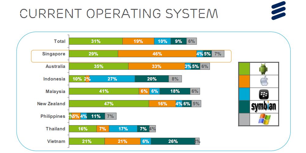
Android-based smartphones market share in Asia

31%

Tonight I was wondering what was Android market share in Asia. It is 31% according to a recent study from Ericsson’s ConsumerLab group (reported by TechRepublic). Although dominant through most studied countries, Android is not dominant in Singapore (iOS has 46%), in Indonesia (RIM has 29%) nor in Vietnam (Symbian has 26%).

Last year ABI Research released a study where they showed that Android-based smartphones market share grew from 16% in 2010 to 52% in 2011 (but this included tablets and did not cover exactly the same countries as the Ericsson study). Voila 🙂

Today is world diabetes day (Merck ends MK-0431E)

As WHO and other organisations are celebrating World Diabetes Day (WDD) it is always sad to read that a new potential drug is stopped.

This time Merck & co. stopped the clinical trial MK-0431E studying the co-administration of Sitagliptin and Atorvastatin in inadequately controlled Type 2 Diabetes Mellitus. Merck cites “business reasons” without further explanations.

Sitagliptin is sold under the trade name Januvia. It is an oral antihyperglycemic and one of the (if not the) best selling product of Merck with US$975 million revenue in the third quarter of 2012. On the other hand Atorvastatin is a statin lowering blood cholesterol. It was a blockbuster for Pfizer (sold under the trade name of Lipitor) until its patent expired.

Combining these two molecules made biological sense in order to reduce the number of medications that diabetic patients take. Of course combining two blockbusters (including one which patent expired) is a nice attempt to maintain drugs and positions on market.

Happy Halloween! (Pharma Q3 results and job losses so far)

Happy Halloween! It’s the season for Q3 reports a bit everywhere so also in Pharma: Abbott (↑), Elan (↑), Eli Lilly (↓), Bristol-Myers Squibb (↓), Sanofi (↓), Novartis (↓), Shire (↑), AstraZeneca (↓), Merck & Co (↑), Novo Nordisk (↑), GlaxoSmithKline (↓), …

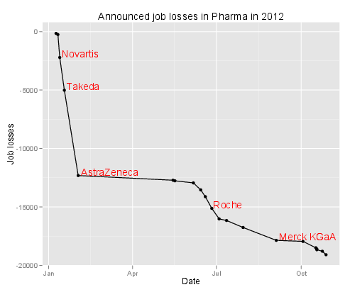
At approximately the same time came a FirstWord List about the largest layoffs in Pharma so far (2012) … I just plotted the losses so far below. Spooky!

Layoffs in Pharma so far (2012)

I wish I were not that connected

Before:

We had a fixed phone line at home. We had a fixed phone line on our desk at the office. There was a letterbox in front of the house and a pigeon hole at some central location in the office.
And we were not reachable when sleeping, when in meeting, when commuting, …

Now:

We have a fixed phone line at home. We have a fixed phone line on our desk at the office. We have a mobile phone in our pocket or connected to the hands-free system in the car. The computers and tablet are running Skype or another communication software that shows every contact if we are “available”, “busy” or “not to be disturbed”. There are still letterboxes and pigeon holes but also e-mails, instant messaging, …
The fixed lines fall back on the mobile if there is no answer after 5 tones. We are reachable when sleeping, when in meeting, when commuting, … People call you when you don’t answer their e-mail after 5-10 minutes.

Next week:

I will be abroad, following some conference. What if I only carry a wifi-enabled music player running just Skype? I will be reachable between talks not during talks, at the conference center but not when commuting, at the hotel but not when reading or sleeping. Will it really make a difference? I wish I were not that connected.

P.S. of course this is a first world problem:

🙂

Idea shared #2 – the feedback toothbrush

After the T-shirt that measures your sleep better than an app, here is idea #2: the toothbrush that provides some feedback.

The idea is simple – so simple it was already applied elsewhere. The idea is to provide feedback about the quality of the way people brush their teeth. The Brushduino focuses on entertaining kids to keep them brushing at the right place for the right amount of time. Other projects (with many variants) focus specifically on time spent brushing.

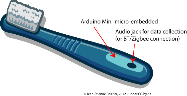
I think embedded projects can go an extra mile (provided they are small enough). You can embark a gyroscope and take into account the types and amount of movements you make while brushing your teeth. This way you also have the time you did it anyway. The toothbrush could communicate with a computer to transmit the data. I guess being offline would save some space at the price of direct feedback. This direct feedback could also come in a simplified way, a bit like the Nike+ Fuelband does: it is not an exact measure that you need but merely the fact you brushed vigorously enough and during enough time. The way a gyroscope work should give the space covered – indirectly if you covered every teeth (to be checked). Connection of the toothbrush to a smartphone or a computer could provide the numerical data as well as some social features (as long as you think brushing your teeth can be something shared with your friends).

In terms of design it could look simply like this:

This kind of device will not replace advices given by dentists. But it can help / accompany people during their daily activities.

Would you buy this device?

Creative Commons Licence
This work is licensed under a Creative Commons Attribution-ShareAlike 3.0 Unported License.

Idea shared #1 – measure your sleep

I don’t consider having more or better ideas than others. But I gradually realized I have less and less time for some activities like programming, electronics etc. Maybe that’s how we realize we are getting older now adults. So I decided to share these ideas rather than fueling the illusory idea that I will implement them one day.

So idea 1 is about measuring sleep. I recorded animals’sleep during my Ph.D. – but it was thanks to an EEG device. I think that if you want to understand or improve something you have to first measure it in a way or another. So I started to try to measure my own sleep with an app (Sleep Cycle). But despite its good reviews it doesn’t work, at least for me.

For instance the chart below is supposed to represent my sleep cycle for the night of the September 14th, 2012. I was certainly not in deep sleep at 1.30AM (baby did not want me to sleep immediately). I also woke up around 4AM (baby was again the reason). And I woke up at 6.45 (with a backup clock – had to wake up for work)?

My Sleep Graph with Sleep Cycle app for September 14th, 2012 night

The last version of the Sleep Cycle app improves things a bit by providing more statistics (so at last you can rely on the approximate time slept and compare your “sleep” across days etc.), more beautiful gaphs and the ability to download raw data. Don’t be fooled however, “raw data” means only start time, end time, sleep quality (how is it measured?), time in bed, number of wake ups and sleep notes. You unfortunately won’t be able to reproduce anything like the graph above.

Hardware devices like the Wakemate or the Zeo might give better results because part of the solution is using a real accelerometer. But the Up story shows that not everything is obvious in this world.

For me the fundamental flaw is to rely only on body movements to detect, quantify and even score sleep. Of course there is an abundant scientific literature about how muscle tone (of different muscles) is related to sleep stages (see here and here for introductory texts). But this is often measured by electrodes glued on your body.

So I think it could be very easy to develop a simple, cheap “sleep T-shirt” with light electrodes that will just stick to your body when you sleep (and you put enough of them so at any time at least some of them are connected). In fact it might happen that the Rest SleepShirt would already do the job – it’s a pity they don’t elaborate more on how they measure and collect data (but I understand they will want to sell the product later on ;-)). In my idea light wires would then go to a small pouch where they would be connected to something like a LilyPad Arduino (because it is flexible and can be sewed to a T-shirt – there may be other devices available). The LilyPad would serve as data collector or as data transmitter to a computer / a smartphone / a specific receiver (coupled to a real clock, like the Zeo). The advantage would be to remain sole owner of your sleep data – but of course the business plan should include some “social” features 😉

In the end it should look a bit like this:

Idea shared #1 - measure your sleep with sleep T-shirtThe other advantage would be that in such way you may also measure electrical activity through the body.

Will it work? I’m sure of it. Will it be enough to sleep correctly? I don’t think so: it’s not because you measure something that it improves. But at least you will have some clue on what is going on. Some other advices may be interesting. And for the moment nothing replaces a visit to a real doctor / sleep specialist!

Creative Commons Licence
This work is licensed under a Creative Commons Attribution-ShareAlike 3.0 Unported License.

Forget pills, here comes e-pills!

The US FDA recently approved Proteus Digital Health Ingestion Event Marker (IEM). Basically, it’s a pill with some electronics attached (very tiny electronics: around 0.5mm in diameter for a total weigth of 5mg, see picture below). Once activated the pill transmit a signal and, coupled with a detector, you know when the pill got into your body.

Edible sensor for electronically confirming adherence to oral medications.
Edible sensor for electronically co-encapsulated with a drug product using a sensor-enabled capsule carrier (from Au-Yeung et al. at Wireless Health 2010)

When you think of it, it seems very interesting. The direct potential application (Proteus is only making the IEM, not the pill itself on which the IEM is attached) is to monitor when a patient actually take her/his pills. Or for the patient, just to remember if the pill was taken already or not (you can also use boxes with specific places for each day). Some people see here a plot against human health in general – maybe. But as I use to say: watch the use, don’t punish the tools. The IEM could of course be used to ensure patient’s compliance and increase the surveillance. But on the other end, the IEM could also help decide if a properly taken medication (from “Big Pharma” or from “natural products”) is indeed efficacious.

Another direct application is the correct identification of pills before consumption. There are a lot of websites that will help us correctly identify pills found outside boxes at home (see here for instance). If you activate the IEM on a pill, the signal emitted can directly tell you which medication it is. Provided the signal emitted contains an unique signature.

And there I have some questions … Kit Yee Au-Yeung and her colleagues published an abstract (PDF) at Wireless Health 2010 about the technology. The detailed paper explains well some aspects of the IEM like the way the battery actually uses the patient’s body fluids to power a redox reaction (very simple – hence clever to use it here). But the paper doesn’t say the distance at which the signal can be recorded nor how this signal is encoded.

Antenna Antenna montaggio completo (amplificatore e elementi radianti)How far can you measure the signal from this IEM? The paper states that the “communication process remains entirely within the body; it is unnoticed by and not detectable beyond the patient consumer“. It goes into several measures during the reported clinical studies but does not mention how far the signal can be measured. In my opinion, the IEM signal cannot be detected from very far for various reasons: the statement copied above, the output of this type of redox reaction and size of substrate used and the way they define their scheduling adherence. In this definition, a “sensor-enabled medication was considered taken “on-time” when ingested within ± 1 hour and ± 2 hours of the specified time“. Since the IEM is activated as soon as in contact with body fluids and the sensor/detector is placed approximately next to the stomach, I guess the sensor only detects the IEM signal when the IEM actually reaches the stomach. I wonder if one would place the sensor just below the throat, will the time-to-detection be shortened?

COS6100A OSCILLOSCOPE 100MHZHow is the signal encoded? The paper reports an identification accuracy of 100%, meaning all detected sensors were correctly identified. It also reports a sensitivity of 97.7%, meaning the study did not detect the negative controls in 97.7% of cases of ingested negative controls. Good. Now what happens if you ingest several different medications at the same time? They will most probably reach the stomach at the same time too and their respective signals will be detected at the same time. The paper says that the sensor/detector “interprets the information from the edible sensor, identifies it as unique“. How? We don’t know. From previous experiment I know it is feasible to encode a somehow unique signal in 5mm of electronics. Up to how many different signals can be encoded (and decoded, given a weak signal)? This will give the maximum number of e-pills you can ingest at the same time.

Although the FDA only approved it for placebo pills so far, it is a very interesting first step towards the control/cure of chronic diseases, sometimes requiring to follow a long-term medication plan. Although the pill is kind of passive and the whole system (*) only measures when a pill is actually ingested, more active e-pills will come to market, for instance only releasing one of their drugs when receiving a signal or delivering a dose adapted to the environment in which they are. Later on you can imagine e-pills acting like Proteus (sic!) in the Fantastic Voyage

A video for the end? There is an official video on Vimeo but I like this one:

http://www.youtube.com/watch?v=WYlzqrgcLi8

(*) the whole system involves a wearable sensor/detector/patch as well as a “social” application on smartphone. The sensor was already approved by the FDA a long time ago (under the name of “Raisin Personal Monitor”). From the official screenshot the app also reports activity (including sleep), heart beat, blood pressure, etc. (as many other apps around now). Could be cool to try this!

Photo credits: antenna picture by Giacomo Boschi on Flickr (CC-by) and oscilloscope signal by Mikael Alternark on Flickr (CC-by).

Effects of Tobacco on health – visualized

As you probably know I am interested in both diseases (and health in general) as well as visualization. Recently Online Nursing Programs (*) invited me to have a look at their latest infographics about the effects of tobacco on health (directly to figure).

Although numbers seem correct (references are at the bottom), although they intelligently re-use the presentation of some well-known tobacco companies, there is one thing that I don’t like that much: like this sentence, the figure is very, very long. You have to scroll many pages in order to see everything. It may look like a story but it is not presented as such (I mean: there are no clear marks of different steps in the story, except the three “chapters”). On the right is the complete figure in exactly 800 pixels of height – can you read something? GOOD.is solved this issue by using a Flash player that allows the viewer to woom in/out and go to different sections of the figure (see here for instance).

Now, about smoking … Smokers do what they want with their health. Of course, I criticise the physical dependency, the effects on social security and indirectly on everyone’s capacity to react to other health issues. And of course I hope that people could stop smoking. But in my opinion the most disgusting thing about tobacco is secondhand smoking (aka. passive smoking): the inhalation of smoke by persons other than the active smoker. This passive smoking is especially harmful in young children. The CDC estimated that it is responsible for an estimated 150,000–300,000 new cases of bronchitis and pneumonia annually, as well as approximately 7,500–15,000 hospitalizations annually in the United States – both in children below 18 months. And in adults, passive smoking increase the risk of heart disease and lung cancer by 20-30%. Without doing anything – just inhaling smoke from your neighbour.

So it was a very nice idea from them to draw people’s attention to these health issues. It could have been better if the figure would have been more “readable” IMHO.

(*) Unfortunately for them, “Online Nursing Programs” sounds like a website that will just ask for your credit card number although they publish nice infographics – like this other one about sanitation. The About page that doesn’t say who they are add to these doubts.

Created by Online Nursing Programs, license CC-…

Visualizing categorical data in mosaic with R

A few posts ago I wrote about my discomfort about stacked bar graphs and the fact I prefer to use simple table with gradients as background. My only regret then was that the table was built in a spreadsheet. I would have liked to keep the data as it is but also have a nice representation of these categorical data.

This evening I spent some time analysing results from a survey and took the opportunity to buid these representations in R.

The exact topic of the survey doesn’t matter here. Let just say it was a survey about opinion and recommendations on some people. The two questions were:

  1. How do you think these persons were, last year? Possible answers were: very bad, bad, average, good or very good.
  2. Would you recommend these persons for next year? Possible answers were just yes or no.

For the first question, the data was collected in a text file according to these three fields: Person, Opinion, Count. Data was similar to this:

Person,Opinion,Count
Person 1,Very bad,0
Person 1,Bad,0
Person 1,Average,4
Person 1,Good,9
Person 1,Very good,3
Person 2,Very bad,3
Person 2,Bad,4
Person 2,Average,4
Person 2,Good,5
Person 2,Very good,0

The trick to represent this is to use  geom_tiles (from ggplot2) to display each count. There is an additional work to be done in order to have the Opinion categories in the right order. The code is the following:

library(ggplot2)
data1 <- read.table("resultsQ1.txt", header=T, sep=",")
scale_count <- c("Very bad", "Bad", "Average", "Good", "Very good")
scale_rep <- c("1", "2", "3", "4", "5")
names(scale_count) <- scale_rep
ggplot(data1, aes(x=Opinion, y=Person)) +
geom_tile(aes(fill=Count)) +
xlim(scale_count) +
scale_fill_gradient(low="white", high="blue")+theme_bw() +
opts(title = "Opinion on persons")

And the graph looks like this:

For the second question, the data was collected in a text file according to these three fields too: Person, Reco, Count. Data was similar to this:

Person,Reco,Count
Person 1,Recommend,16
Person 1,Do not recommend,0
Person 2,Recommend,5
Person 2,Do not recommend,11

And we use approximately the same code:

library(ggplot2)
data2 <- read.table("resultsQ2.txt", header=T, sep=",")
ggplot(data2, aes(x=Reco, y=Person)) +
geom_tile(aes(fill=Count)) +
scale_fill_gradient(low="white", high="darkblue")+theme_bw() +
opts(title = "Recommendations")

And the graph for the second question looks like this:

Easy isn’t it? Do you have other types of visualization for this kind of data?