Category: Reading

Jamie Oliver: Teach every child about food

In the latest TED Prize wish, Jamie Oliver, the “Naked Chef”, talks about teaching every child about food. His wish is:

I wish for your help to create a strong, sustainable movement to educate every child about food, inspire families to cook again and empower people everywhere to fight obesity.

Although I have a child and I’m obviously interested in his idea, I was also interested in the simple bar chart depicting the leading causes of death in the USA. In the tiny Flash video, the text is unfortunately barely legible and I was interested in knowing where he got his data from.

Leading causes of death in the USA from Jamie Oliver's TED talk

The answer is really easy: the leading causes of death in the USA are compiled every year by the (American) National Center for Health Statistics and the results are available on their FastStats website. So, for 2007 (the latest results at the time of writing), the 15 leading causes of death in the USA are (ordered by decreasing number of cases):

Rank Cause Number
1. Diseases of heart * 616,067
2. Malignant neoplasms (cancers) * 562,875
3. Cerebrovascular diseases * 135,952
4. Chronic lower respiratory diseases 127,924
5. Accidents (unintentional injuries) 123,706
6. Alzheimer’s disease 74,632
7. Diabetes mellitus * 71,382
8. Influenza and pneumonia 52,717
9. Nephritis, nephrotic syndrome and nephrosis 46,448
10. Septicemia 34,828
11. Intentional self-harm (suicide) 34,598
12. Chronic liver disease and cirrhosis 29,165
13. Essential hypertension and hypertensive renal disease 23,965
14. Parkinson’s disease 20,058
15. Assault (homicide) 18,361

The exact ICD-10 codes are in this report ; you can find their exact meaning here. Causes with an asterisk are related to food intake, according to Jamie Oliver.

Now you have the numbers, the origin of the data and the methodology used to collect these data. You can watch the presentation:

You’ll find a critique of Jamie Oliver’s talk by Presentation Zen.

A good issue of Nature, obviously!

The October 14th, 2010 issue of Nature is obviously a good one. It had to be a good one! I usually advocate Open Access but it is always nice to reading complimentary issues of Nature which is Closed Access but is also publishing very good articles about science at the same time.

In this issue, I was interested in various topics …

First, there is a serie of articles about the US midterm elections and what (US) scientists feel about two years of Obama administration. Obama promised total transparency in American science, a new era of integrity and more freedom for scientists. From what I read, this isn’t the case yet.

Then, there are two article about publishing computer code from scientific experiment. In a World View, Nick Barnes, director of the Climate Code Foundation takes some concerns about that to pieces. The main reasons to provide computer code is to improve programming skills (the software author’s and others’) and enable others to engage with your research. Don’t be ashamed of the quality of your code. Don’t be afraid of starting the trend if no one around you share their software. Don’t be afraid to refuse support when badly asked for. Don’t overestimate the intellectual property value of your code. Nick Barnes also wrote a blog post about it. And you can comment on the Nature article here.

In a News Feature, Zeeya Merali tells stories of scientists who found themselves in uneasy positions regarding to the software they wrote but, at the same time or later on, realised publishing their software was the best thing to do. Besides formalising one’s training in programming, Zeeya Merali advocates some simple steps to practise “safe software”: use a version-control system ; track sources, data and events ; write testable software ; test the software and encourage sharing of software.

I was also interested in these articles in two ways. First, I also realised the need of a formal training in programming during my Ph.D. and I eventually got a B.Sc. in computer science. In the team and field where I’m now working (Health Economics and modelling of infectious disease), I can clearly see the benefit of having such training. Don’t get me wrong: I meet wonderful colleagues every day who don’t have the training but have lots of skills and can solve lots of problems ; I just often see the ease to grasp algorithms as well as some better procedures and testing that comes with training. And, second, I would like to addd that free software licences are to be considered when publishing your software (for science or not).

In the same issue, there was also a small news about the Europe’s use of research animal. This reminded me of the good-old-days :-). Fundamental biology still account the largest proportion of animal experiments but what intrigued me is the 12.2% of “Other” usage.

There was also a comment on a book, The Professional Guinea Pig, about paid participants in phase I clinical trials. Interesting perspective from “the other side” of trials.

There is also an Outlook on the Lindau Nobel Laureate Meeting. It features interviews with 10 Nobel laureates (it’s always nice to readd their comments on science) and an article about science in the digital age (not yet read but it seems interesting).

Finally, an ad for my previous lab (GIGA ULg) caught my attention, as well as the small article about Science in Belgium. I must however write that this article is a bad summary of the research landscape in Belgium with, for example, mention of only two universities: the KUL and the UCL (we have many more). Souvenirs, souvenirs.

Let my dataset change your mindset

In the previous post, I shared a video of David McCandless giving a talk about information visualisation. One phrase caught my attention and a bit of research lead to a very good discovery. The phrase and context is (emphasis is mine):

We need relative figures that are connected to other data so that we can see a fuller picture, and then that can lead to us changing our perspective. As Hans Rosling, the master, my master, said, “Let the dataset change your mindset“. And if it can do that, maybe it can also change your behavior.

Who is Hans Rosling? A Professor of International Health at Karolinska Institute and Director of the Gapminder Foundation (from Wikipedia). Nothing fancy nor anything related to information visualisation at first sight. Except that the Gapminder Foundation is “a non-profit venture promoting sustainable global development and achievement of the United Nations Millennium Development Goals“. So what? Gapminder also “pursue[s] the development of the Trendalyzer […] [seeking] to unveil the beauty of statistical time series by converting boring numbers into enjoyable, animated and interactive graphics“.

And this software is really great (see screenshot below but, above all, in all Rosling’s videos): from one single interface, you can gather lots of different types and sources of data (about the development of the countries of the world) on the same chart and it nicely display them along more than the two dimensions of your screen. Bubble sizes and colours represent other dimensions. And the whole thing move with time (years).

Trendanalyzer screenshot

What is also very interesting is that you can play with Trendanalyzer (in Gapminder world) and download the data behind it. In addition, Google acquired Trendanalyzer and offers some of its components as a “gadget”: Motion Chart.

The beauty of the software is nothing without appropriate use. And in all of his videos, Hans Rosling makes appropriate use of data visualisation, succeeding in converting messages heavily relying on statistics and various sources of data (not something usually visual attractive) in simple visualisations. As David McCandless said: “It’s effortless; it literally pours in”. By visualising it in such a way, it’s more easy for the dataset to try to change your mindset.

Because the tool isn’t everything. With its help, Hans Rosling is trying to convey messages. And if you watch any of his videos, you’ll see that he effectively succeeds in doing it wether it’s to make you stop talking about “developing” countries or to make you think about the role of the end of poverty in the growth of world population, for example. In his Six Minutes blog, Andrew Dlugan summarises Hans Rosling’s technique in 6 points:

  1. Explain the data axes
  2. Highlight subsets of data
  3. Dig deeper to unwrap data
  4. Place labels close to data points
  5. Answer the “Why?” questions
  6. Complement data with energetic delivery

Hans Rosling presenting The seemingly impossible is possible at TED 2007

Althought some of these techniques were taught or discovered by own practise during B.Sc./M.Sc./Ph.D., the combination of them make a presentation very effective, even in front of a small audience.

Why do I blog this? I watched all Rosling’s videos in one go. Once the current presentation was over, it was difficult to resist to watch the next one. From a general perspective, I’m very interested in all means to ease the way people can grasp huge amount of data and to maintain their interest during presentations. From a more practical perspective, I’m starting to deal with some amount of information for various projects and I’m looking for attractive ways to show them. And I was about to forget Hans Rosling is professor of Global Health, a field close to my current one: Health Economics. You couldn’t dream of a better thing than learning more about your field with interesting ideas and appealing presentations.
What triggered the redaction of this blog post is the release of a 55-minute documentary about Hans Rosling’s life and thoughts on YouTube.

David McCandless on information visualisation

Tonight, I realised that David McCandless was behind informationisbeautiful.net, a blog dedicated to information visualisation which I often mentionned before on this blog.

David McCandless speaking at TED, July 2010

Last month, David McCandless gave a talk at TED, a NGO “devoted to Ideas Worth Spreading”. And it was very interesting to hear him, to put a living face on a blog and to apprehend the amount of work to make such great infographics simple to understand. Here is the video (thanks to the license: CC-by-nc-ndon this page, there is a link to download the high quality video):

http://video.ted.com/assets/player/swf/EmbedPlayer.swf

Why do I blog this? I was always and I am still interested in information visualisation, could it be from others (like the flu tracker or, more modestly, my own attempts (to stay in the flu topic). As David said, everyday, everyone of us is blasted by information design, it’s being poured into our eyes, it’s a “dormant litteracy”. And I am curious of new ways of visually presenting large datasets like at the Hack.lu 2009 InfoVis Contest or results of time-consuming models of disease spread.
But of course, on the other hand, you have to ask the right questions, look from the right angle: the one who master information design may also influence the minds of those who see this information and, more importantly, its interpretation. David McCandless didn’t say anything about this: the responsability of the designer regarding the interpretation of his/her design.

"Facts & data"

A colleague of mine is always hammering home the message of bringing facts and data to a discussion rather than rumors, hearsays and daily newspaper articles. Since a few days (because H1N1 is not a pandemic anymore?), newspapers are coming with another “Superbug” or “Germinator“, wrongly named “NDM-1“. So, before spreading fear, uncertainty and doubt, please read the scientific litterature or, at least, read quality newspapers (articles from The Guardian are quite fair and balanced).

NDM-1 (New Delhi metallo-beta-lactamase) is just the name of a gene in a plasmid that two bacteria at least, K. pneumoniae and E. coli, can carry. This gene makes bacteria resistant to almost all antibiotics. If you want to know more about this gene, Yong’s paper characterised it (access without subscription). Health care agencies know about this issue at least since last year.

Now, you can still go to India and Pakistan. New Delhi is still a safe city to visit. But yes, in general, the world will face a problem in the future because bacteria are becoming resistant to more and more antibiotics.

Cognitive Surplus visualised

In the 300-and-more RSS items in my aggregator this week, there are 2 great ones from Information is Beautiful, a blog gathering (and publishing its own) nice ways to visualise data.

The first one is based on a talk by Clay Shirky who, in turn, was referencing his book Cognitive Surplus. In Cognitive Surplus visualized, David McCandless just represented one of Shirky’s ideas: 200 billion hours are spent each year by US adults just watching TV whereas only 100 million hours were necessary to create Wikipedia (I guess the platform + the content) …

Cognitive Surplus visualised from Information Is Beautiful

It makes you think about either the waste television helps to produce either the potential of human brain(s) if relieved from the burden of television.

The second interesting post appeared in fact in information aesthetics, a blog where form follows data (referencing Information is Beautiful but I can’t find this post). In Top Secret America: Visualizing the National Security Buildup in the U.S., Andrew Vande Moere relates “an extensive investigative project of the Washington Post that describes the huge national security buildup in the United States after the September 11 attacks”. The project website contains all the ingredients for a well-documented investigation with the addition of interactive maps and flash-based interfaces allowing the user to build his/her own view on the project.

Top Secret America from the Washington Post

It’s nice to see investigative journalism combined with beautiful data visualisation and handling!

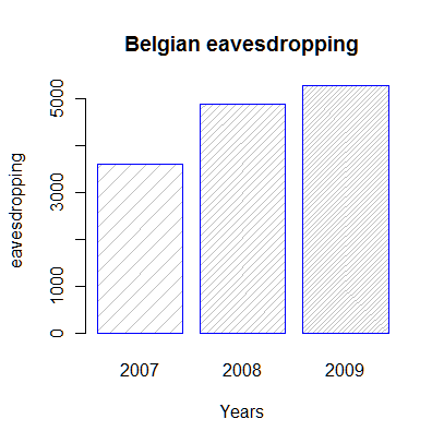
Belgian eavesdropping increased in 2009

Following this article (French), official phone eavesdroppings again increased in Belgium in 2009: Belgian police listened 5265 times to private conversations. The French transcript is here.

Evolution of the number of official eavesdropping in Belgium

One doesn’t get much more than these numbers: nothing about the number of hours spent listening, nothing about the percentage of effectiveness/results, nothing about internet eavesdropping (e-mail e.g.). One thing struck me: all requests for eavesdropping were accepted. Or, at least that what the Minister implied when he wrote “there is no distinction between the number of requests and the number of effective eavesdropping”.

Volcano and CO2 (bis)

Well, now I understand a bit better why experts said the small fall in carbon emissions indirectly due to the volcano is unlikely to have any significant impact on climate (see previous post) … InformationIsBeautiful made a correction following comments and the difference in CO2 emission is smaller:

Comparison of C02 emission by InformationIsBeautiful

However, although the air traffic is to slowly come back to normal, we can still enjoy some very nice moment without any plane in the sky:

Still no plane by jepoirrier on Flickr

Volcano and CO2

One side-effect of the eruption of the Eyjafjallajoekull volcano is that there is no more plane in the European sky for the last few days. On one side, people are obliged to stay longer on holidays, others can’t make business trips, some food and other items can’t be transported, plane companies are crying but train and coach ones are more than happy. The last week-end was sunny and a lot of people enjoyed going outside in North Europe.

Lavender Ash Cloud from tj.blackwell on Flickr

This morning, stuck in a traffic jam, I was wondering what is the amount of CO2 emissions saved by forcing planes to stay on the ground. And I found this great illustration from Information Is Beautiful:

planes or volcanos from InformationIsBeautiful

So, visually, forcing planes to stay on the ground has an impact. But experts says although this has caused a small fall in carbon emissions, it is unlikely to have any significant impact on climate (cited by The Guardian). I don’t really know who these experts are. I guess the newspaper wants us to believe what it wrotes as is. But continuing reading about the subject, one learns that although the industry seems to take the pollution aspect of flights into consideration, we are far from perfection.

Finally, what I like the most in this illustration, it’s that it’s backed by real data (see at the bottom of the cited post). BlueSkyModel.org also has some data on how to compute a flight carbon footprint.

Credits:
First illustration: Lavender Ash Cloud from tj.blackwell on Flickr
Second illustration: Planes or volcanos from InformationIsBeautiful.

Ignite presentation style

Being away from presentations to my dismay since a few months, I always enjoy reading the Presentation Zen blog, Garr Reynold’s blog on issues related to presentation design.

Recently, Garr came back on the Ignite presentation style with a presentation from Pamela Slim. Here is a video recording:

I maybe liked this presentation for its content but above all for its style … At Ignite, you can have a maximum of 20 slides that automatically advance every 15 seconds (so max. 5 minutes talk). I like this kind of challenge. Unfortunately, there is no planned Ignite event in Western Europe soon where I would be able to watch this live.

Finally, I still have to find a way to use this kind of presentation (large images, few words) in a scientific communication (who said PhD dissertation?) where precise facts and figures are often more important than concepts or message. Maybe just because scientific presentations are often meant to share measures, quantitative observations, statistical data, etc. For a communication that will show a review of the literature on a subject, this style would fit better.