Category: My life

TEDxBrussels in tweets and videos

TEDxBrussels is a local, self-organized event that brings a TED-like experience to Brussels. I already often mentioned videos and presentations from TED (for instance here, here or here). When I read that it will again be organized in Brussels in 2011 I decided to attend this edition. Here is a short summary of this intense day with my tweets and the just-released videos. It would be very time consuming to write about each and every talk. Here I will just highlight speakers I like the most (you can have a look at TEDxBrussels website for the complete list of speakers).

22.11.11-09.09: Tell people you work in a #pharma company and you immediately get questions on #ethics. Yes it’s an ethical business!

One of the nice thing about a TED event is that you get to see many new people, most of them very interesting with cool background, strange or simply something nice to say. And, yes, when you tell people you are working in the pharmaceutical industry, questions on ethics immediately pop up 🙂

22.11.11-09.40: Nice sweet talk from Cuartielles at #tedxbrussels #arduino. Learn by doing.

One of the first talks was from David Cuartielles on the Arduino project. His talk was like a reminder that life is still very physical and the Arduino project is a good example of “open source hardware” and of “leaning by doing”. It reminded me that when I will have time, I would really like to play with the Arduino!

Also embedded in physical life were talks by Henrik Scharfe (F-Geminoid) and Ken Haase (E Pluribus Unum). Hasan Elahi (Hiding in plain sight) and Kaliya Hamlin (Identity) introduced concepts of radical transparency and participatory totalitarianism (respectively). And during that time, many people were logged in Facebook, Twitter and many other social networks, updating their status, giving everybody parts of their lives and, for most of them, using their unique identity given at birth.

22.11.11-10.28: #eyeborg Spence at #tedxbrussels: I’m not an expert but I have a camera in my eye

Then we went back to hardware with Rob Spence talking about the camera he used to have in place of his eye. It was also interesting to discover how people improved a lot prosthetic arms, legs (and eye thus). I found also cool the augmented reality that was displayed in the fireman mask as well as the simple way a fireman can change this display.

22.11.11-11.16: #smartcars are not just cool tech projects, they can solve some current issues. Waiting for #collaboration between them. #tedxbrussels

Raul Rojas presented his team’s “car that think”. Again, it was very interesting to see how technology evolved: this VW can drive all alone in the traffic in Berlin! It seems that cars are becoming “smarter”. But I thought he would touch the fact these smart cars can autonomously collaborate between themselves (once they are more than one). Then these smartcars could one day outperform human drivers in heavy traffic.

22.11.11-11.27: High concentration of #apple products at #tedxbrussels. Feeling a bit lonely with my #moleskine and #pen 🙂

And if we stay in hardware, there was an awful lot of MacBooks, iPads, iPhones, IObjects in the audience. And even some speakers brought Apple products on stage. I just had a moleskine and a pen to take some notes. My Android phone was way enough to update Twitter 🙂 (but it was definitely not good at taking pictures in the feeble light during talks).

22.11.11-13.16: Great talks from Ashdown, Meyer (entrepreneurship), Hypponen, Janah (microwork) & Chakrabarti (education+) this morning at #tedxbrussels 🙂

The end of the morning was filled with interesting presentations from Paddy Ashdown (Why the world will never be the same …),  Mikko H. Hypponen  (Definding the net), Julie Meyer, Leila Janah  (see below for the previous 2 people’s videos) and Kushal Chakrabarti (What does education mean to you?). While both have their own qualities and bring work to the world, it was interesting to compare the personnalities of Julie Meyer (more formal, on the financial side, “money follows ideas”, presentation with the logo of her company on top right, helping individual entrepreneurs) …

and Leila Janah’s (less formal, playing more with emotions, “technology must serve humanity”, more “web 2.0” presentation, being an entrepreneur and helping individuals getting jobs in the same company (hers)).

22.11.11-07: Wonderful and breathtaking para-music #tedxbrussels

The afternoon indeed started with a beautiful concert by disabled people with Charles Hazlewood as conductor. It was then followed by a serie of science-fuction authors where they explained to us a part of life (and its adaptability to a changing world): David Brin (Target 2061), John Shriley (False singularities …), Rudy Rucker (Beyond machines …), Jacques Vallée (Theory of everything else), …

22.11.11-15.41: Strange talk about death bed visitors by Fenwick #tedxbrussels

And it continued with a very strange presentation (imho, ymmv) about dying well by Peter Fenwick!

22.11.11-16.45: I should have danced my PhD 🙂 #tedxbrussels

Then we saw an effective way to present what Ph.D. students are doing: dance (John Bohannon and the Black Label Movement)!

22.11.11-16:57: From Oxford or not, a video link is unfortunately still less powerful than a live talk #tedxbrussels

The Science section started with a video conference from David Deutsch (The Unknowable …). His talk was very interesting but nothing will beat a real, live talk, especially if the professor on the other side of the video link is … well, teaching like a professor.

22.11.11-18.31: @xprize I would prize simple delivery system and tech that drastically improve basic sanitation+health issues for 10mio people #tedxbrussels

Deutsch was followed by a presentation of what does the XPrize Foundation by Eileen Bartholomew. In the end, she asked for feedback and what we would like the XPrize Foundation to support. I think that tackling basic health issues will not be very difficult; getting money for less developed countries can be the problem and that’s where the Foundation can help. Solutions submitted to this hypothetical prize won’t necessarily be using the latest, cool hi-tech of the moment but I’m sure they can be very effective. Leveraging power, they said.

22.11.11-17.16: Interesting futuristic story from Marc Millis #tedxbrussels

And after these two high-level talks we went back to science fiction with Marc Millis telling his story going to other planets (“colonies”) in space. That was relaxing (btw, he was sitting on a sofa).

22.11.11-17.39: Great session on the future of biology and health – at least for a biologist #tedxbrussels

22.11.11-18.35: Intetesting perspectives on bioengineering (Hessel), fut medicine (Tuszynski) and ageing (Duncan) #tedxbrussels

Then, as a finale, 3 talks on biology and health! Yippee! Andrew Hessel started by talking about synthetic biology, biotechnologies and his participation in the open source biology movement. One day, there will be an org (organism) for the things you want to do. Jack Tiszynski followed with the drastic idea of replacing doctors by software for diagnostics and brought the idea that we will have a “virtual double” in our future smartphones. This double will know our predisposition to diseases and suggest prevention methods and cures. Finally David Duncan talked about extreme ageing and some of the important issues brought by prolonging life and being healthy for a longer period of time than before. (I wish the videos were already on the website!)

22.11.11-18.37: Overall, loved this first #tedxbrussels experience! 🙂

I unfortunately didn’t have time to attend the last part of the session (damn!). But anyway, thanks to the organizers for this edition of TEDxBrussels! Even if all of them are not relevant to your job or will not be applicable before a long time, it gives you lots of ideas and it will take me some time to explore more in details some (many) of them. I started by collecting direct links to presentations above on Pinboard. Feel free to use them as starting point too!
Visualizing how a population grows to 7 billion (NPR)

The NPR has produced a nice visualization / video showing how population grew to 7 billion (original article):

If you want to model the improvement in child survival, you just turn the birth tap off (or nearly). Then, with wealth, prevention, healthcare and better food, the population will also grow older (death tap also turned off or nearly) and during a certain time, lots of adults will be economically active (i.e. they will work and consume). This is a demographic dividend. But it comes with a risk: at the next stage, there might be a disproportionately high number of people compared to / depending on a small number of active adults (the next generation). In addition, if you fill it up slowly but you also empty it slowly, the container risk to be full soon, it all depends on the various rates …

Note that this representation is also very effective to understand the basics of compartmental models in epidemiology 🙂

Human Development Index 2011

The United Nations Development Programme (UNDP) released its Human Development Report 2011. It “argues that the urgent global challenges of sustainability and equity must be addressed together – and identifies policies on the national and global level that could spur mutually reinforcing progress towards these interlinked goals“.

In this report, there is a ranking, the Human Development Index (HDI). The HDI is a way to measure the development. It combines indicators in three main dimensions: health, education and living standards. The mathematical way used to combine these indicators is explained in a technical note (PDF). The interest is of course to have a single number to use in comparison for both social and economic development. It’s not the only element to take into account to compare development. It’s merely a starting point giving an overview of development. An in-depth discussion about development and comparison between countries will need to go further and analyze each indicator separately (as well as other indicators if possible).

But human nature likes rankings. So be it. Here are the top 10 countries according this HDI:

1 Norway 0.943
2 Australia 0.929
3 Netherlands 0.910
4 United States 0.910
5 New Zealand 0.908
6 Canada 0.908
7 Ireland 0.908
8 Liechtenstein 0.905
9 Germany 0.905
10 Sweden 0.904

And the 10 least developed countries are all in Africa (again, according to the HDI):

178 Guinea 0.344
179 Central African Republic 0.343
180 Sierra Leone 0.336
181 Burkina Faso 0.331
182 Liberia 0.329
183 Chad 0.328
184 Mozambique 0.322
185 Burundi 0.316
186 Niger 0.295
187 Democratic Republic of the Congo 0.286

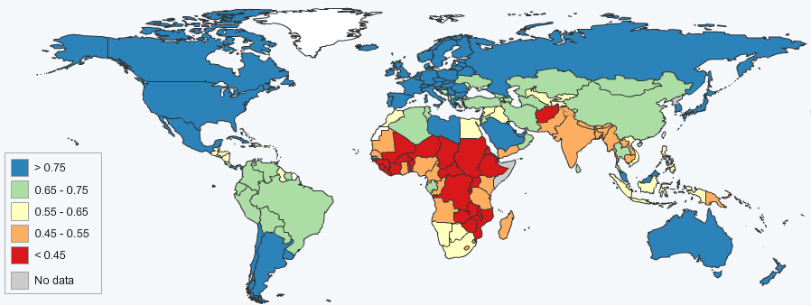
For information, China is 101st with an HDI of 0.687 ; Vietnam is 128th with an HDI of 0.593 ; India is 134th with an HDI of 0.547 (all three in the group of medium human development countries).

If I put all this in a map, it gives (thanks to the UNDP Statplanet tool):

Map of the Human Development Index 2011

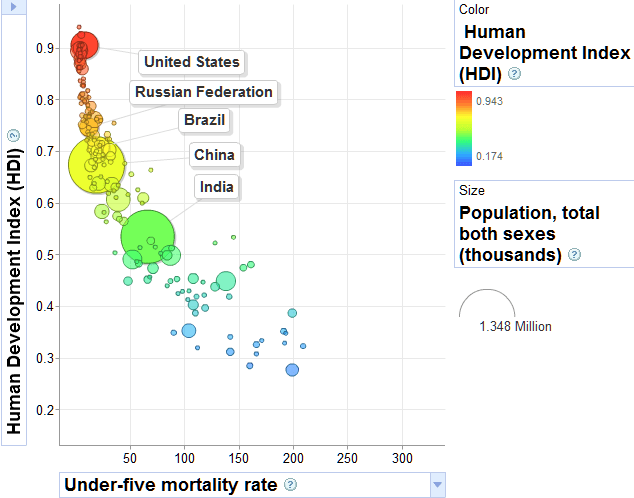
The UNDP also has a data explorer tool à-la-Gapminder. Yesterday, I wrote about Hans Rosling’s talk urging us to continue to improve child survival in order to curb the world population growth. If I plot the HDI -vs- the “under-five mortality rate per 1,000 live births” (the probability of dying between birth and exactly age 5, expressed per 1,000 live births), I get the following graph that intuitively makes sense: the smaller is your under-5 mortality rate, the bigger is your HDI (meaning the country is more developed).

HDI -vs- under-5 mortality rate

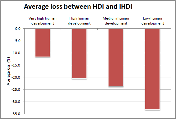
Now the HDI is admittedly a theoretical value: it doesn’t take into account inequalities within each specific country. That’s the reason why the UNDP created in 2010 the Inequality-adjusted Human Development Index (IHDI). The IHDI is thus the actual level of human development (taking into account inequality). The average loss in the HDI due to inequality is about 23%. And although the loss is variable from country to country, it increases on average when you go down the human development index (HDI), see figure below. This average loss is the smallest in Europe and Central Asia (-12.7%) and the biggest in Sub-Saharan Africa (-34.5%).

Average IHDI loss

How to feed 7 billion people?

The world reached a population of 7 billion people at the end of October 2011. United Nations symbolically chose Danica May Camacho, a girl born in Philippine, to mark this global population milestone. I recently wrote about the world population getting older, about non communicable diseases becoming the most dangerous threat to health (here too) or about World Population Day(11th of July 2011). We are now 7 billion and new projections tells us we will be 9.3 billion in 2050. When I heard all the news around this, I couldn’t help but think about Hans Rosling’s presentation on population growth at TED Cannes, in 2010.

In this presentation, Hand Rosling made a small recap of the situation in 1960, when the world was divided between 1 billion wealthy people and 2 billion poor people. He made this situation more obvious by plotting the number of children per women -vs- the percentage of child survival.

Hans Rosling's population in 1960

Then, if you watch the movie (watch it at the end of this post), you’ll see how the different populations evolved to the situation of 2005 where the differences were still there but less marked than in 1960. And all this was thanks to soap, hygiene, education, vaccination, family planning, …

Hans Rosling's population in 2005

So, one thing is to worry about what would be the world with 7 or 9 billion people. Another thing is to prepare the environment (i.e. both our container – the earth, its ecosystems, its water resources, etc. – and its content – us, other animals and plants, etc.) to cope with such an amount of people. And a third thing is to try to curb that curve and find ways to slow the world population progression.

In the remaining of his talk, Hans Rosling states that one way to curb this population growth is to continue to improve child survival to 90%. This would help reach a sustainable size population of the world. Unfortunately there isn’t any “gold recipe” in order to improve child survival. Two general goals can achieve this (as well as achieve many other things): an improvement in education and a reduction in poverty.

Fertility predictors, from Science magazine

If you improve education (especially of girls/women because they will become/are mothers, they could give their voice in that matter if we give them enough power), you will decrease fertility. The less children you have, the more time you have to take care of each of them, to give them more education, to feed them properly. On the other hand, if you reduce poverty, you also decrease fertility and, at the same time, you have more wealth to take care of your children, to send them to school and to give them proper food. This is not always the case, just generally the case.

Improving child survival will not solve all the issues. An addition of 2 billion people during the next 35 years or so is something big and it will have an impact of every aspect of our lives. But I really like the idea of having a leveraging effect starting from the improvement of child survival.

I let you watch Hans Rosling’s talk, now …

First promising results for a malaria vaccine

Malaria is the 5th cause of death in low-income countries (according to WHO). That’s why I’m very happy to read that a malaria vaccine showed promising results in a phase 3 clinical trial (in The Guardian, The New York Times or Google News). As usual, I find very interesting to get all the information at the source: the original scientific paper was just published in The New England Journal of Medicine.

The main result of this study is that “the vaccine reduced malaria by half in [young] children […] during the 12 months after vaccination”. The study also showed that “the vaccine has the potential to have an important effect on the burden of malaria in young African children“. The conclusion of the article ends with “additional information on vaccine efficacy among young infants and the duration of protection will be critical to determining how this vaccine could be used most effectively to control malaria“.

Indeed, as highlighted by the timeline reproduced below, the clinical trial isn’t over yet. Some data still needs to be reported (regarding younger children and duration of protection, as stated above).

RTS,S malaria vaccine candidate timeline (Source: PATH MVI)
RTS,S malaria vaccine candidate timeline (source: PATH MVI)

If you want to follow what’s happening with this vaccine, the PATH Malaria Vaccine Initiative seeks “to accelerate the development of malaria vaccines and ensure their availability and accessibility in the developing world” and their website contains lots of useful information.

Disclaimer: I’m currently working for the pharmaceutical company that discovered and produced the RTS,S vaccine in this study. I’m however not part of the malaria team in any way. There is only publicly available information in this post.

Yesterday was International Day of Older Persons

On 14 December 1990, the United Nations General Assembly designated 1st of October the International Day of Older Persons. 1990 … it is already more than 20 years ago! People who signed the resolution at that time are now more than 20 years older. Some (most) of them probably are now considered as “old persons”. Do they still have the same view on elderly? Maybe the highlighted principles at that time (independence, participation, care, self-fulfilment, dignity, …) are too broad, too short, just enough?

So, already a century ago 😉 people were concerned by the dramatic changes in the composition of the world population. Thanks to progresses and greater availability of preventive measures and treatments more people are living longer and healthier. Even in countries where fertility rate is high, there will be less and less working-age adults per older adult. When you look at China, the percentage of people above 65 years old is projected to rise up to one fourth of the total population in only 40 years.

Actual and projected percentage of people above 65 in China
Actual and projected percentage of people above 65 in China (partial data from Leeder et al., Columbia University, 2005)

Imitating other countries like the USA, UK, the Netherlands, etc., Belgium recently launched its Open Data Initiative. Well, don’t expect fancy graphs nor any “web 2.0” widgets, it’s only a repository of data made available elsewhere. Most (if not all) data is provided “as it is”, in proprietary formats and not easily combined nor even visualized. So I welcome this initiative but just wish it will be at least maintained and updated or, better, grown into something better, just like other government open data websites. A dream will be to have at least direct data manipulation online, downloads in open formats, a clearly open license and why not an open API?

So, what about the elderly in Belgium? There is a section about population forecast by age (which comes from the economy ministry in Excel format).

Projected aging of population in Belgium
Projected aging of population in Belgium (data from http://data.gov.be)

The Belgian population will continue to increase. The older population in Belgium will increase faster than the younger population. But seen like this, the growth will not be very dramatic.

Actual and projected percentage of people above 65 in Belgium (data from http://data.gov.be)

If we look at the projected percentage of people above 65 years old, we see that Belgium in 2010 is already at the same status as China in 2040. If experts say China will have an alarming percentage of old people in the future, the future is already here in Belgium! But it’s also true that Belgium took many decades to achieve this allowing some adaptations to take place. China will achieve it in only a few decades and will have to cope with these changes very quickly.

UN highlighted some challenges and ways to overcome them at a country / government level. The main issues will be to maintain older people as much as possible the same levels of health and independence as they enjoyed during their active lives.

N.B. For other sources of data in Belgium, one may be interested in visiting the Bureau fédéral du Plan, Statistics Belgium and the Statistics section of the National Bank of Belgium.

NCDs account for the majority of deaths worldwide

A few days before my last post and still about the UN High Level Meeting on Prevention and Control of Non-communicable Diseases, The Economist issued a daily chart showing that non-communicable diseases (NCDs) account for the majority of deaths worldwide. I copy the chart below:

The Economist: non-communicable diseases account for the majority of deaths worldwide

I have nothing to add about the chart on the left (except I don’t think stacked bars are really useful to visually distinguish between quantities ; ok, I added something). My first reaction to the chart on the right was: these countries in the lower middle income group should really do something to tackle non communicable diseases: they represent more than the double amount of deaths than the total number of deaths in other income groups. Even for communicable diseases, they should do something: from the chart, it seems to be a bit less than 10m deaths from communicable diseases, i.e. approximately the same amount as the total number of deaths in other income groups too!

Just for you information (and because I also had to recall which countries were in that lower middle income group), here are some countries in the various groups (*):

  • Low income group: Afghanistan, Bangladesh, Ethiopia, North Korea, Nepal, Somalia, Togo, a.o.
  • Lower middle income group: Angola, Bolivia, Congo, Georgia, India, Iraq, Morocco, Pakistan, Sudan, Ukraine, Vietnam, a.o.
  • Upper middle income group: Algeria, Brazil, China, Cuba, Libya, Malaysia, Russian Federation, Serbia, South Africa, Thailand, a.o.
  • High income group: E.U. countries, Japan, Singapore, Switzerland, USA, a.o.

(*) Technically it follows the way the World bank classifies countries: economies are divided according to 2010 GNI per capita, calculated using the World Bank Atlas method. The groups are: low income, $1,005 or less; lower middle income, $1,006 – $3,975; upper middle income, $3,976 – $12,275; and high income, $12,276 or more.

Then you realize that if you just take the absolute number of deaths and compare these group of countries (as it’s done in the chart on the left), you don’t compare exactly on the same basis. What if some groups have more countries or lower/higher population? What if the total surface of countries in one group are much higher (lower) than in other groups? Idem for the population density, etc.

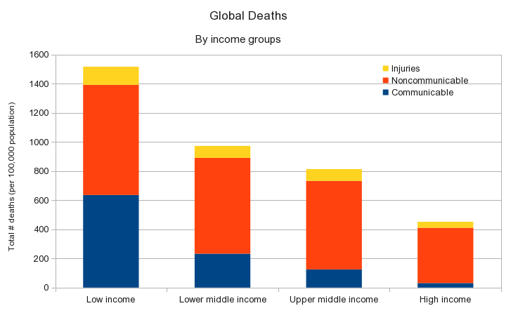
Fortunately, the WHO has a parameter one can use in order to objectivize a little bit this issue: the “Age-standardized mortality rate by cause (per 100 000 population)”. If you plot this parameter in the same way as above, you obtain this chart:

Age-standardized mortality rate by cause (per 100 000 population) per income group

From this you can now say that low income countries should really do something about NCDs but also communicable diseases, etc.

Presented like this, the number of deaths due to injuries and communicable diseases (per 100,000 pop.) decreases if the income of the country increases. In other word, more income you have, relatively less risk you have to die from injuries or communicable diseases. That explains why 1 death under a fallen wall is reported as a big sad news in Belgium while 60 deaths in a bus crash are not even reported in the news in India.

Another striking conclusion is that in low income countries there is approximately the same number of deaths (per 100,000 pop.) due to NCDs and due to communicable diseases (+/- 20%). We are all aware of tuberculosis, malaria, AIDS/HIV, etc. in less rich countries but it seems NCDs are an equally important issue.

But the most frightful conclusion from these numbers is that there is approximately the same number of deaths (per 100,000 pop.) due to NCDs in all income groups (674 ± 75) except the high income one. In other words, irrespective of you location or your income (except high income), you have the same chances to be affected by a non communicable disease. And irrespective on your income (and this time, even for high income countries), you have more chances to die from a non communicable disease than a communicable disease.

Ways to mitigate risk factors for NCDs (end of previous post) are still on.

N.B. WHO numbers are from 2008 for both charts.

The state of non communicable diseases

Last week, United Nations gathered in New York, USA, to talk about prevention and control of non-communicable diseases (NCDs). Non-communicable diseases are non-infectious, of long duration and generally progressing slowly. Due to the fact they are not infectious, there is no pathogen to target and there is no transmission medium to fight. Due to their long duration and slow progression, one usually notices NCDs when it’s too late and eradicating NCDs is less spectacular than other (not less important) infectious diseases. However WHO measured that NCDs represents more than 60% of all deaths in the world. For the occasion, WHO released an introductory video that summarize the issue.

So there are 4 main non-communicable diseases:

  1. Cardiovascular diseases
  2. Diabetes (both of them represent 70% of deaths by NCDs)
  3. Cancers (~ 20% of deaths by NCDs)
  4. Chronic respiratory diseases (~ 10% of deaths by NCDs)

NCDs are not directly in the UN Millenium Development Goals but I already mentioned they represent 4 of the top 5 killers in the USA. Two of them are also in the top 5 killers worldwide. If the Millenium Goals succeed, non-communicable diseases will be the next big issue in health.

Although NCDs were considered as a disease limited to high income countries (with infectious diseases affecting low income countries), this is not really the case anymore. For instance, the map of male deaths due to cardiovascular diseases and diabetes in 2008 shows an approximately uniform rate in high income countries with some higher rates in low income countries (especially on the African continent).

World : Cardiovascular diseases and diabetes, death rates per 100 000 population, age standardized: Males, 2008
WHO World : Cardiovascular diseases and diabetes, death rates per 100 000 population, age standardized: Males, 2008

If you are looking for more numbers, visit the WHO Global Health Observatory on Noncommunicable diseases.

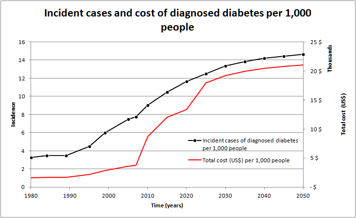
If nothing is done, the incidence of NCDs will increase. On top of being a health issue, a matter of life and death, it will also become an economical problem as the costs of treatment as well as the indirect costs will also dramatically increase (increase per case treated and increase due to the number of cases treated).

Incident cases and cost of diagnosed diabetes per 1,000 people
Incident cases and cost of diagnosed diabetes per 1,000 people (adapted from Boyle et al. 2010 and Alternative Futures Diabetes 2025)

If you are looking for more figures about the cost of non-communicable diseases, here are two detailed reports recently published:

In a nutshell, non-communicable diseases are everywhere and the future doesn’t look happy. However …

However risk factors are identified and many of them are related to our own lifestyle:

  • Physical inactivity
  • Unhealthy diet
  • Tobacco use
  • Harmful use of alcohol

To end on a positive note, all these risk factors can be easily controlled and for a limited additional cost. For instance, governments can protect people from tobacco (taxes as well as bans on tobacco advertising, promotion and sponsorship, …) and alcohol (access restriction, bans on advertising, …) as well as promote public awareness about diet and physical activity. Companies can also promote healthy diet and physical activities to their employees. On top of that, the food industry can also include relevant actions in their corporate social responsibility policies. Finally on a personal level, we can increase our physical activity, increase fruit and vegetable intake, reduce our use of tobacco and alcohol, etc. Simple, cheap actions ; huge interesting consequences.

References, references, references!

When I studied biology as well as when I did my Ph.D., our professors were always after us because of references. I think with their precious help we learnt the art of referencing: choosing good references, citing them at the appropriate location in a text and, of course, giving enough information at the bottom of the text to allow the reader to find these references.

I just finished reading two articles in a recent edition of The Economist and they reminded me how important are these references. These articles are What would Jesus hack? and Worrying about wireless.

First an aside: it might be an editorial choice but I would prefer to know who wrote an article rather than anonymity. I don’t have (and won’t have) anything personal against any author. I just like to know if I’m reading something written by a young Mr. I-know-everything with no background in the topic of the article or by a Mrs Specialist who appears to work in the field she’s writing about. In this blog, who I am is in the “About” section in the bar above.

In What would Jesus hack? the anonymous author is throwing a mix of everything and anything to make a story. And actually it works: the article has some logic in its sequence of statements. From an external point of view you may even think it’s a nice article. You discover news and organisations that you may have missed: an opinion from Antonio Spadaro in “Hacker ethics and Christian vision” (Google translation of the abstract), the reply from Eric S. Raymond, Elèutheros, … But you will also be staggered at the hotchpotch mixing Open Source, internet, Twitter, … Why not add Facebook then, the archetypal anti-privacy web service?

Richard Stallman changes my lifeThe only point that the article might get right is that some software programmers are somehow seeing themselves and / or seen by others as gods: Richard Stallmann, Linus Torvalds, Bill Gates (god turned philanthropist), Steve Jobs (god turned designer), etc. On top of that, every programmer had her/his Eureka moment when she/he solves a bug after hours trying to fix the code. Otherwise, I agree with what the unnamed author puts in the mouth of Kevin Kelly and that I can summarize by: “with more power comes more responsibilities”.

And, as I pointed out in the beginning, there isn’t any reference at the bottom of the paper version, any link in the digital version. Statements and people in this article could have been 100% fictional, no one would have known that (until you look for them on the web).

I have the same issue with Worrying about wireless: no sources, no references. I don’t forbid the anonymous writer to have an opinion on the topic. Just let the others also make their own opinion by citing the sources you are using. This article is just shaping the opinion of  readers in a hurry by using a partisan language and not citing sources. Even when indirectly citing sources (e.g. the WHO IARC classification), the anonymous coward succeeds in using negative wording to dismiss what doesn’t please his / her theory. I would have liked to have more information about the potential adverse effects of wifi waves in the long run, for instance. But I will unfortunately not believe such one-way gibberish.

Now you’ll tell me I don’t have to read The Economist and you’ll be right 🙂

Illustration credit: Duty calls by xkcd and Richard Stallman by Pladour on Flickr (CC-by-nc)