Category: Health

Evolution of the number and causes of death in Belgium (2010-2014)

Statbel, the Belgian governmental organisation for data and statistics, just released mortality data for 2014 (press release in French, dataset). The headline of their press release was that, for the first time, tumors were the first cause of death for Belgian men. Diseases of the circulatory system remains the main cause of death in Belgium, for women and for both sex together.

While the death of someone is a bad news in itself, I’m more interested here in the evolution of death causes. I’m interested in the evolution of causes of death because it might be a consequence of the evolution of the Belgian society and, as a proxy, of any (most) developed, occidental countries.

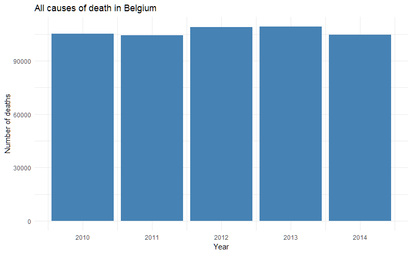
If you look at the data, the number of Belgians dying is stable and natural death is still the main cause (and also stable, around 93%). Note that if we look at data before 2010, it seems that mortality is slightly increasing since around 2005.

Evolution of the number of deaths in Belgium, all causes, 2010-2014

If the total number of deaths seems stable, the press release seemed to indicate that tumors (cancers) are on the rise, especially in men. The breakdown in categories is made following the international classification ICD-10 and, because the names of the different chapters are quite long for graphs, I will use the corresponding chapter numbers instead. Here is the key:

Chapter Header
I Certain infectious and parasitic diseases (A00-B99)
II Neoplasms (C00-D48)
III Diseases of the blood and blood-forming organs and certain disorders involving the immune mechanism (D50-D89)
IV Endocrine, nutritional and metabolic diseases (E00-E90)
V Mental and behavioural disorders (F00-F99)
VI Diseases of the nervous system (G00-G99)
VII Diseases of the eye and adnexa (H00-H59)
VIII Diseases of the ear and mastoid process (H60-H95)
IX Diseases of the circulatory system (I00-I99)
X Diseases of the respiratory system (J00-J99)
XI Diseases of the digestive system (K00-K93)
XII Diseases of the skin and subcutaneous tissue (L00-L99)
XIII Diseases of the musculoskeletal system and connective tissue (M00-M99)
XIV Diseases of the genitourinary system (N00-N99)
XV Pregnancy, childbirth and the puerperium (O00-O99)
XVI Certain conditions originating in the perinatal period (P00-P96)
XVII Congenital malformations, deformations and chromosomal abnormalities (Q00-Q99)
XVIII Symptoms, signs and abnormal clinical and laboratory findings, not elsewhere classified (R00-R99)
XX External causes of morbidity and mortality (V01-Y98)

One thing to notice is that, for chapter IV, Statbel only counts categories E00 to E88 while the WHO includes 2 more, from category E00 to E90 ; I would assume here that it has no important impact. Also note that, below, R ordered the chapters in a strange way – I’ll see how to fix that.

Excluding natural causes, we see that indeed, diseases of the circulatory system (chapter IX) are still the first cause of death, followed by neoplasms (chapter II) and diseases of the respiratory system (chapter X). If we compare the relative ratio of all these causes (second graph below), we also find the same conclusion – but the relative decline in deaths due to diseases of the circulatory system is better shown. And we can see that neoplasms take back approximately the same relative percentage of death, in 2014 (although they returned to the absolute number of deaths of 2012, approximately).

Causes of death in Belgium, 2010-2014

Causes of death in Belgium, 2010-2014, relative numbers

The available data set doesn’t go into more details than numbers by ICD-10 chapters. Therefore we cannot tell from that what kind of neoplasm is the most prevalent or what kind of infectious disease is the most present in Belgium, for instance. The press release however mentions that respiratory, colorectal and breast cancers are the top three killers and that flu was not very present in 2014.

As the cancer occurrence is increasing with age, and as the Belgian population is aging, one of the explanation for a high number of deaths due to neoplasms can be age ; however we don’t see a dramatic increase of neoplasms (fortunately!). Another potential factor is the impact of screening for cancers. Due to a very intelligent political split (sarcasm!), prevention (and therefore screening) is not a federal duty. Therefore regions started different screening programs, at different times, with different results. Screening data and their results are therefore difficult to obtain. The Belgian Cancer Registry doesn’t publish data on screening in oncology – although its latest report (revised version of April 2016) very often mentions screening as a main factor for change in the number of cases diagnosed. In its 2016 report (PDF), the Flemish Center for the Detection of Cancer (Centrum voor kankeropsporing) indicates that they increased the number of women screened for breast cancer by more than 8% between 2011 and 2015 (especially in 2015), with a quality of test between 90% and 95%. They also showed an increase in cancer diagnostics (without linking it directly to the increase in screening).

screening-flanders

This is by no means an exhaustive review of the data. There are other potentially interesting things to look at: the geographical disparities between the three regions, the gender ratio evolution (as some of these diseases are known or by definition affecting more one sex than the other), etc.

It would also be interesting to follow these trends as some changes occurred recently in the Belgian curative landscape. New drugs in cancer immunotherapy were recently authorised and reimbursed, for melanoma, lung – and other indications will follow. These costs have a price (less than what is in the press, however, I may come back on this in a future post) but they delay death (unfortunately they don’t avoid it). However, for some of them, in some indications, their administration and reimbursement is sometimes also linked with screening, testing and prior treatment failure ; that might decrease their impact on overall mortality. New drugs for Hepatitis C also arrived in 2015 and 2016 and the Belgian health minister decided to reimburse these drugs for patients in their early stage 2 of the disease. Studies showed that treating at this stage may prevent hepatitis C from progressing to later stages and, in some cases, studies showed patients cured from the disease. This is an opportunity to see a decline in mortality due to this infectious disease (although it is already quite low – compared to other diseases).

About antibiotic resistance and the price of drugs

Many headlines stated today that UK wants to tax pharmaceutical companies again in order to contribute to a pooled fund against antimicrobial resistance (AMR). The proposed ‘pay or play’ mechanism is a bit more subtle than that. The report (full text here) is also suggesting other financing mechanisms (including the improvement of existing ones) as well as describing potential non-financial measures to reduce these resistances in the first place. Actually, financial measures occupy only about 6% of the report. But headlines need to be catchy. Let’s see a broader picture on tackling antibiotic resistance …

The WHO summarizes well the situation: “Antibiotics are medicines used to prevent and treat bacterial infections. Antibiotic resistance occurs when bacteria change in response to the use of these medicines. Bacteria, not humans, become antibiotic resistant. These bacteria may then infect humans and are harder to treat than non-resistant bacteria. Antibiotic resistance leads to higher medical costs, prolonged hospital stays and increased mortality.

An illustrative diagram that shows the difference between a drug resistant bacteria and a non-resistant bacteria.

For Belgium, the Joint Programming Initiative on Antimicrobial Resistance displays a long list of governmental bodies and initiatives that study and/or tackle AMR. The Belgian Scientific Institute of Public Health has a dedicated program against AMR. Despite that, a recent study showed that, in 9 European countries, 99% of bacteria Streptococcus pneumoniae taken from nose of people aged 4 or more show antibiotic resistance (S. pneumoniae causes many types of pneumococcal infections like pneumonia or meningitis). The same study showed that Belgium has the worst resistance rate against the antibiotic cefaclor (fortunately authors also show there is little resistance against the most common antibiotics used against S. pneumoniae). A study from last year in 8 European countries (including Belgium) showed that approximately 4 out of 5 Staphylococcus aureus (another bacteria) isolates from individuals without specific health issues were resistant to at least one antibiotic and more than 7% of them are multidrug resistant. And we are talking here about Belgium, a country with a well developed healthcare system, following best practises in antibiotic stewardship and often considered as an example for the reduction of antibiotic consumption outside hospitals.

B0006889 MRSA

Coming back to the UK report, a big part of it advocates more or less what the 2015 WHO country situation analysis on antimicrobial resistance described too: countries need a plan to fight AMR, surveillance and laboratory capacities should be raised (no data = no knowledge of the situation and no capability to measure progression), antimicrobial medicines should be correctly used, public awareness campaigns should be deployed, and the prevention and control of infections allow to tackle the issue at the source.

The question raised in the report is also how to accelerate the discovery of new antimicrobial medicines? The report advocates for a “global innovation fund for early stage and non-commercial R&D”. And it correctly points that there are currently little incentives for companies to invest in research for products that will ultimately be priced very low (also thanks to generics) for a high volume to produce. Because in “normal times” (periods of “usual drug resistance”) competition between existing products drives prices down. However, if resistances become too high (and they will because they are selected over non-resistant bacteria), none of the existing medicine will be effective anymore, the willingness to pay for innovative drugs will be high but the time to develop them will still be in decades (i.e. too late to tackle the resistances).

Intervention 9 of the UK report tackle this issue with a complex reward mechanism (“the carrot”). But then the next section describes a very simple tax in one page (“the stick”). This ‘pay or play’ mechanism that was highlighted in the press and should indeed be the simplest mechanism that can be applied at a country level.

However, another mechanism could be to make the antimicrobial market attractive again. Allow for (moderately) increased prices on existing drugs (even the ones with competition from generics) and pharmaceutical companies will see opportunities to develop new medicines. Yes, they will become richer thanks to these price increases – but these funds are (partially) re-invested in research and development.

Photo credits: What Is Drug Resistance? by NIAID (licence CC-by) and B0006889 MRSA (clusters of methicillin-resistant Staphylococcus aureus (MRSA) bacteria) by Wellcome Images (licence CC-by-nc-nd).

Is it worth buying a coffee machine at work?

As I moved to a new office, I met new colleagues and one of them brought her own coffee machine and placed it on her desk. It’s a bright red Nespresso machine, a kind of statement that the owner doesn’t drink the free coffee offered in kitchenettes on all floors:

IMG_0152b

Given that the company has a professional Nespresso machine downstairs (i.e. similar quality of coffee but with capsules of different shapes), I was wondering if this is really worth buying. The calculation is simple …

On one hand, the “public” Nespresso machine sells 1 capsule at 0.50€ and pours the water (through the capsule) in a cardboard cup.

On the other hand, the cheapest personal Nespresso machine you can buy in Belgium costs 199.00€. The cheapest personal Nespresso capsule you can buy costs 0.35€ (let’s forget for a moment you have to buy them in multiple of 10 and there are savings to be made if you buy large quantities).

Therefore the upfront cost of the personal Nespresso machine tells me it’s more expensive to have my own machine on my desk. But after how many capsules (i.e. cups of coffee) does it become cheaper to have my machine? The equation is easy: 199.00 + 0.35 * x = 0.5 * x (where x is the number of cups of coffee). Solving it tells me I need to consume 1,327 capsules from my machine in order to get my coffee cheaper than on the “public” machine. That is more than 3.6 years if I drink 1 coffee per day – only slightly less than a year if I drink 4 coffees per day (which is a lot).

Of course, this simple calculation doesn’t take into account electricity, water, cleaning cups or the cups themselves ; they are considered free in both situations (which they are, in practice). It doesn’t take into account neither the convenience of not having to stand up, go down a few stairs to the “public” machine. But, for the future, it doesn’t take into account neither the benefit of having moved more during office hours (more than just sitting the whole day).

So, given some assumptions, having my own Nespresso machine on my desk is probably not economically viable at a reasonable time horizon, unless I drink a lot of coffee and if I value the convenience of not losing a few minutes to go down to the “public” machine. But going downstairs for a coffee prevent me from sitting for too long at my desk and it allows me to meet other colleagues downstairs. I’ll keep this habit! 😉

Apple HealthKit already created some disruptions …

… At least in the minds of people.

Marketing is a powerful persuasion tool and you sometimes need a few early applications to create 243076870_1166dfc14e_zthe impression that something radically new came and is changing an area.

I like to listen to podcast while doing repetitive activities that don’t require my brain too much. One of the podcasts I listen to is the Clinical Air from the Pharma Talk serie. A few weeks ago, I listened to episode #14 about consumer electronics in clinical research. It was all about the Apple HealthKit. In a sense it was very interesting to hear about it as it contained more details than its Wikipedia page for the moment ; another top-level summary of its capabilities is found in this Rahlyn Gossen’s blog post (Rahlyn was one of the guests of this episode). Episode #14 was published on July 21, 2015.

Tonight I listen to episode #12 about digital startups and applications for clinical research. It struck me that the discussion was more serious, more focused on actual startups and apps, what they try to solve, how they would/should evolve in the future, etc. Apple was mentioned only once, as part of provocative titles of articles in the press at that time. Because “that time” was August 29, 2014 (when episode #12 was published), one month before Apple announcement.

For some things, we’ll have to dig for information before big marketing campaign, in order to find out interesting content that explore various areas instead of being funneled in the same direction …

Photo credit: Birds: a tragedy by Shannon Kokoska on Flickr (licence CC-by-nc-nd).

Movember 2014 is over, thanks for your support!

With more than 2,400€ collected, our team – Bordet’s angels – can be proud, for a first participation! We are 12th of more than 100 Belgian teams. One key learning is that the gold, old paper display still works better than anything else to raise money.

And it was fun for me, a bit itchy in the end. But with the right trimming tools, this goes away very quickly. Thanks for all my supporters 😉 – your support is worth a thousand thank-you!

And a bonus video that was fun to create …

Nearly halfway through Movember

We’re nearly halfway through Movember, the month we grow our moustache in order to raise awareness about men’s health. I am in Amsterdam, for a congress and this was the hardest day of the month so far: since 8am, nearly every single person I met said it didn’t look good. And this can be harsh when you talk with (potential) business partners! However, practically, when you have time, this is an unique opportunity to initiate discussions with others about prostate cancer.

So this is a plea to make it worth! Please donate to prostate cancer research via my profile page: http://mobro.co/jepoirrier. Belgian men lives on average 5 years less than Belgian women. Belgium has the 4th highest cancer rate for men diagnosed in 2012 worldwide. Survival rates are however good but together we can do better!

Still want to see how it looks like so far? Here you see I will soon need to use wax, scissors and all sorts of precision instruments to tame it 😉

Movember moustache Jean-Etienne Poirrier

And if you are still not convinced, here is a short interview of professor Swinnen, from KUL (in Belgium), about his research and how Movember is helping his team:

And again, donate to a good cause! Many thanks in advance for your help!

Polio eradication geographical modelling

I recently read with interest Dr. Gammino’s post on how geospatial data and microplanning is helping the CDC and its partners to work towards the eradication of polio.

There Dr. Gammino describes the hurdles faced by healthcare workers in countries where census data is often missing, where political, seasonal and geographical variations are making these more difficult. The description of the different social structures in urban or rural areas was also interesting. But the post also highlights how “social mapping” and geographic information systems (GIS) are helping understanding where the population resides and helping reaching them (here for polio vaccination but this could be for other purposes: maternity care, child care, etc.).

140707-wraggs-polio-pakistan
In Uttar Pradesh, households supporting polio vaccination in blue, those opposing polio vaccination in red (from Waggs)

In this respect, modelling could help determine the best strategy to reach still unknown population, where settlers could move, where to concentrate efforts e.g. And a few papers actually address these issues. For instance, Rahmandad et al. studied the impact of network types (networks between individuals) on the dynamics of a polio outbreak. Or Tony Wragg reported the influence of information campaigns on polio eradication in India (one could use information as an infectious agent).

Now it would be interesting to see the two worlds collide: having these geotagged information feed a prediction model and reverting back predictions to healthcare workers in the field to inform them of potential areas to visit. This would have some implications for logistics and these efforts should also address privacy questions. But it would potentially help eradicating polio too.

2013 in review: how to use your users’ collected data

With a few days of interval I received two very different ways of reviewing data collected by users of “activity trackers”.

Jawbone_20140117-075010b The first one came from Jawbone (although I don’t own the UP, I might have subscribed to one of their mailing-lists earlier) and is also publicly available here. Named “2013, the big sleep” it a kind of infographics of how public (and mostly American) events influenced sleep of the “UP Community”. Here data about all (or at least a lot of) UP users were aggregated and shown. This is Big Data! This is a wonderful and quantitative insight on the impact of public event on sleep! But this is also a public display of (aggregated) individual data (something that UP users most probably agreed by default when accepting the policy, sometimes when they first used their device).

The second way came from Fitbit, also via e-mail. There was written how many steps I took in total as well as my most and least active periods / days of 2013. At the bottom there was a link to a public page comparing distances traveled in general with what it could mean in the animal kingdom (see below or here). This is not Big Data (although I am sure Fitbit have access to all these data). But at the same time (aggregated) individual data are not shared with the general public (although here again I am sure a similar policy apply to Fitbit users).

Different companies, different ways to handle the data … I hope people will realise the implication of sharing their data in an automated ways in such centralized services.

Fitbit2_20140117-075745

More sleep with Fitbits

After a bit less than 2 hours, jepsfitbitapp retrieved my sleep data from Fitbit for the whole 2013 (read previous post for the why (*)). Since this dataset covers the period I didn’t have a tracking device and, more broadly, I always slept at least a little bit at night, I removed all data point where it indicates I didn’t sleep.

hours alseep with FitbitSo I slept 5 hours and 37 minutes on average in 2013 with one very short night of 92 minutes and one very nice night of 12 hours and 44 minutes. Fitbits devices do not detect when you go to sleep and when you wake up: you have to tell tem (for instance by tapping 5 times on the Flex) that you go to sleep or you wake up (by the way this is a very clever way to use the Flex that has no button). Once told you are in bed the Flex manages to determine the number of minutes to fall asleep, after wakeup, asleep, awake, … The duration mentioned here is the real duration the Fitbit device considers I sleep (variable minutesAsleep).

Visually it looks like there is a tendency to sleep more as 2013 passes. But, although the best linear fit shows an angle, the difference between sleep in March and sleep in December is not significant.

R allows to study the data in many different ways (of course!). When plotting the distribution of durations asleep it seems this may be distributed like a normal (Gaussian) distribution (see the graph below). But the Shapiro-wilk normality test shows that the data doesn’t belong to a normal distribution.

Histogram of hours asleep in 2013Hours asleep in 2013 - Normal?As mentioned above, Fitbit devices are tracking other sleep parameters. Among them there is the number of awakenings and the sleep efficiency.

Awakenings in 2013

The simple plot of the number of awakenings over time shows the same non-significant trend as the sleep duration (above). The histogram of these awakenings shows a more skewed distribution to the left (to a low number of awakenings) (than the sleep duration). This however shows there is a relation between the two variables: the more I sleep the more the Flex detects awakenings (see second graph below).

Number of awakenings in 2013 (histogram)Relation between sleep duration and awakenings with Fitbit FlexSleep efficiency is the ratio between the total time asleep by the total time in bed from the moment I fell asleep. This is therefore not something related to the different sleep stages. However it may indicate an issue worth investigating with a real doctor. In my case, although I woke up 9 time per night on average in 2013, my sleep efficiency is very high (93.7% on average) …

Sleep efficiency in 2013… or very low. There are indeed some nights where my sleep efficiency is below 10% (see the 4 points at the bottom of the chart). These correspond with nights when I didn’t sleep a lot and also with very little awakenings (since these are related).

There is no mood tracking with Fitbit (except one additional tracker that you can define by yourself and must enter a value manually): everything tracked has to be a numerical value either automatically tracked or manually entered. It would be interesting to couple these tracked variables with the level of fatigue at wake-up time or the mood you feel during the subsequent day. I guess there are apps for that too …

The code is updated on Github (this post is in the sleep.R file).

(*) Note: I just discovered that there is in fact a specific call in the API for time series … This is for a next post!

Getting some sleep out of Fitbits

After previous posts playing with Fitbit API (part 1, part 2) I stumbled upon something a bit harder for sleep …

Previous data belong to the “activities” category. In this category it is easy to get data about a specific activity over several days in one request. All parameters related to sleep are not in the same category and I couldn’t find a way to get all the sleep durations (for instance) in one query (*). So I updated the code to requests all sleep parameters for each and every day of 2013 … and I hit the limit of 150 requests per hours.

Hours asleep (March-April 2013)This graph is what I achieved so far. I didn’t sleep much in March-April 2013: on average 4.9 hours per night. The interesting thing is that I can understand why by going back to my agenda at that time (work, study, family …). As soon as I can get additional data it would be interesting to see if sleep durations will increase later on.

(*) If you know how to get all sleep durations for 2013 in one query, let me know!